I opened a rather large/complicated project in 2.9. The corkboard’s background was back to the default blank, and all the cards were a hodgepodge on the corkboard. Others display just fine. For instance (on another imported project):
I think you have Freeform mode on for the corkboard. You should be able to drag the index cards around. It’s hard to see, but the “selected” button is the one shaded in light grey (even though the whiter one looks more “selected”).
Use the Grid button just to the left of it (the one that looks like a window) to return your corkboard to its orderly fashion.
Gotcha, thanks! Yeah, the white makes me think that the grid is selected when it isn’t. Bug or new thing to get used to? It seems counter-intuitive that the white one isn’t the selected mode.
The selected/unselected behaviour here mirrors that of the view mode selector in the main toolbar–the selected icon is a darker grey. In general throughout the interface, the grey highlight indicates the selection. I’d say give it a try for a bit–it may be one of those things you don’t even notice after a few uses.
In my opinion, the confusion isn’t that dark grey is the selection colour, it’s that the unselected button is (1) a different colour from the rest of the unselected buttons on this toolbar, and (2) this unselected button is coloured in a way that’s contrasting strongly with the rest of the toolbar buttons.
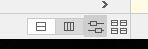
Take the view mode selection:
I’m on Corkboard mode right now, so the Corkboard button is coloured dark grey, and the Scrivening button and Outliner button are coloured white. The rest of the toolbar is a light grey. Since both the Scrivening and Outliner buttons are coloured white (ivory? I’m not so great with shades), it’s obvious that Corkboard is the one that’s selected. It looks great to me.
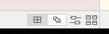
Then contrast it with the Corkboard options at the bottom:
I’m using Grid mode, so the Grid button is coloured a dark grey. The Freeform button is white/ivory. The Arrange By Label and Corkboard Options buttons are the same light grey as the rest of the bar.
Since of the 4 options, 2 options are light grey, one is white, and one is dark grey, it’s not immediately clear at a glance which option is the one that’s selected. The white and dark grey both have a pretty stark contrast to the background light grey.
I don’t mind the dark grey being the selection colour (I actually quite like the aesthetic). I can also see that we want these smaller buttons to “fade” into the rest of the bar instead of shaded white and thus “obvious” like the larger buttons up top. But if so, the unselected Freeform button should be light grey like the Arrange By Label and Corkboard Options buttons. That way, it’d be immediately obvious which option is the one that’s selected because there would only be one button that’s coloured differently from the rest of the light grey toolbar.
I’d say the same issue would apply for the Horizontal/Vertical buttons once we get into Arrange By Label view.
In short, my suggestion: keep the dark grey as the selection colour. Aesthetically it’d probably be better for these Corkboard options to not visually “pop” like the view mode selections up top, so maybe all the unused Corkboard options would be the same light grey as the bar.
This is a very minor thing and it only takes a little getting used to, but I can see where the confusion stemmed from for the original posters. But it’s very low on the priority list no matter what. (Also, sorry for length; brevity isn’t my strong suit.)


