Tahoe minor bug with font declination with Unicode

So for context, I asked first at the Mac Forums, who kicked me, because I was using Tahoe, to the developer forums.

Times New Roman does not have superscript for 0-9 on numbers built in.

I need 0-9 because I’m trying to write Chinese Pinyin for some dialects that need it. (In this case Hakka, but others as well) Zia³po² for example.

TNS only has superscript for 0-3, but Cantonese has tones 1-5.

The declination for when TNS fails is to make the next font Lucida Grande. TT This is a san-serif font that doesn’t look a lot like Times New Roman. The Unicode font I want it to select instead is EB Garamond (free from Google). Unfortunately, Times New Roman is industry standard.

The Mac forums said one could program a declination into the core programming per program/app, but it’s outside of the user’s power.
Yes, I’m aware this is super low priority, but I’d still like this, or for someone to make a unicode TNS font that is automatically loaded into all computers that does have 0-9 superscript, mostly to be able to render Chinese dialects and math correctly in books. Also, how do people submit math manuscripts when they can’t do superscripts?

I know someone is going to lecture at me something like, “But Scrivener can do superscripts!” And I’m going to point out that styles erases all superscripts and doing that is painful. Plus it doesn’t render correctly when I do text substitutions (via System Settings). Because while I have some basics of Chinese, I don’t remember all of the pinyin, so it’s easier to do a substitution on the fly from text substitutions. `Ziapo → Zia³po² is much easier to type.

Also, why is TNS racist. :wink: What does TNS have against 4-9 superscripts anyway?
Actually, someone already did this. Check out the STIX fonts. (The “Math” version should definitely do the job.) Their project page. It’s basically a less dumb interpretation of TNR, plus the math stuff.

(I hope you didn’t mean the “loaded into all computers” part literally.)

Some additional thoughts. I say this as a user. The only meaningful way to implement something like this would be some kind of user setting, like “those are my fallback-fonts, and in this order…”. How else would any software know what the user needs or prefers? (This is actually what macOS already does. It guesses – and the result didn’t satisfy you.) And then there’s still the issue that you need to make sure those fallback font(s) are also installed on the computers of all people you collaborate with. So you may as well agree on a font that doesn’t need a safety net to begin with.

2 Likes

The font isn’t the same as TNS, though… Sadly.

This is TNS-12 pt

This is Stix Two Math Font 12pt. The spacing is radically different from TNS and it’s not hard to tell the difference.

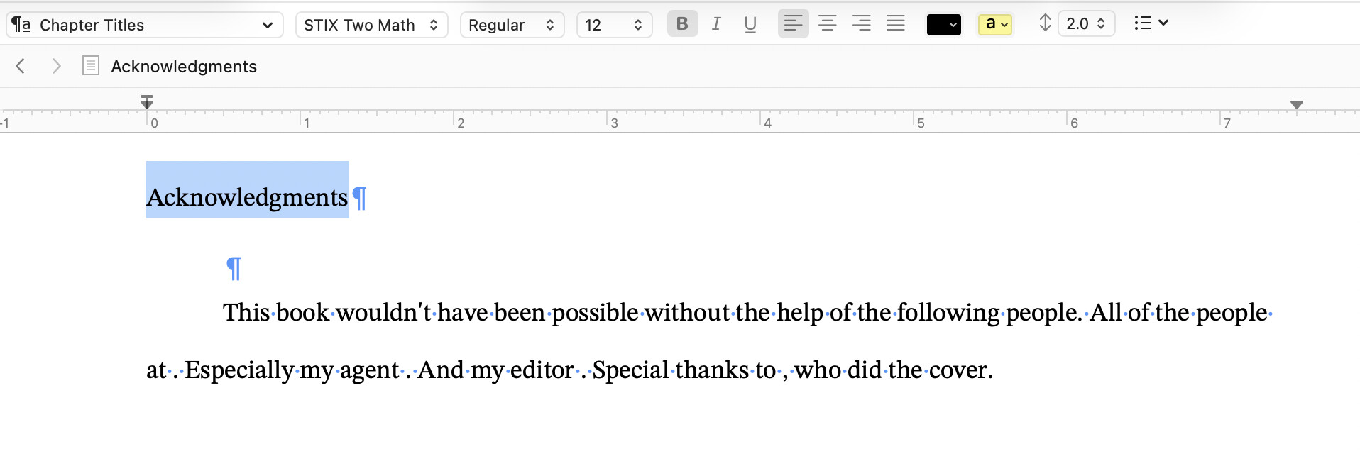
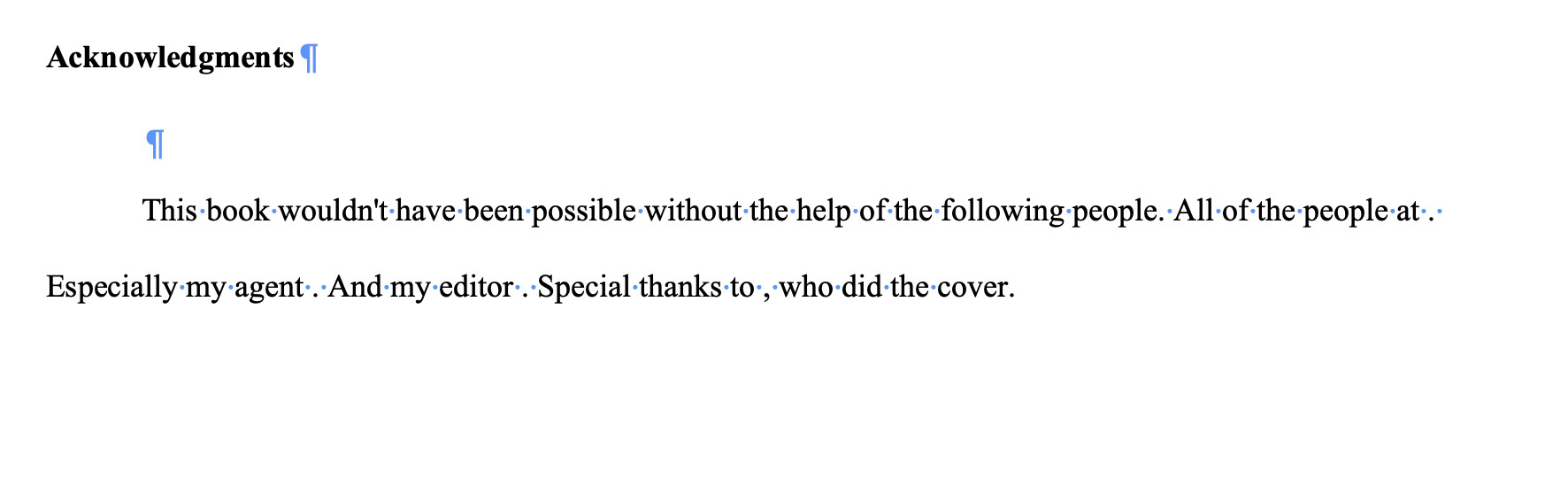
I can’t get STIX Two Math to do bold… In Manuscripts you need bold to do chapter titles.

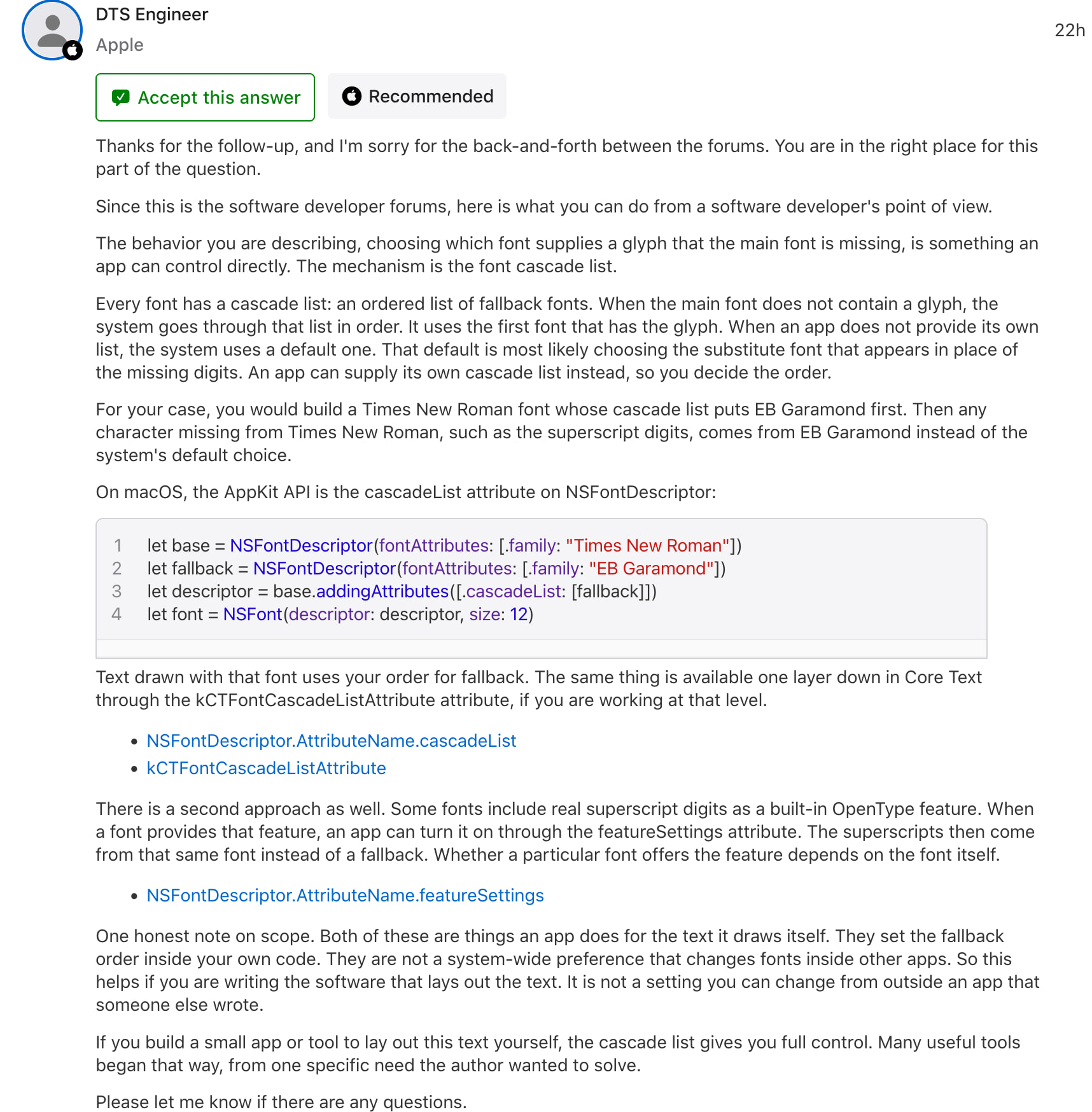
The programmer on the Mac developer forum seemed to think that programs programmed on the Mac framework could set up a declination within the program. i.e. Scrivener could do it.

But yeah, the publishing establishment needs to choose a better font.

That’s weird (the bold issue). :thinking:

Yes. But to what? It’s not a technical problem. Scrivener has no idea what’s the best fallback font, and even if it had (let’s say it lets you configure one) – there’s still no guarantee that your collaborators have that font installed. Unless you all agreed on one. Which would render the whole fallback solution moot to begin with.

1 Like