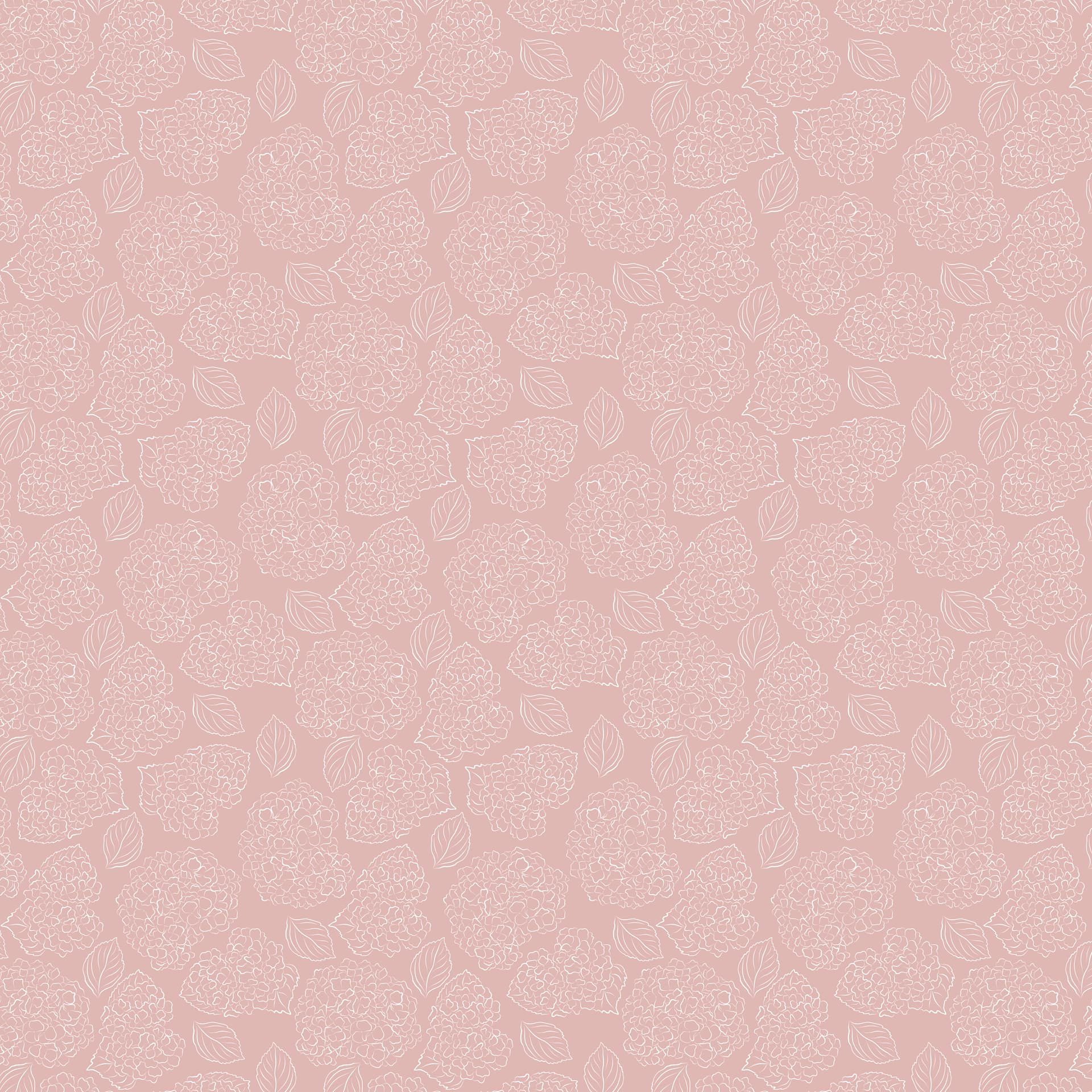
I’m trying to make custom themes for Windows and Mac. On Mac, my tileable images work perfectly even at a small file size. 100% happy with Mac.
Windows is a nightmare. I have tried 50+ variations of different resolutions, sizes, flattening techniques, and anything Chat GPT will accept. This ginormous 7000x7000 image still is super zoomed in and blurry. The exact same pattern in Mac is 1200x1200 and displays crystal clear.
Am I missing something? How can I have a fixed width background image on Windows that actually looks good?
The image file:
Smaller is going to be better with both versions, but maybe more so with the Windows version (I haven’t really stress tested it with massive images since it’s not designed to take them).
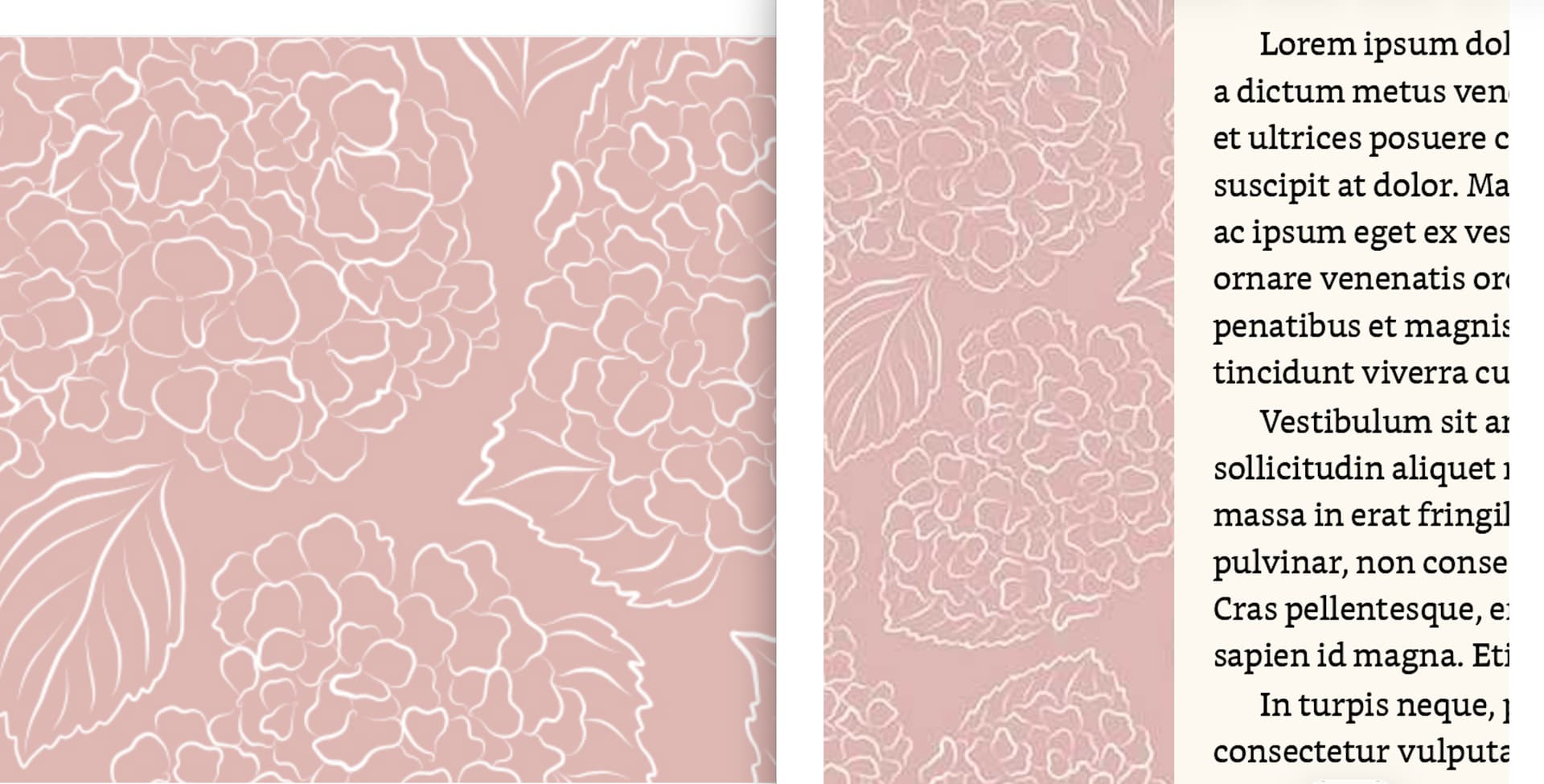
All you need is just enough to tile the pattern, and in this original image I see the same pattern of shapes nine times. I bet it will look identical if you cut the top 1/3 corner out, and it will make your theme files smaller and easier to share, too.
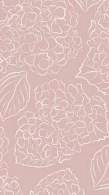
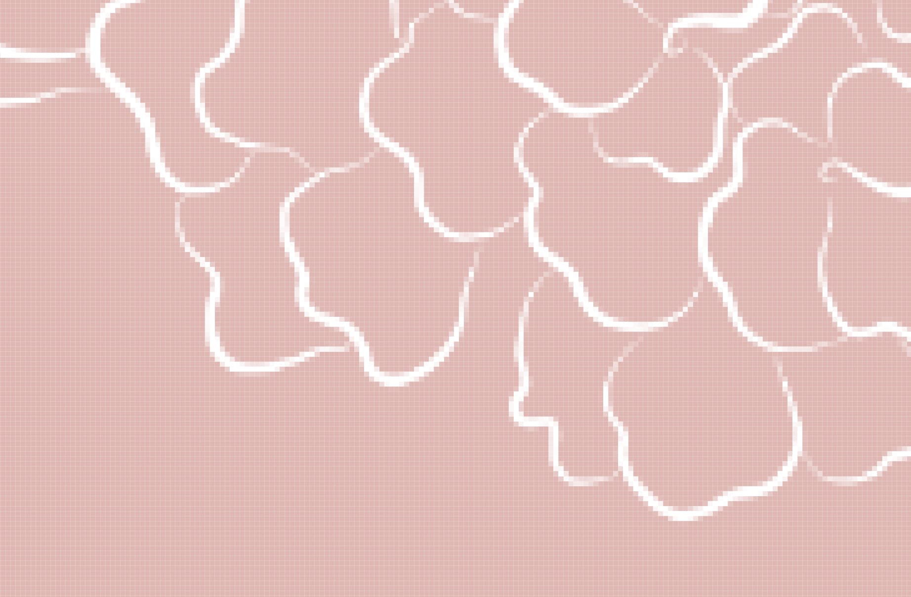
I started way smaller and that looks just as bad. It seems like Windows is stretching the image once while Mac is actually tiling it, but idk. This is what it looks like at 1700x1700 vs 7000x7000
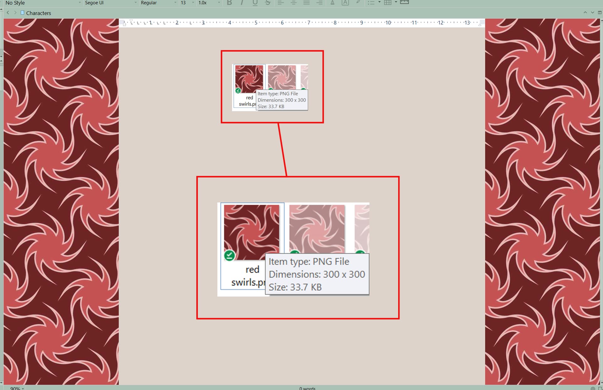
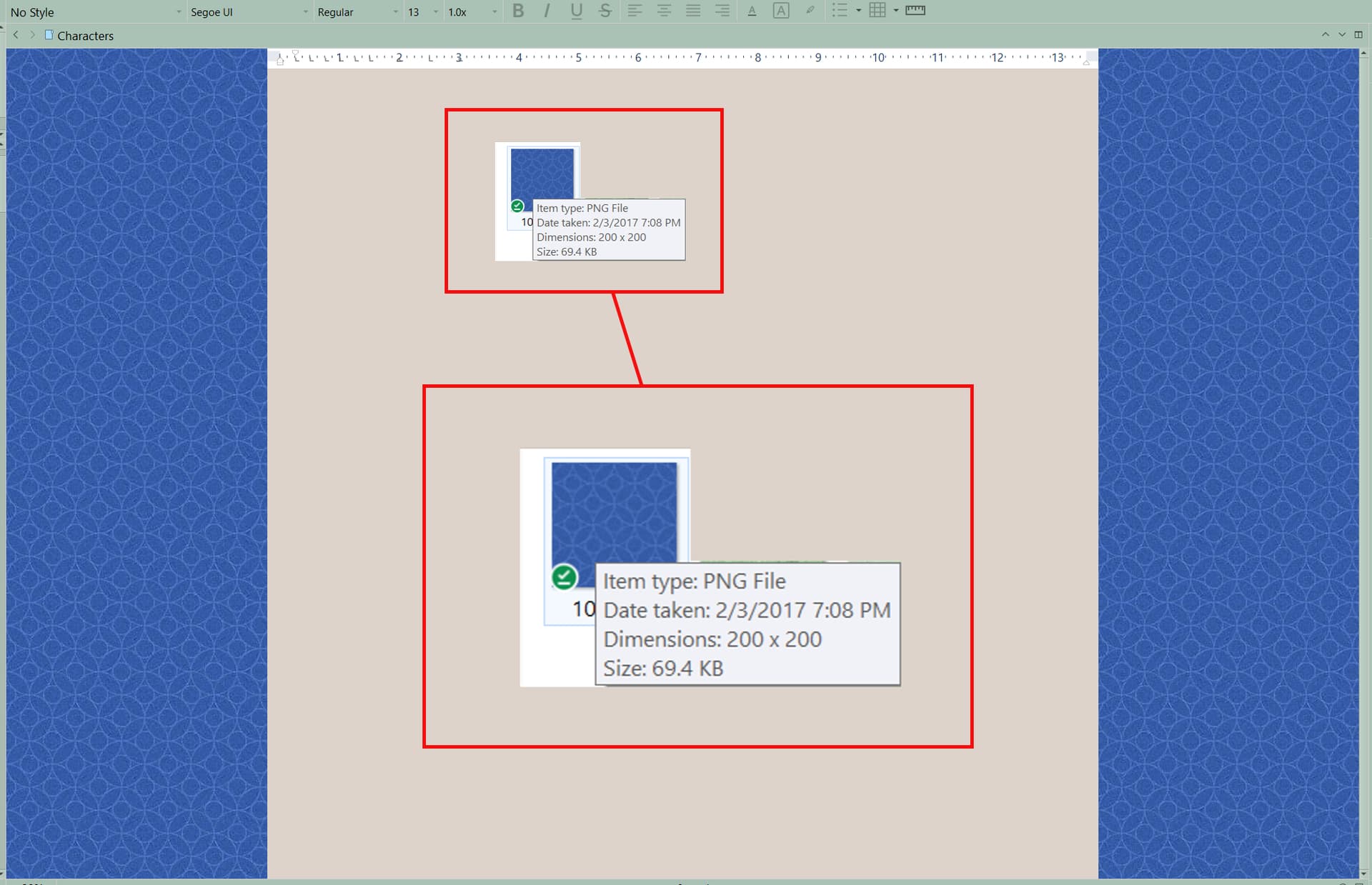
This is my final Mac pattern file uploaded to Windows, which is only the tileable pattern “once.” When that was so big and blurry, I tried making the pattern repeat 4 times in one image file, but that also looks bad
Hmm, I gave it a try with a 640x cut from the original top-left corner, and I’m getting something that is the same size as the original. I will say that the display engine does seem to be boosting the contrast a bit, which causes the original heavy JPEG compression artifacts to be more obvious, which is what you might be seeing.
Do you have the original in perhaps PNG or TIFF format?
I tried 640x640 jpg too. I’d started with jpg but moved to png as one troubleshooting method to see if it looked any better.
Still not great. People have complained about not having Windows versions of themes for years and every time I try, I remember why I’ve stuck with the Mac version
Sorry if this is stuff you know, but just in case: saving as PNG after the fact is just going to faithfully preserve the damage the original JPG image has, so you really need the original. It’s those faint “heat wave” looking echoes around the original shapes that is making it feel grainy, I think. They get worse every time you save as JPG again, so maybe if you don’t have a non-lossy original, the original JPG might be better than continuing to work off a chain of variants.
But zoom in on it in your graphics program, and try boosting the contrast. If it’s clean these lines should be sharp, but if’s already degraded there isn’t much you can do to fix it that I’m aware of.
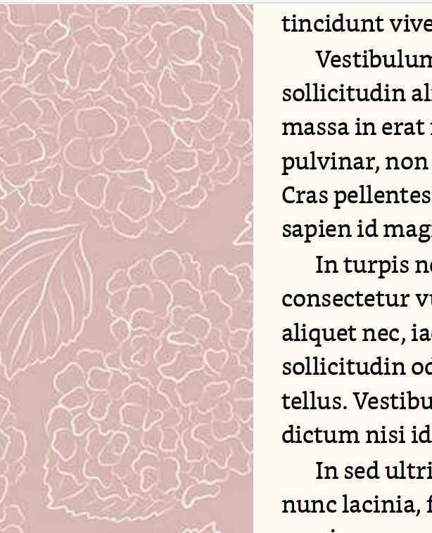
Here’s what I’m talking about, this is a magnification with boosted contrast and saturation, to exaggerate what JPEG does:
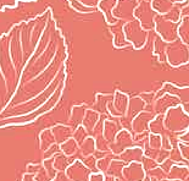
Thank you for your effort here! I have an original photoshop file and I’ve been reexporting for each attempt. Would the original photoshop file still be holding onto damage from previously exporting the file as a jpg? This is zoomed in on my actual photoshop image file. Upping the contrast/saturation doesn’t look any worse.
That looks fantastic to me. Try saving a 640x slice of that to PNG-24 and see if that looks any better.
It is interesting to me that the exact same file looks much better in corkboard than main editor
Yeah, for whatever reason the fixed width tiler is boosting the contrast and bringing out these artifacts. The size is identical though, to the point that clicking back and forth in editor history between a corkboard and an editor shows no movement of the texture.
In fact, I wonder if it is even running further compression on it, to save space. If it is using a relatively low quality JPG filter to save the image into settings, on a file that already has heavy artifacts, it would only get worse. I’ll check to see if that might be the problem on our end. We should maybe only do that if one selects non-lossy formats to begin with, or if it is over a certain limit.
This is 640x640 png-24! And side by side screenshots of the same image in main editor vs corkboard. It’s the same for me that the position of the image doesn’t change, but when I toggle back and forth between main editor and corkboard, I can physically see the pattern degrading
I didn’t try to make the screenshot/preview app line up but in app, the scale/positioning is the same. It’s just the line blurring that changes
Seriously, I appreciate your back-and-forth so much.
Yup, my earlier hypothesis looks to be what is happening. It’s stepping down way too hard on the imported file with compression. I don’t know if that is in particular necessary (why not do it for the corkboard then?), so I’ll write it up for the developer and see if this can be improved.
In the meanwhile, I don’t think there is a way around it, that’s the best it’s going to look.
The problem is that even a perfect quality file (such as tried with the original PSD above) on input will become extremely compressed when imported into settings. You can see this effect in your screenshots for example:
Circling back to say I still care about this, lol! I’m hoping it wouldn’t be too difficult of a fix since corkboard seems to be fine, and it’s just the main editor having trouble, but I’m not a developer.