I not sure whether this is strictly feedback or setting that I can adjust.
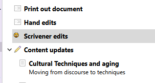
I was quite excited to realize that I could use emojis as icons as an quick way of producing custom icons. However, I have found that the emojis only seem to take about a quarter of the allocated pixels, making them much smaller than in-built icons. They are really too small to be able to actually really see what they are - see image below. I would expect the smiling face icon to go all the way down to the bottom of the text. Is there a way to change the size of text-based icons? If not, I would like to suggest that it would nice if they were by default designed to scale to the same size as other icons.
This seems to be a Windows-specific issue. The icons from text are small and pixelated on Windows, whereas they’re larger and much better quality on Mac. I imagine that this is related to the difference in text engines, but perhaps it’s something that can be improved in a future update.
Thanks! Would love to see some improvement in the Windows version eventually, but I realize that’s its probably a fairly low priority fix in the grand scheme of things.
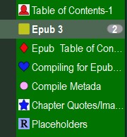
I took geometric shapes as png files and colored them as circles or squares etc, much easier to see than flags or do png of large letters such as R for revision and colored tied to revision colors. Limits are imagination and show well
These are custom made. As GoalieDad said, much more visible.
They all have a specific meaning to me. I don’t use them everywhere, but used alongside the default folder and files icons, I have all the info I need at a glance.
here is example of shapes and if colorize could use green, blue, yellow, white, black, etc and with letter R for revision colors to represent each stage, show up much better and jpg or png can be dragged into manage icon window and instantly becomes icon.