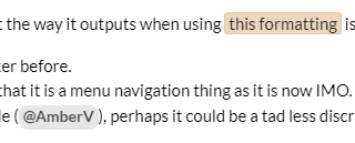
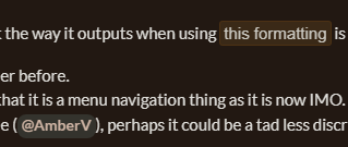
I just noticed that the way it outputs when using this formatting is not as it used to be.
I think it was better before.
Too easy to miss that it is a menu navigation thing as it is now IMO.
If this is adjustable (@AmberV), perhaps it could be a tad less discrete ?
In case it is a user setting (or a browser thing), and that I’m the only one getting this, this is what I get:
I have the forum set to dark mode. Chrome as a browser.
As a matter of fact, switching the forum to light theme,
two things are noticeable:
. . . . . . .
1- In the light theme, there is a big difference between the formatting I am “complaining” about and the user tag. In dark mode, they just look the same.
2- The formatting that recently changed currently looks in light mode exactly how (or very close to how) it used to look in dark mode.
This was changed on purpose, as I never liked how bright the highlights were, and particularly when a post was rather dense with shortcuts and menu commands. I could play with it a bit more, but I don’t think they are hard to see. Maybe that is a difference in screen calibrations.
FWIW, I would say something a bit less muted is wanted. It seems certain that someone whose eyesight is less acute (or has trouble differentiating colors) will have trouble apprehending them. As so often, the answer lies in the happy medium.
I think you went a bit overboard with it. It’s so subtle now (especially in dark mode) that it hardly makes any useful difference at all. Those code bits, in my opinion, should pop. Now they look like they try to pass the marksman final exam.
My eyes are not particularly bad, but either you or “everybody” over there possesses eagle eyes. The Knowledge Base body font size of 9pt / 12px and the hairline Blog font with 120 characters wide lines (also) hint at that. No offense.
Looking at it closely, there seems to be a slightly different shade for the outline of the box. (?)
If adjustable, making that outline a lighter shade would probably do… As long as it is clearly a box, I think it’d be fine. It only needs to stand out more than it now does, is all.
No longer having the text in reverse color is not a problem. (I used to find it quite violent and irritating too – so I’m with you on this. )
We often use screenshots of Scrivener to go along explanations; look at the instance of that said formatting that is just below the white backgrounded screenshot in my second post. The contrast with the white screenshot makes it almost invisible.
I believe a user would read a post containing instructions once, then scan it from top to bottom, as doing in Scrivener according to the instructions, his/her eyes searching the post for details like this. It could only gain by being more visible. Esthetics shouldn’t be that much of a priority, in this specific case, in my opinion.
Thanks.
Else, what can I say ? It looks like chocolate and makes me hungry.