I get this all the time.
Add a bunch of gaps where you already have one.
Like 6-10 everywhere ; it’ll make it not as bad.
→ Start by adding the exact same number of gaps everywhere, so that the toolbar appearance doesn’t change. (Each gap is worth a relative % of the available empty space. )
→ Then balance the whole to your taste by adding again 1 or 2 gaps where needed.
I think the issue is that an unsolicited gap is added before the very fist icon. So, the more you add of them (reducing that unwanted gap’s width value when compared to the whole – instead of being one of say 5 gaps, it is now 1 of 25 (its share of the unoccupied space then going from 20% to 4%)) the less the toolbar becomes messed up.
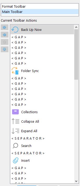
See how there visually is an unwanted gap before “Back up now” (but not in the above list).
And yet, it ain’t that bad :
→ Normally, the first icon (back up now) should have been all the way to the left. But doing as I just described, it is almost where it should have been.