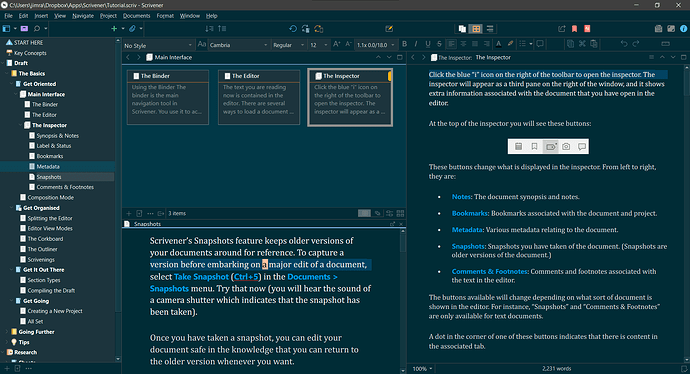
The closest you’ll get to your desired layout is something like this:
What you’re seeing is:
- The Binder on the far left.
- The left Editor pane top has the Corkboard, and the bottom has a Copyholder
- The right Editor pane contains the Scrivenings view
- The Inspector is hidden
You could control the contents of the Copyholder via the Binder and/or the Corkboard.
Personally, instead of trying to do everything in Scrivener’s main window, I’ve grown to greatly prefer Quick Reference panels, which I use almost exclusively for editing these days. I leave the main window for accessing research materials, and, same as you, tracking plotlines and how the manuscript flows. And also as a launch pad for QR panels. ![]()
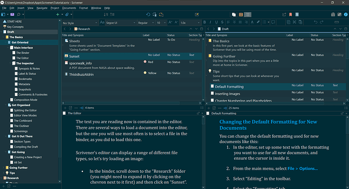
Because I find the Corkboard view too limiting, my typical layout looks more like this:
What you’re seeing here is:
- The Binder on the far left.
- The left Editor pane top has the Outliner, and the bottom has a Copyholder (controlled by the Outliner)
- The right Editor pane top also an Outliner, and the bottom has a Copyholder (controlled by the Outliner)
- Not shown would be one or more QR panels, in which I’d be editing.
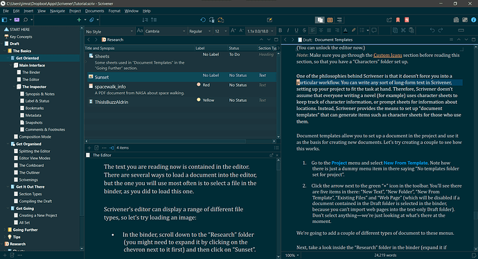
When I’m checking for flow, I’ll drop a Copyholder and incorporate Scrivenings view in the right Editor:
Hope you find this helpful.
Best,
Jim


