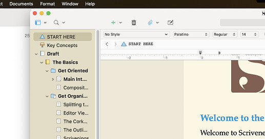
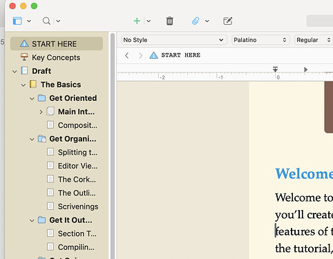
Despite 4 prescriptions of increasing magnification, a larger than average monitor, and sitting up close … the User Interface is still too small in the tick-points. I don’t know what you call the little, teeny, downward/upward triangles, +/- ticks, etc. Personally, if I could I’d switch up every header bar, title bar, ruler, etc., that is part of the ‘set features’ and upgrade or let me click to increase to an 18pt font! When I increase the focus (usually around 200%), the tick-marks don’t ‘swell’ to match.
Antoni Dol made a beautiful theme where the Binder carets are much more visible. Look him up on the Forum
I’m not familiar with the Windows version of Scrivener. But on the Mac, the appearance of a lot of these UI elements is under the control of the OS and cannot be controlled through Scrivener.
Antoni Dol is an extremely knowledgeable user and has done some wonderful Scrivener for Windows themes, but they won’t work on Mac.
I see from your profile that you work on both Windows and Mac. Antoni’s themes may well help with Windows Scrivener, but I suggest that on your Mac you may need to look into your system appearance and accessibility options.
Forgive me if you already know this, but if you’re on a Mac then there are couple of things you can do to make the interfaces of all Mac programs more readable on a system wide basis.
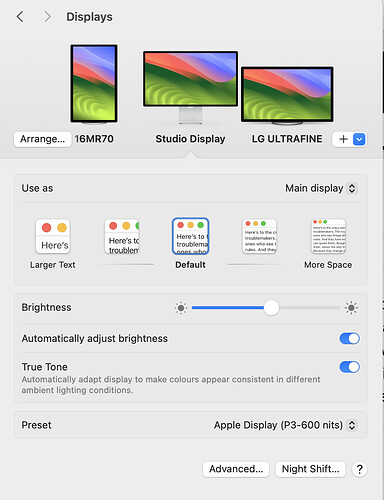
The first is to change the resolution of your screen. In System Settings (or System Preferences if you’re on an older version of MacOS), go to the Display section. You should see a row of screens with your current resolution highlighted.
If you choose one of the Use as: screen sizes to the left of your current one, then everything on the screen will become larger and the difference is significant. Perhaps one of these will suit you better?
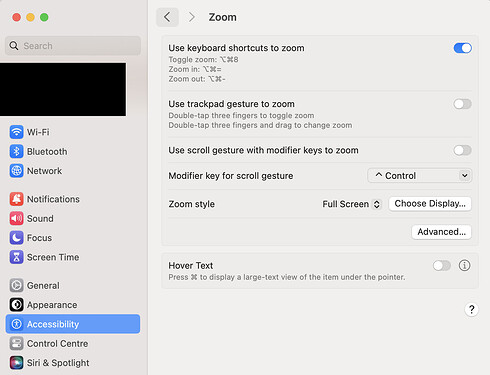
If that doesn’t work, then you can temporarily increase the size of any part of the screen by toggling cmd-alt-8 (once you’ve enabled it in the settings).
The Zoom stye dropdown has a couple more options so it’s worth experimenting.
As far as I know, these are the only methods of dealing with too-small UI on a Mac – apologies if you already know about them but I thought it worth mentioning in case others have the same issue.
THANK YOU. … in a font size that fills this box to show my appreciation. This display deed is amazing. My apologies for not knowing this path to my problem’s solution. THANK YOU. Woot-woot (again) to you and LIT&LAT.


