V3.1.1 Line Spacing bug with mixed fonts/sizes

Basic text in Calibri, one word in a strange font called Papyrus. Standard font size 10-pt, Paprus sizes 11, 11, 10, 14, 10, 10, 10.

Naturally (and correctly), with line spacing Single it looks like this:

Bug So, I set the line spacing to exactly 12.5pt (Question BTW… what is the exact factor equivalent to Single, I expected 1.2, but that seems too little, and 1.25 too much) and got this:

i.e. the font change has completely confused it.

Even having uniform font size (all 10pt) does not resolve the issue:

Question is there any way I can use different fonts without affecting the line spacing?

If you are in scriptwriting mode (I strongly suspect you are), the issue is not with the font, but rather that there is a bug with line spacing using this mode.

I’m not in scriptwriting mode as far as I can tell. I’m glad you agree there’s a bug with line spacing!

Even your first screenshot doesn’t seem like single line spacing to me.


(Same shape, same size, just copied from above the C to above the S.)

Are you certain you are not in scriptwriting mode ? In the binder, is your document icon white or yellow ?

Does the bottom of the editor look like this ?
image

Another explanation could be that (because it sure seems so) the special font you are using is NOT AT ALL coherent with its alleged point size.

First screenshot - it is single line spacing and probably correct given the letter sizes which I stated individually, including a 14pt, where all the Calibri (bulk of the para) is 10pt.

(My document icons are white)

PS Some examples from PPT on my machine that suggest the font spec is generally OK - similar spacing variations used

image

Nudging @AmberV - are you aware of this issue, or have any other insight from your side?

NB I have read recently that typographers “hate” Papyrus, but does that mean there is something defective about the font spec that might not show up in other uses??

I don’t think there are any bugs here, what is being observed is how the Exactly line-height setting works when it has to deal with different font baselines and metrics. In short, it’s not a good tool to use for this particular thing you are trying to do. It’s better for baseline adjustments within a line, or keeping similarly sized inline graphics from causing uneven leading.

Ultimately I don’t know if any of the models supplied by the text engine will produce a nice looking result with radically different fonts on the line, like this, but you could try experimenting with different settings, maybe something will end up working. It’s one of those many little things for why I stress Scrivener’s typesetting isn’t intended for production output. Other engines are better at this problem, and in some cases may not even require adjustment, meaning the look in Scrivener should just be ignored.

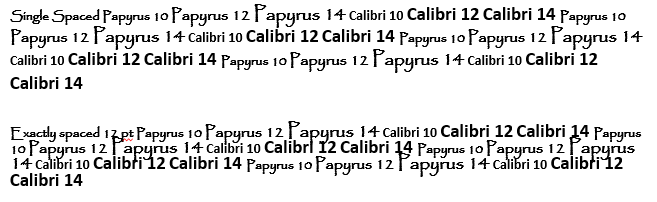
@Julian_M1: Question BTW… what is the exact factor equivalent to Single, I expected 1.2, but that seems too little, and 1.25 too much

Neither, if I understand you correctly. Single is “1.0” multiplier, by definition and nothing else. 1.25 would be a quarter of the way to double spacing.

@Vincent_Vincent: If you are in scriptwriting mode (I strongly suspect you are), the issue is not with the font, but rather that there is a bug with line spacing using this mode.

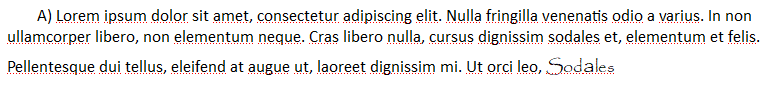
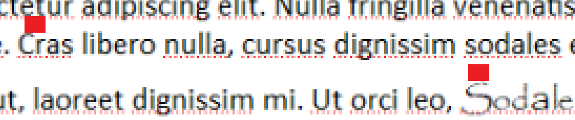
That is not entirely true. There are no bugs (at least in this context) specific to scriptwriting mode. What you may be referring to are drawing bugs with adornments (including the cursor) that appear when using the Exactly line-height model, which screenplays by default do use; that’s entirely different from saying all of scriptwriting (not screenplays included) has a line-height bug. But to reiterate we’re talking about the adornments Scrivener adds to the text, like inline annotation bubbles and style highlight boxes—not basic text layout.

One might cause poor layout with the Exactly setting, but that isn’t a bug, it’s just a matter of pushing the model into a task it isn’t designed to handle gracefully (much like putting a 500pt tall image on a line with exactly-12pt line-height would break layout). How it breaks is up to the text engine. LibreOffice will clip overrun beneath text (so you’d only see the very bottom of such an image for example, or a large font), while Scrivener’s engine overlaps. Either way, it’s a failed layout that needs manual help.

OK, seems very strange* from the uninitiated POV but I trust you (you earned it) :slight_smile:

Thx for responding.

* You don’t have to respond to this unless you change your mind about it being expected… I’d rather you did important things :wink:

In my 2nd (“bug”) image the baselines are not evenly spaced. Regardless of ANY font variations, why are they not at least the same - even if the value is wrong? Line spacing surely (?) controls baseline-baseline spacing between lines… individual characters then placed relative to the controlled baseline.

It seems the baseline of Papyrus is (placed) the same as Calibri. Note that the Capital S of Sodales does seem to be slightly below the dotted baseline. I believe that is called baseline shift (thought I have done lots of typesetting with LaTeX I have never had to bother with such things before), but even assuming some misreading of font specs, I note that the line spacing to a shifted letter (“S”) level isn’t equal either.

My expectation was that Exact spacing would make baseline-baseline spacing exact and uniform within the paragraph, or is line spacing - unexpectedly to the uninitiated MS Word user - a per line property?

If anyone else has facts please let me know, though I admit it’s just curiosity now. I am a dog with a curious bone. NB Windows… specifically papyrus.ttf V1.11 (c) Esselte/Microsoft. Apparently Linux/Mac Papyrus is not the same.

OK, seems very strange* from the uninitiated POV but I trust you (you earned it)

It is odd, no doubt about that, I consider it a fail condition. Whether it is a bug in both Qt and the macOS text engine, which have nothing to do with each other, is probably less likely though. I would wager it has more to do with how this line spacing model is calculated from a particular edge of the font, and so using different font metrics in a line can make a big mess of it. I don’t know the specifics of why that is though, just a vague idea by observing its behaviour when adjusting the point sizes up and down. And yes, it does seem to have a more line-oriented approach than averaging the overall paragraph’s font usage, or something else.

1 Like