The symbol itself is very much influenced by the font you use, though it might fall back to some system level default font if it doesn’t have an arrow or pilcrow symbol, for example. Here is Consolas, by way of example:
And that of course also demonstrates one thing you can do to boost visibility: change the colour. That setting is found in Appearance: Textual Marks: Colors: Invisible Characters.
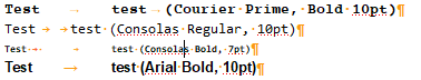
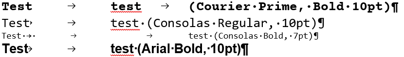
the change in alignment of the tab and space marks of the Consolas Bold 7pt (the arrow is now noticeably larger), (i.e. the space marks are always fixed height above baseline regardless of zoom??)
the Courier Prime, Bold and Arial Bold (10pt) arrows looking essentially unchanged despite the x2 zoom – even though the pilcrow is different
the Consolas Regular zoomed is less visible than at 100% – it’s blurry and it seems the arrow itself is exactly the same size!
Obviously my choice of Courier Prime (or Courier New ) is deeply unfortunate because the appearance of the tab would test the eyesight of a hawk.
All that said, I would suspect Qt because I just can’t imagine how one might create such a bug programming at a higher level
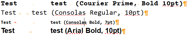
FYI here is the identical text as it appears in MS Word @200%
Yes, all symbols should scale with the magnification setting in proportion to the text around them. It probably is a Qt thing, but I’ve appended these notes to the open ticket on general improvements to these symbols.
Incidentally, if you can get away with it, I’ve always just set the font size the way I like it to begin with, rather than use scaling. You should find the result is much better if the text is 12 or 13pt instead of 10pt.