Warm amber-type night mode?

I don’t own, but I’m considering buying the iOS version of Scrivener. Something that’s very important to me is laying in bed with my device and reading my writing as I go to sleep (yeah I know, no screens before bed; you don’t have to explain it to me), and so I want to add a night mode to the wishlist.

I’m aware that iOS Scrivener has a dark mode. I’ve looked at the screenshots on my ipad with the night-mode color-shift turned on, and it still looks rather blue-tinted (even through the ipad’s built in amber color-shift). When I say night mode, I mean a version of the UI that removes as much blue light as possible. So the existing blue-ish dark mode is not what I would consider a night mode. Though it does look nice and I imagine it’s great for simply low-light conditions when one isn’t trying to fall asleep.

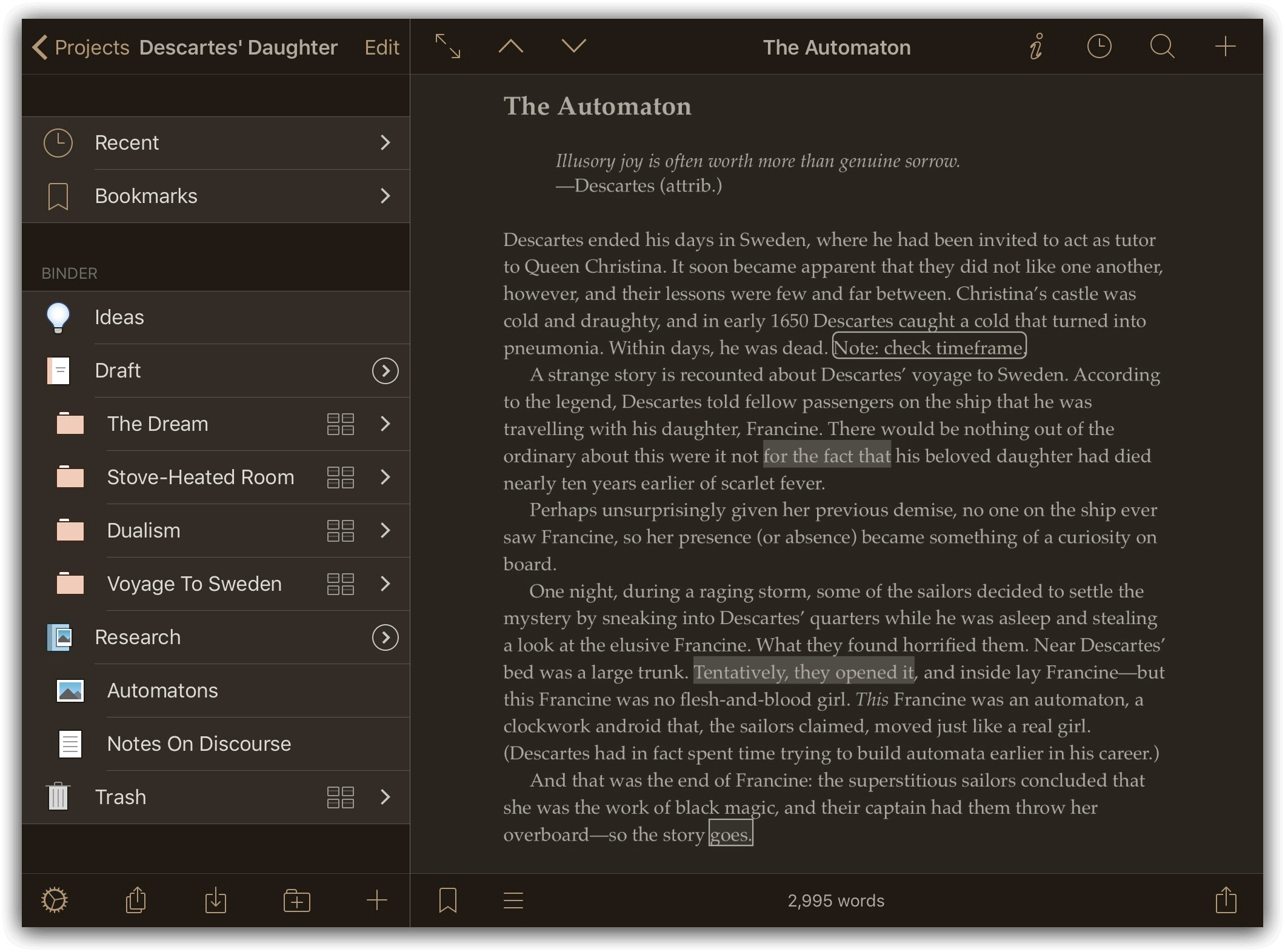
For clarity’s sake, I’m thinking something kinda like this: (definitely does not need to be exactly this, I made this in like a minute using only a web browser, it ain’t prefect; in fact it’s simply a hue shift and minor saturation drop)


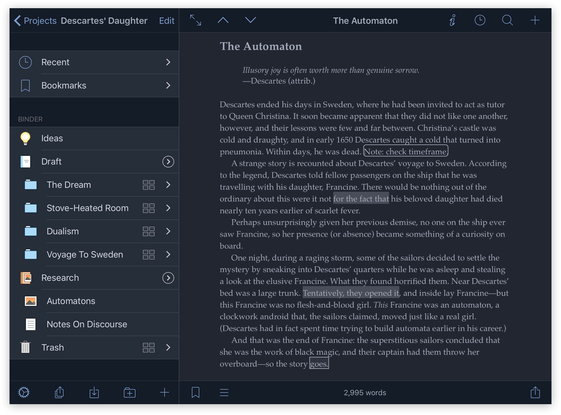
and purely to put them right next to each other (to make the contrast as obvious as possible), here’s the original:

I think you’ll find that Apple has you covered, at the iPadOS level. Have a look at this where it talks about ‘Adjust brightness and color temperature in Settings’:

[https://support.apple.com/en-us/HT202613](https://support.apple.com/en-us/HT202613)

Along with Dark Mode, there are two helpers here. Night Shift is precisely what you ask for. True Tone will also help, as it shifts the display spectrum warmer when you have warmer light in the room.

I haven’t had any problem with late night viewing interrupting sleep, and I also need these things because of eye issues – using other tools on laptop and android phone.

As I already said, even with apple’s night shift turned on, the Scriv for iOS interface still has a blue tone to it when compared to other apps that have a more desaturated/neutral black tone to them. I bought the app, so now I’m not just looking at screenshots, but rather the app in split-screen mode against other apps. My ipad is old and while it has iOS 15.1, it lacks true tone so I can’t speak to this, but no, apple and their iOS features do not have this covered and that is exactly why I made this post in the first place.

Even if you don’t notice the effects of blue light doesn’t mean it isn’t affecting you & your sleep (not being aware of something doesn’t stop it from happening). Plus to some degree, this is a personal preference thing / a matter of taste. I don’t like cool colors from my devices and greatly prefer warm blacks.

Well, I apologize for a moment of snappishness that was my own.

Here’s the substance, though, that may help you and others.

First, yes, in agreement with what you found, Night Shift is pretty evidently calibrated to be used in combination with True Tone, so without that, it’s weaker.

I do think it’s worth mentioning in view of what you said that diabetic retinopathy affects many persons, and so one shouldn’t assume another doesn’t understand blue light issues, which are perhaps more evident there.

So, with sympathy why a person may want a softer color presentation, it’s also worth understanding that generating a full new UX of this kind is very likely a big job on an iPad.

I’ll leave out the technical suggestions about this, but mention that it’s a small team we honor quite a bit for the remarkable apps they create and support, and that we have an idea how much they have on their plate. With this, changes in appearance have before been put pretty much on the back burner, as is understood.

I’d wanted to let you think about an alternative solution that existts, in otherwise transparent blue light filter protectors for the iPad – there are several about, with reviews, and including Amazon as a way to review and choose one.

I think this covers the other question you asked me, about goals, which in fact I thought a lot about. As we are often literary persons here, one may understand that subject is always more complicated than any statement, and in fact I’m sorry it’s apparently not going to be comfortable to go into that more here. In its way, though, even the sharpness I showed in responding to your own language has an underlying intention to be generous.

If you wonder how, my first inclination this morning was to point to some words of Ursula Le Guin, which you’d likely discover in reading an again contemporarily interesting novel, The Dispossessed. Pay no attention to rocket ships on any cover; authors never have say over this in traditional publishing, and I can say that book has had possibly the worst set of selections over the years :slight_smile: . It is, however, an unusually fine and intriguing story…

In the meantime, if you’ve not yet, an Apple setting to try (in conjunction with the others) that might please your eyes is at:

Settings app > Accessibility > Display & Text Size > Color Filters > Grayscale, or Color Tint

Both of those options (iPadOS 14.8.1) present a significant difference to my eyes; I don’t have True Tone.

2 Likes

Interesting, I’m not sure what I think of this yet, and will need to try it out for a little while. A grey-scale ipad certainly has an odd feel to it, I’ll say that. I’ve paired it with the accessibility shortcut so I can quickly turn it on and off by triple pressing the home button.

I still would prefer a warm version of Scriv’s UI, but like you said @scshrugged in the meantime, this might be the best option.

Ahem. Friendly moderator here.

This is a user forum. Participants are free to offer suggestions that they believe may be helpful. Quite often, experienced users of the software can offer ways to use existing features of the software to solve problems. If your feedback is intended only for the development team, feel free to open a support ticket, here:

Meta-arguments about whether a post is or is not appropriate generally do not contribute to the discussion. I will be deleting such posts from this thread, and I would encourage all participants to have a look at our forum guidelines, here:

1 Like

point taken, at some length, and thank you, Katherine :slight_smile:

1 Like

Yes, that’s a good idea, to try for a personal fit, at least.

It’s too bad every improvement in Apple’s base software can’t apparently be ported back to earlier models; yet in our ways of making things and their improvements, it can be an arbitrarily tough thing to do…

I appreciate the apology; thank you.

I guess this is just apple being really dumb, because night shift has existed for far far long than true tone, and I don’t understand why my iPad Air 2 can’t use it either. Yes it’s an older ipad, but still reasonably powerful under the hood from what I understand. At some point I do plan to upgrade my hardware (replace my existing ipad), but it might be a while before I have funds for it. Me and my boyfriend are looking to buy our first place together, and so that’s my priority when it comes to money right now (we’ve been living separately for well over a year).

I don’t think I clearly communicated my intentions on this one, I don’t think my phrasing was effective. Because it sounds like my intended message didn’t get through.

It was not my intention to comment on rather you understand blue light. Rather I intended to comment more broadly on how all humans have a tenancy to think they understand the affect (or lack thereof) that something has on them, in situations where an outside observer can clearly see the opposite is true. I also intended for the next part of the paragraph to be an admission that perhaps the effect on myself is nonexistent or negligible and this might all just a matter of taste preference and opinion (as in, maybe it’s purely that I want a warm UI and not something I need at all).

Everything in life is a balance of priorities. Ideas can still be worth adding to the wishlist regardless of the priority the dev team assigns to them. A user wishlist is not a dev to do list after all, the two are very different in nature. I never intended to come off in a demanding way, and I’m fully aware the iOS dev team might never add this feature/option. I didn’t find any other posts about it when I searched, and it matters to me, so I wanted to at least have the idea out there. Even if it gets ignored, because sometimes you never know until you ask (assuming the answer will be no can cause huge amounts of misery that are purely unnecessary).

If my statements implied that I don’t appreciate the iOS dev team, then I wish to correct that: I do really appreciate all of their hard work. Having the app on my ipad is several worlds better than sync with external folder (no offense to anyone who worked on that feature; I’m sure it’s a critical for some workflows, but it doesn’t fit my needs/workflow the way the iOS app does).

Good on you, @demonofsarila, and I hope the living situation works out well for you :slight_smile:

If I remember correctly, True Tone depends on specific hardware functionality in the screens that was only present from certain generations of iPhone/iPad on. I know this because I purchased a pre-owned iPhone of the correct generation, but did not have the True Tone functionality present in my settings because the original owner had a cracked screen replaced with a non-Apple part that didn’t contain the appropriate hardware support.