I finished a short fiction piece and compiled (Project formats—> Short Story (Times)) it to .docx using Shunn proper formatting.
So far, so good. No compile issues {{{faint}}}.
I opened the .docx file in Pages, looks good; then LibreOffice. Ok, still looking good.
I even went to my Microsoft Office online (the free web version of Word) just to assuage my paranoia about Word compatibility and it looks great, there.
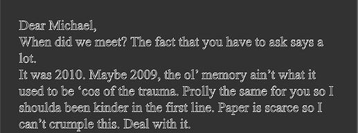
However, I open it in Bean, TextEdit, iTextExpress, Growly Write, and even Nisus Writer Pro (grabbed another 15 day demo!) and the text looks like this:
In Scrivener, Pages, LO, online Word, it’s Times New Roman, 12 pt., with proper line spacing and indentation, etc.
All of these report that it IS Times New Roman, 12 pt.. The stuff way up top (name, address, word count, title and author name is rendered properly, not this weird engraving look.
I compiled it again, and now it isn’t doing that. I am quite certain I didn’t touch any compile settings.
It’s the “Outline” font style in action (as in: Format -> Font -> Outline), and apparently some word processors / editors choose to ignore it.
But I have no idea what compile hickup caused that.
1 Like
Did you check it in online word before the others? I’ve seen threads from the Windows side where Scrivener-compiled DOCXs opened in Word have been rendered with outline variant of the font.

Mark
I checked it in online Word; not before the others.
1 Like
I just wondered because of seeing other threads where Microsoft Weird was reportedly substituting outlined for regular. I thought if you’d looked at it first using Word it might have changed the underlying code.

Mark
That’s a good idea, but why did it stop doing it now?
I uploaded the file to Word, never downloaded it; the original file should have remained unaffected?
It was also doing other weird things; after the font stopped misbehaving, viewing it in Bean, etc., it was all right justified. After highlighting the text and left justifying it, it looked ok except periods were at the beginning of sentences and commas were before where they’d go.
