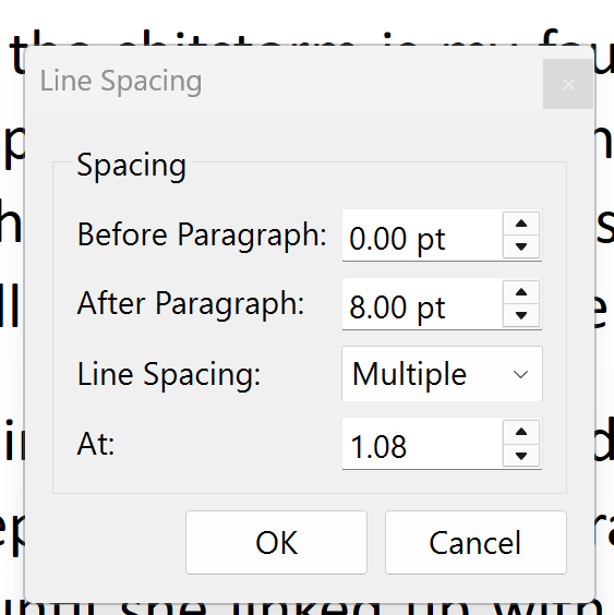
Insert > Break > Word Joiner visibly expands Line/Paragraph Spacing, though the menu options don’t show any difference.
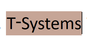
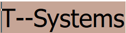
Example: The name T-Systems. I selected Insert > Break > Word Joiner between the hyphen and the S, and this happened.
I also tested it with unicode FEFF (Zero-Width Non-Break Space) and got the same experience.
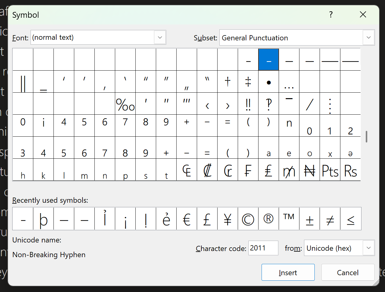
If I copy the hyphen from Wikipedia and paste it into Scrivener, or Paste & Match Style, it shows towards the top of the lowecase letters. See image.
Tried it for the first time, so can’t say if it’s a new error.
Unable to reproduce. I tried a couple of different fonts.
(Does the hyphen need to be pasted from wikipedia? (And if so, why would you want to do that?) - I just typed T-Systems and messed around with it.)
So I approached it (1.1) from the zero-width non-breaking space perspective (which might be a deprecated feature if I read some sites correctly, and therefore may not be supported by certain fonts) or (1.2) the Word Joiner alternative and (2) from the non-break hyphen point of view.
Options 1.1 and 1.2 displays my text as expanded.
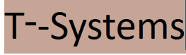
Option 2 elevates the hyphen higher than usual.
That said, certain fonts in Scrivener place the non-breaking hyphen higher than a normal hyphen. This does not happen in Office products like Word or OneNote.
See here in Scrivener: Non-Breaking Hyphen and Normal Hyphen used next to one another for illustration purposes.
Since I’m finnicky about changing fonts, I’ve settled for leaving the non-break (elevated) hyphen (character code: 2011) with my Calibri 11 pt default font.
According to what I’ve read, Calibri doesn’t (or no longer for some obscure reason) support the particular code, so the “system” chooses the character from another font, hence the misalignment. Same goes for more than half the other available fonts I worked through. And the same applies when using the Word Joiner option, where the zero width non-breaking space is most probably pulled from a random font, or from a close font family relative, if such exists.
Compiling
Compiling to PDF, I get the same misalignment.
But when compiling to Word, Word auto fixes it to look like a normal hyphen but retaining its functionality. Then saving that compilation as a PDF, leaves it in its fixed state. I can only surmise that the Microsoft developers found their own fix that they’re not willing to share because it’s their IP and IP translates to more users and more money in their bulging pockets, which means they’re just full of it.
Scrivener for Windows uses Qt’s text rendering.
It treats certain control characters as part of the glyph run, sometimes miscalculating line height when using variable fonts (Calibri being one).
That’s why you see the vertical expansion glitch—it’s an interaction between the Word Joiner’s zero-width metrics and Calibri’s variable line metrics.
For Windows + Calibri + visual stability, your best bet is use U+2010 (a true hyphen, as opposed to a minus sign)—visually identical, non-breaking, and layout-stable.
There is a drawback that might be a bother: There appears to be extra horizontal space on either side of the hyphen in Scrivener, i.e. the hyphen doesn’t kern into the hyphenated word/name like the adjacent letters do.
Well, there is a reason the key on the keyboard is called the “hyphen-minus” (yes, with a hyphen-minus inside of the name), because it is not a real minus sign either! That is a much wider (and in good fonts, thinner) symbol, (- vs −) U+2212, for that. Really the key on the keyboard shouldn’t be used typographically. But for writers it is fine to use, just like “straight quotes” (which are neither inch markers or quote markers!) are fine to use. This kind of stuff should be cleaned up by a professional when it matters.