Hi all - I’ve encountered a bit of odd behavior using the Apple LiSung font. When I type a contraction (can’t, won’t, etc.) it formats to can’ t, won’ t and so forth. I’ve only seen this with this font so far. Does anyone have suggestions, besides "don’t (don’ t) use that font? Thanks in advance.
Some of those CJK fonts have punctuation characters with extra space “baked in” (also curly quotes; mark the text, the selection shows only one character). I don’t think there’s a sane solution other than not using this font.
Hi,
The problem of using the Roman characters within a Chinese font is that it uses Chinese punctuation marks, which occupy a full character space.
Have you tried turning on “Use Halfwidth Punctuation”?
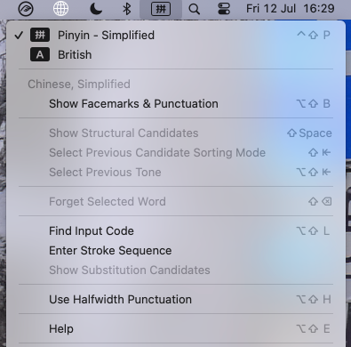
You can switch backwards and forwards with Opt-Shift-H while using the Chinese input system.
Mind you, I haven’t tried it with Apple LiSung as I use Songti SC as my Chinese font.
![]()
Mark
1 Like
Interesting! I’m not using any Chinese fonts in my system. This particular font is what I was looking for (using English characters) - I wanted to find something close to the old Apple fonts they used in past print ads - nostalgia has me in its grip.
“Apple LiSung” is a Chinese font (with some roman characters).
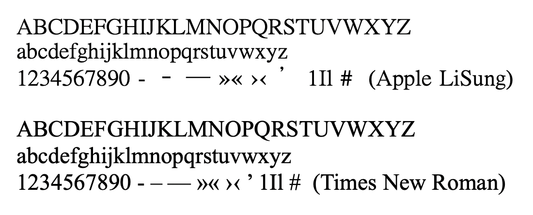
ADD: Not sure what they used back in the day, but it looks damn close to a lighter version of Times / Times New Roman:
1 Like
I think the font they used for a long time for printed material was Adobe Garamond Pro.
All Chinese UTF 8 fonts include all the basic Roman glyphs. The problem is that most of the Roman characters in them are poorly designed so look ugly. From @November_Sierra’s post Apple LiSung looks better than many but, for instance the baseline of the numbers is bizarre… 5–0 look slightly lower than 1–4 to me. But it’s still essentially a Chinese font, so if you want to use it without adding the Chinese entry system, you’ll be stuck with the over-spaced punctuation.
![]()
Mark
2 Likes
That sounds right. But then “LiSung” is not a good match. Rather some of those free ones.
1 Like
I’m trying to decide if I like this particular outcome, or if it’s going to drive me crazy. Thank you for the information!
Thank you for the help on this!
1 Like
If you have any example of that you can show us here, between us, we might be ble to recommend something. Here’s another comparison.
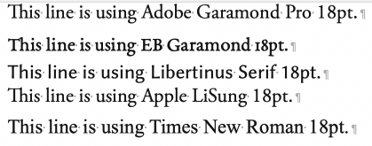
Adobe Garamond Pro is not free; I got a free copy of Adobe Garamond when I bought PageMaker in the early 1990s, then when I updated to InDesign, Adobe Garamond Pro came with it. But if you have to buy a licence, I bet it would cost an arm and a leg.
EB Garamond and Libertinus Serif are free. Apple LiSung seems the nearest to AGP, though it’s more condensed. But it comes with the matters I pointed out above.
![]()
Mark
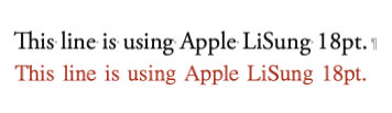
Now that’s weird. Your “LiSung” font (black) looks nothing like mine (red):
![]()
I typed mine in Nisus Writer Pro; did you use Word? How did you put them together?
![]()
Apple Pages. Took a screenshot. Saved your screenshot. Tacked them together in Affinity Photo.
Clever! NWP is built on the Apple Text Engine, like Scrivener; Pages of course, has a proprietary and more sophisticated text engine. I think, if you did the same in Word it would again look slightly different. Font metrics!
![]()
@xiamenese Probably. But they’re not the same font family. Look at the “T” for instance. That’s not just some distortion, it’s a different cut.
Yup, a Garamond. Slightly condensed, which works great for headings. Would be pretty annoying for long body copy, though (the “condensedness”).
Hmm. That’s definitely not AGP, taller x-height. It’s nearer to TNR, but I don’t think it’s that. Here you are, from Wikipedia:
Apple Garamond [edit]
Apple Garamond was used in most of Apple’s marketing.
Since the introduction of the first Macintosh in 1984, Apple adopted a new corporate font called Apple Garamond.[citation needed] It was a variation of the classic Garamond typeface, both narrower and having a taller x-height. Specifically, ITC Garamond (created by Tony Stan in 1977) was condensed to 80% of its normal width. Bitstream condensed the font, subtly adjusted the stroke widths, and performed the hinting required to create the font, which was delivered to Apple as the Postscript font “apgaram”.
In cases where the Apple logo was accompanied by text, it was always set in Apple Garamond. Aside from the company name, most of Apple’s advertising and marketing slogans, such as “Think different”, used the font as well.
I was nearly right. I’m pretty sure they used Adobe Garamond for the bumff that came with their hardware.
For a near match, look at Allegreya.
![]()
Mark
1 Like
I’d agree with you, but I can imagine there are those who might like it. But as it was Apple’s corporate font, I doubt if it’d br available for others to use.
![]()
Mark
2 Likes
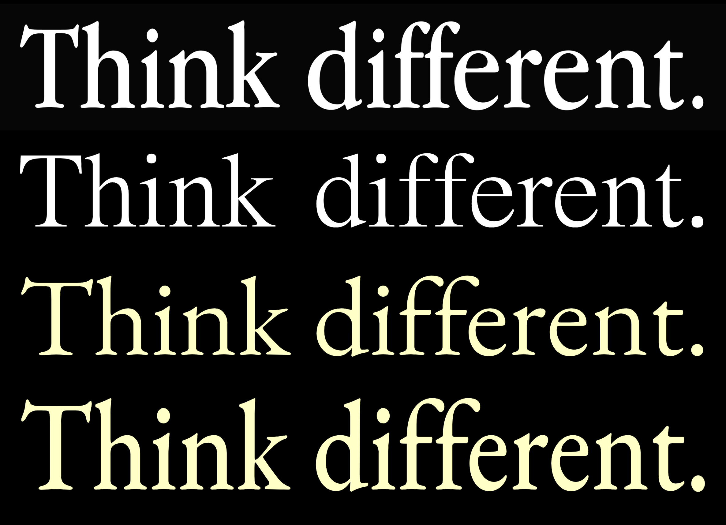
Top to bottom: Apple ad, Apple LiSung, EB Garamond and a slightly condensed EB Garamond (I just squished it):
and Alegreya (not really close IMHO):

1 Like