Hi, I got a big, getting bigger all the time, novel and I find Scrivener works awesomely in organizing the chapters and scenes. One thing that changed in the latest big revision though, is that the binder highlight (that tracks what the editor is editing) highlights nicely when the binder is selected, but when I go to the editor to edit, the binder highlight gets very dark, so dark I can’t tell at all where it is.
I’ve poked around Scrivener’s color prefs and the MacOS system’s too. Am I missing something? where else can I look?
Here are some tips on increasing binder selection visibility. Notably the default macOS behaviour of greatly decreasing the visibility of inactive sidebars and selection markings (especially in more recent versions), can be avoided by the first settings listed in that checklist. The shading will not change at all when the binder is inactive.
I am using collections with great ease, but maybe due to my slightly offset color view, I run into trubbles in this workflow:
select collection
select item from the list.
once selected, items bacground color is highlighted.
clicking on the related document, the highlighting disappears
when I the want to select “the next” document, my eyes fail to see the previous choice, so I have to read and locate the same headding
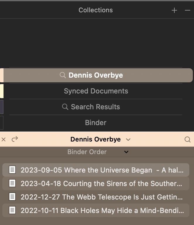
I attach two screen prints for clarification.
Maybe I have chosen nonpractical colors, but I prefer not to change them, as some of my KM macros relies on finding an area (containing the name of the Collectionand having the same background color).
First what I see on selecting a document:
It’s still highlighted but apparently too little for you. Try ⌘⌥⌃+b. This shifts the focus to the binder / collection. With two shortcuts you can at least switch back and forth if you don’t see the document.
Ah, if you’re using KM, you can create a macro that shifts focus back and forth with one shortcut.
I’ve moved this over to a recent thread on the same problem. Here is a link to some settings that might help. In there I speak of changing the binder background to increase the contrast, with that alternate highlight setting enabled, but in this case the collection background colour is what you would more easily adjust.
great suggestion, it does what I need… and first I tried out the changing og colors, but that went haywire… when I thought I had selected a new color for search bacground… scrivener collapsed and then decided to rebuild index… so after some cups of … I have “decided” to go with the shortcut you mention.
and maybe I can get it to execute with a tiny KM macro, having a simpler hotkey-combo
I think you need a “cycle action.” So you can alternately jump from the binder to the text and back again with one hotkey. Maybe you can download a prefabricated macro from the KM forum.
Unfortunately I don’t know KM very well. If you used BTT, I could tell you exactly.
that’s fine as it is. At the moment the selection is for documents not containing a specific value in Arc (I use Custum Metadata). Once I have fix the specifics and added, via tiny KM macro, the specifix Arc value, I want to go to the next item… that is where the shortcut comes handy.
Rather simple and noncomplex, execpt for my colorvision
As for simply cycling between binder and editor(s), there is always ⌃Tab. If the editor isn’t split, then it’s a very straight-forward double tap to highlight and return—otherwise it’s a triple to get around the views and back to the start.
Otherwise, you might try a reinstall of the software at some point; just a quick and simple one, replacing the software in Applications folder with no further ado. Changing the collection colour should of course ordinarily not crash the program!
Hmm… on my Mac Studio and Ventura 13.5.2 (danish language) the ⌃Tab does not work as you describe. That’s not a problem for me, I made a tiny macro using CMD x, and this highligst the actual document in the collection listing.
When I have concluded this task, likely before x-mas (1.178 done and 389 items to go), I will likely not have use this keyboard quickstep, ever.
It concerns a new enhanced trimming of fotos to smaller size and look. It is amazing for me to se a project this “small size” shrink from 4.75 GB to (as of now) just 2.59GB
I intend to write a short description/story of my findings in the forum so where would you suggest I post it.
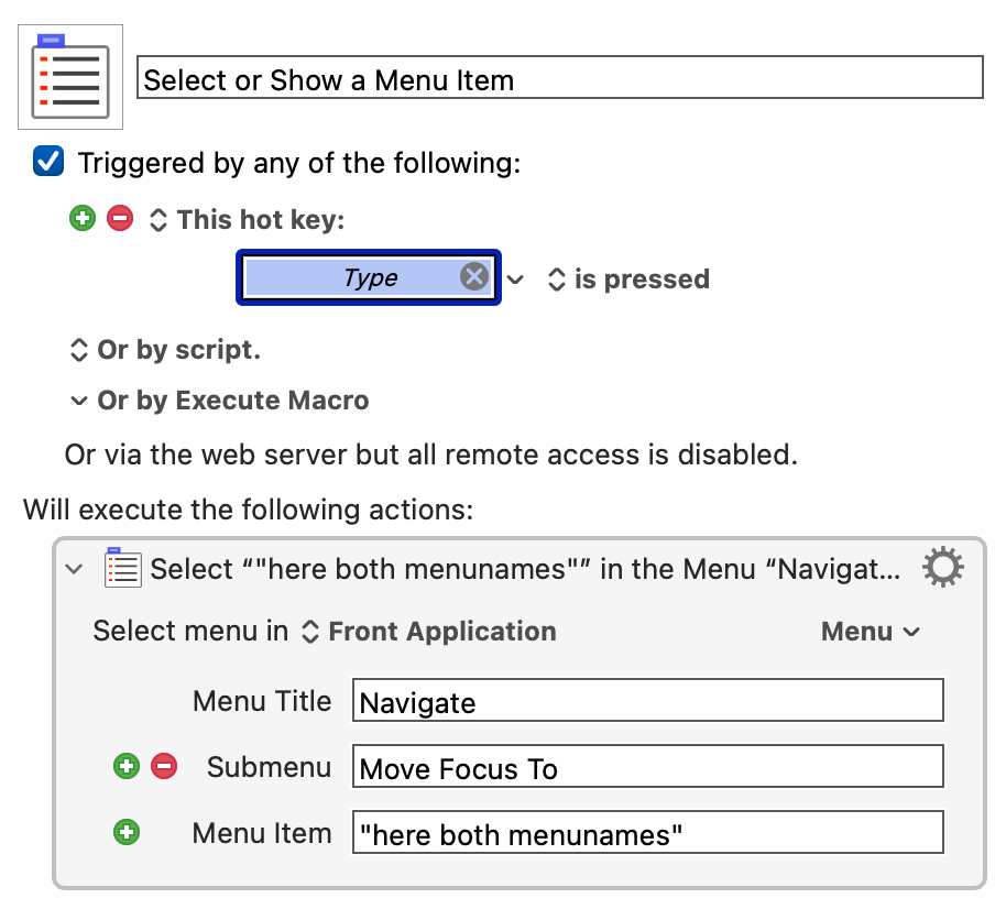
Huh! I wouldn’t have thought that the Danish layout would mess with that shortcut. Well it is in the Navigate ▸ Move Focus To submenu, at any rate. The top entry in there is the one that cycles through the sidebar and two editors, and its label rotates depending on which will be focused next.
Well, at least you have something that works, either way! As for posting findings and tips, that is what the usage-tips tag is for. You should have access to it (I limited it, because it tends to get sorely abused as a “please give me usage tips” marker instead of an “I have usage tips to share” marker, and isn’t the forum already 99.9% the former? ).
Maybe you don’t need that anymore. Anyway, if ⌃Tab (the function) can be reached via a menu, the KM macro is very simple and you can assign any shortcut.
Correct. Changing language did not help, then I checked KM, and deep down in “All Mcros” this “highly specialized” macro was burried. After disabling it, everything is fine.