Firstly, yes, in theory modifying the font’s metadata so that both RTF engines are working with the same identifier would work. I’ve never actually tried it, but I can’t think why it wouldn’t. That said, I don’t think it’s going to help you out in this specific case.
Okay, so this is weird, and I’m not sure if there is actually anything you can do about it short of giving up the use of boldface entirely and disabling the variant on both systems (and I have no idea if that is wise at all in Windows since Cambria is a core MS font).
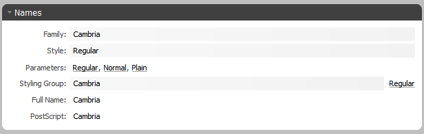
For some reason the Windows version of Scrivener is addressing this font as “Cambria-Bold” in the font table header, and then when using it, uses the \b0 switch to force regular weight rendering, and \b1 when there is actually bold. That’s an odd way of going about things, and the iOS RTF reader isn’t prepared to work that way—it’s wanting a separate font declaration for each variant where each variant is distinct, rather than forcing normal weight switching from a bold font base.
Gritty technical details...
Basically here is what the iPad produces (in excerpt and cleaned up a bit for legibility):
{\fonttbl
  \f0\fnil\fcharset0 Cambria;
  \f1\fnil\fcharset0 Cambria-Bold;
}

\f0\fs24 \cf0 test font setting\
\f1\b BOLD: test font setting
Now here is what the Windows version is writing:
{\fonttbl
  {\f0\fnil\fcharset0\fprq2 Cambria-Bold;}
  {\f1\fnil\fcharset0\fprq2 Cambria-Bold;}
}

{\f0\fs24\b0\i0 PC: this is a font test}
{\f1\fs24\b1\i0 BOLD: this is a font test}
So first of all, you can see why RTF is an archaic monstrosity that we’re only using because the Mac/iOS text engines do (and support nothing else more modern or sane). What a mess.  But you don’t have to be an sorcerer to see the problems.
In short, iOS uses the \b switch by itself on bold text, and uses the bold font variant as the font setting for the text. The Windows version uses \b0 and \b1 to indicate whether text is bold as well as different font identifier declarations. In theory neither method is right nor wrong, and that is one of the reasons why RTF is a nightmare for coders, but in this case the fact that Windows is writing both fonts as Cambria-Bold is the real culprit.
I don’t understand how or why it would be doing that, and in my testing it doesn’t do that with other fonts in general. Maybe there are others that have this quirk, but here for instance is another Microsoft font, Calibri, being addressed correctly in the RTF header:
{\fonttbl{
  {\f0\fnil\fcharset0\fprq2 Calibri;}
  {\f1\fnil\fcharset0\fprq2 Calibri-Bold;}
}
So this is some kind of bug worth looking into, and checking our records, we have done some tinkering with how the engine works with font names in the past, to get around some of the most common iOS/Mac/PC issues, so this might be something we can fix.