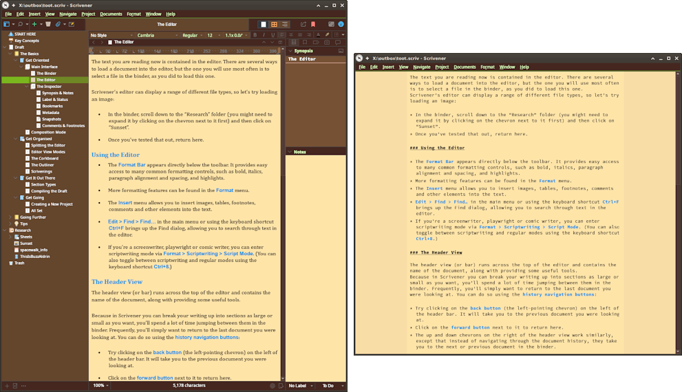
For those authors who primarily use the software to compose in a Markdown dialect, HTML, LaTeX, or any of the other common markup syntax systems, emulating a plain-text appearance can prove beneficial. The default settings in Scrivener assume one has a word processing intent in mind. They uses a carefully typeset layout that mimics common end-production feel with indentation of paragraphs and a classic proportional serif font. As nice as this looks, it can be deceiving to use indents or paragraph spacing when you need to be aware of such things as literal whitespace characters in your document.
If you are coming from a Markdown-writing program, you may be used to a very lean and mean interface, and desire to reduce window complexity in Scrivener:

Optional view settings...
- The
View ▸ Text Editing ▸ Format Barand▸ Rulermenu commands will toggle off two toolbars that will considerably clean up the user interface, and largely contain features that will be of little interest to plain-text authoring. I do use the Format Bar now and then (for text colour / highlights and styles) but have the shortcut memorised so I can only bring it up when needed. View ▸ Customize Toolbar...menu command, for cleaning out default buttons. And of course this toolbar can be hidden as well, as you prefer keyboard shortcuts in general to clicking on buttons.
Ultimately the window can be made even simpler, if you prefer, by turning off the editor header and footer bars, in the View ▸ Editor Layout submenu. By saving a simplified editor window as a Layout (see §12.3, Saved Layouts in the user manual PDF) along with a more traditional setup, you can quickly swap between a lean, distraction-free writing environment, or something that more closely resembles Adobe Premiere.
Preference Files
I’ve put together a preference file that changes a few of the defaults to better suit a plain-text driven authoring environment. If you’ve already made considerable modification to your settings, it may be counterproductive to overwrite them all with this basic set; thus the following list itemises the changes so that you can set them individually as you see fit:
-
Mac Only — The preferences will make use of the Inconsolata font which has been included in the zip file. You should install this font first, and restart Scrivener, before using the preferences file.
Those using Windows can make use of Consolas, which the options file uses, there is no need to install Inconsolata.
-
All pseudo-spacing at the paragraph level has been disabled. There will be no first-line indents or extra spaces following a carriage return.
-
Tab stops are set to every 29pts, which closely emulates four spaces.[1]
-
All typographic substitutions have been disabled in the Corrections pane, so as to produce valid ASCII txt on output. You could reenable these and then add Replacements in compile to turn them into XML or HTML entities, though.
-
An 8pt block cursor has been enabled. This will work best with a 12pt fixed-width font.[2]
-
Fixed-width editing settings are modified to closely emulate an 80-column width text editor. For those who write with code samples, this can be useful for keeping your code readable in a context beyond Scrivener. A text “ruler” has been provided in the sample project so you can fine tune settings to your preferred look.[3]
The zip file will also contain a project with a stylesheet that has been modified to present a less flamboyant and more “syntax highlighting” style approach to marking text. It also includes several character styles (Addition, Deletion and Highlight) which will by default generate CriticMarkup when using our provided Markdown-based compile formats, as well as two indexing styles, which will be made use of in Markdown outputs that support full indexing. To bring this stylesheet into your working project:
- From your project, use the
Format ▸ Style ▸ Import Styles...menu command. - Locate and open this project.
- Confirm any overwrites or duplications of styles if need be.
Downloads
To use these preferences, download the zip file above, decompress it using the Finder by double-clicking on it. Use the Scrivener ▸ Preferences menu command and click the Manage... drop-down menu to “Load all preferences…”. Choose the .pref file with the file chooser, and click Okay.
After downloading, if necessary open the .zip window using your browser’s download list, or File Explorer. Drag the *.prefs file to your Desktop, or somewhere else handy, and switch to Scrivener. Use the File ▸ Options... menu command, and use the Manage drop-down menu to “Load Options from File…”. Select the .prefs file you extracted from the zip, and click Okay.
Windows Notes
The default tab stop setting does not currently work correctly in newly created documents. ↩︎
The cursor size does not scale with the editor magnification setting. The given settings work with 12pt fonts at the default 100% editor scale, and will need adjustment if you prefer smaller or larger text. ↩︎
Rendering glitches may cause differences in fixed-width settings at reduced magnification. The setting should be accurate to 80 characters down to 90% editor zoom, but will be narrower at lower settings. ↩︎
 The only version that requires Snow Leopard is the Mac App Store version, but that’s only because the App Store can’t be loaded onto older computers in the first place, and you need that to install and authenticate it.