Hi, I’m a big fan of modifying UI, and I love that I can change colors and fonts in Scrivener. However I always find it very hard to figure out what the settings are actually changing.
Either I’m just missing it, or it’s missing from the settings. I’m not sure if or how many of the colors aren’t in there are but there seem to be some. For example I got very confused by the Binder Background Color because it didn’t change when the change is ‘applied’, only when the preferences tab is closes, and sometimes only when restarting. Not to mention it doesn’t cover the full background, which is a separate issue.
This could also be an issue of terminology. I have no way of determining what the various labels mean? I don’t know what ‘Scrivenings Titles Background’ is, and there’s no description info. Some things just aren’t very clear and if it’s not being used somewhere on the screen it, you might just not know what you’re changing at all.
As far as solutions to this, there are a lot of ways to approach this. If this was HTML one could inspect and find that info. The Specified UI could be open/highlighted, so we can see it change. Dynamic examples could be included in the color editor screen so we could get an idea where we need to look. Probably the simplest would be to add descriptive text and the visual location of the specific elements it will change. That said if some elements are not editable, that’s probably the biggest issue, since I can’t tell which ones aren’t listed, I will end up changing everything just trying to figure it out, ultimately fruitlessly.
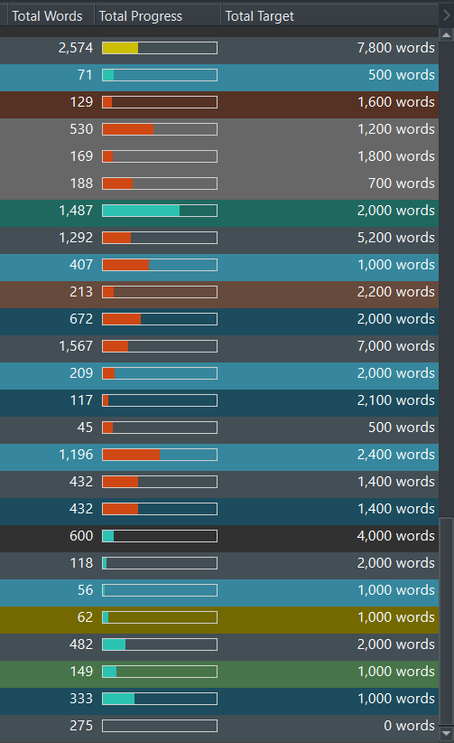
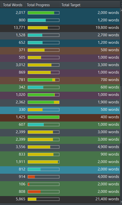
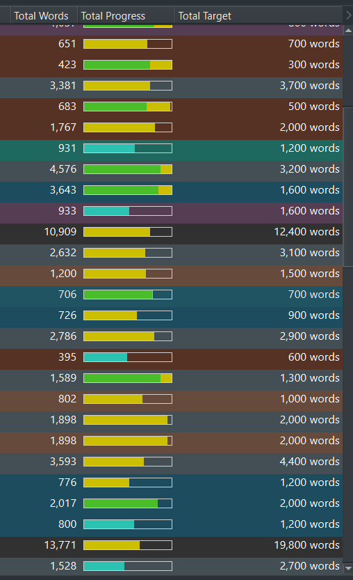
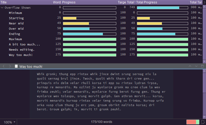
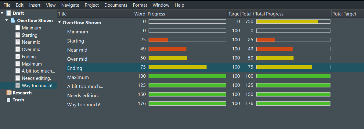
There’s also the Progress Bar colors (In mine I have Start as red, End as green, the Midway as yellow, and the Overflow as cyan, and looking at it, I think it’s just wrong? For whatever reason the overflow color is used somewhere between Midway and Start. Midway is used only briefly, and then once it reaches End, it starts adding an extra bit of Midway color instead of the Overflow color. Or else I’m very confused about what these things mean.
That’s just my thoughts on improvements for color/text UI customization. Do with as you will.