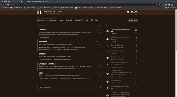
I can confirm that (also in Safari and Firefox). But I can’t explain it. ![]()

. . . . . . . . . . . . . . . . . . . .
That, in conjunction with the fact that their own forum is alright, leads me to think that they just don’t (yet) know.
Perhaps a server thing. Although go figure how and why we don’t end up with it all at the same time (???)
If I had to guess the image files (or HTML / CSS responsible) survived in the browser cache until the latest update.
Here’s the culprit:
theme_1.scss, Line 149
.latest-topic-list-item .topic-poster img.avatar {
	scale: 50%;
}
Entering “100%” restores the previous look. Now the interesting question is: Who made this change and why. Looks deliberate.
@AmberV I think this sort of thing is your domain?
To clarify, the avatars on the Latest list were always set to 50% like that in our site’s theme CSS. This was done because some people on the team felt the larger avatars made the page look cluttered. So whether one way or another looks “bad” is obviously somewhat subjective. Personally I never had any strong feelings one way or another, so I was happy to make that change to the theme. It has always been that way, since before we launched the site.
Now the real question is why Chrome, up until this point in time, was ignoring that entirely and doing its own thing. ![]() If anything it looks like the Chromium developers fixed a CSS selector bug, so I wouldn’t be expecting that to change back.
If anything it looks like the Chromium developers fixed a CSS selector bug, so I wouldn’t be expecting that to change back.
My vote: leave everything as-is.
You mean bigger? – at 100% or whatever % the bug ended up displaying icons at ?
. . . . . . . . .
I am totally aware that this ain’t no life or death situation; but I seriously don’t like the way things look now. I have changed my default page to “latest”.
@AmberV Perhaps 50% is a bit extreme. How about 75 or 80% ? (My two cents.)
Might be a subjective thing, but I started noticing differences in other websites too.
For example, the online newspaper I read on a daily basis suddenly had a font size change. And not for the best.
I am guessing but my hunch is that there may be a way to have a user (you) defined CCS for websites. Make one for your use of this web site.
Gee. I wouldn’t know where to look.
My programmer skills are a flatulent ∅. (And I have no intention of taking steps to improve on it ![]() )
)
I’ll stick to writing novels.
Chrome has extensions. Otherwise …
That’s the downside. Yet another addon (if that’s even possible, say on mobile). But if one uses something like Stylus anyways, it’s pretty simple:
@-moz-document url-prefix("https://forum.literatureandlatte.com/") {
    .latest-topic-list-item .topic-poster img.avatar {
        scale: 100%;
    }
}
My guess is that Chrome did not respect the scale formatting declaration until a recent update.
It’s worth noting that every other browser I’m aware of has supported it, meaning everyone not using Chrome has been seeing the forum the way you’re seeing it now this whole time, without complaint.
So what’s more likely, that everyone other than Chrome users has different subjective tastes about avatar sizes—or maybe it’s not so much the before and after, but the fact that your browser of choice finally got updated and some sites have changed.
I.e. maybe give it a couple of months. ![]()
I don’t mean it to come across dismissive, trust me I’m the same way. If something seems to change for “no reason” I don’t like it. Doesn’t matter if it’s actually even better now. In this case there is a reason: that is a design choice we made nearly two years ago, and it’s a browser’s CSS specification being expanded (presumably), but it can seem like for no reason without that knowledge. Whatever the case, it surely is not a “bug”, nor is there anything for us to “fix”.
I will also add, as a Stylus user, it is probably safe to say that 80% of my usage of Stylus is to roll back dumb changes I don’t like. So again, I get it.
@AmberV While we’re at it, could you please add something like
html {
	color-scheme: dark;
}
to the dark theme? It fixes the light scrollbars, at least on Chromium based browsers.
There you go! That looks better on mine as well (Vivaldi, which is Chromium-based). It updated in real time for me, but if you don’t see it, give it a hard cache refresh.
Some day I’ll have a moment to theme it proper too, as some browsers let the website choose colours for scroll bars and other elements. I’ve always turned that off as I prefer consistency, but for those that like it, a matching skin vs dark grey would be nicer yet.
Thanks, now it changes with the style. I feel your pain.
Well… Microsoft Edge too was displaying larger icons. (Not anymore.)


