Improvement: Tables should be rendered better in epub

The editor supports formatting options that are not respected when the epub table is generated. For example, borders are added no matter what and the first row is assumed to be a header. In so far as possible, the formatting of individual tables in the editor should be preserved in the generated epub code.

Background: How to get tab stops into epub

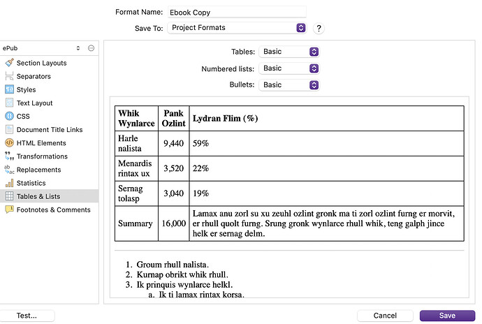
Have you had a look at the Tables & Lists compile format option pane, yet? There are a few different table styles given, with previews so you can see what it will look like before compiling. You can see the actual formatting they implement though, in the CSS pane (right column)—and that pane, in the left column, is where you could override aspects of the design. This is how you could remove the borders and make the heading row using a normal font weight, for example.

ePub uses HTML and CSS, not rich text formatting like the text editor does (which also answers your question about tab stops, those are a paper-based tool that make very little sense in an environment where the display can be anywhere between the width of a credit card or a giant television screen), and on top of that, the compiler uses Markdown to create the HTML, which itself doesn’t relay specific formatting other than column alignment.

1 Like

Many thanks! Is this what you mean?

I don’t see any option for no borders or to negate the assumption that the first row is a header. Besides, this is an override for all tables, but the editor allows specfic formatting of individual tables.

You write ā€œYou can see the actual formatting they implement though, in the CSS pane (right column)—and that pane, in the left column, is where you could override aspects of the design. This is how you could remove the borders and make the heading row using a normal font weight, for exampleā€ I don’t see any such pane in Tables & Lists. Could you provide a screenshot that shows how to do what you describe?

I’m sure I’m being very naive, but when you say ā€œthe compiler uses Markdown to create the HTML, which itself doesn’t relay specific formatting other than column alignment.ā€ I would reply by asking why the compiler uses an inadequate technique.

The wish is only that the compiler use the features of HTML tables, not that it do the impossible. My HTML is a little rusty, but I’m pretty sure I could write the HTML that renders my little tables the way I want, and all the clues are there in the editor, so, naively, I have to ask what is impossible here?

The idea that one has to tweak the results of the compilation by hand is not generally feasible: These are what are known as ā€œdownstream changesā€ and are the ruin of an efficient process. Everything done by hand has to be done before the process of compilation starts. After that, the results must be right without further manual intervention.

1 Like

Please note that Scrivener has never promised to do this, for any output format.

It’s possible to send raw HTML through to the output document if you like.

Noted! IMHO it’s a pity that the goal isn’t a little more ambitious, but I don’t have to implement a solution so I’m ignorant of the issues. :wink:

Maybe escaping to raw HTML is a workable solution. For this book I only have two little tables and I’m going to use the hack at How to get tab stops into epub - #12 by ds.

Without trying to sound like a know it all (and probably failing!), it seems to me using Markdown as an intermediate compilation language (which is how I understand the statement ā€œthe compiler uses Markdown to create the HTMLā€) is not the best solution. Translating from a more expressive language like the editor’s to a less expressive language like HTML is always going to present problems, but going via a language that is even less expressive than HTML–Markdown–only increases the problems. Why not just generate HTML directly? There’s no rocket science in that.

Just curious–and sorry to be a pain in the ass!

P.S. Don’t get me wrong: I love Scriviner! The editor and ā€œbinderā€ environment is really well done. The way through the compilation process is pretty well done. And the PDF output is good enough for the purpose of my little book.

P.P.S. If the editor representation is RTF then maybe a tool that goes directly from RTF to HTML could work. Five minutes searching found this: GitHub - lvu/rtf2html: RTF to HTML converter for use both with your applications and as a standalone tool. Small and fast. Processes tables better than any other tool I've seen..

1 Like

I think maybe there is a matter of there being two threads about the same topic at this point? I followed the link to the one at the top, and found much of what I described in my post above has already been gone over in greater detail, on how you can control the formatting the book with CSS, in the main CSS pane. You have the final word on what things look like in the vast majority of cases.

So I’ll keep this more abstract, as any more technical discussion of table formatting should probably be kept over there.

You mention not wanting to have to edit the ePub after compiling, and hopefully the solutions given over there address the notion that this is hardly ever necessary with Scrivener. I do use Sigil for design, because of its real-time environment; it is ideal for that. But I always copy and paste my designs back into the compile settings so that from that point forward they are baked into what I get when I click the compile button. There are maybe only one or two things I can think of that would require post-compile editing, and they involve getting resources into the ePub that Scrivener doesn’t support, like custom fonts for headings and video media. You can set it all up in Scrivener so that all you have to do is drop those files into the ePub, it’s a 5 second thing.

As for why Markdown is used for HTML production, quite simply its because the text engine Apple provides is in the dark ages when it comes to that. It cannot produce HTML 5, which is what ePub 3 needs. I suppose we could spend months making our own HTML generator from scratch, but this addresses 99% of what people do, and it was bootstrapped off of existing code that was built to make Scrivener a better Markdown production environment in the first place. So it just made sense, and continues to make sense in my opinion.

To clarify one thing, it isn’t entirely Markdown, it’s a bit of a hybrid, which is how you do get formatting that Markdown can’t do, like highlight and text colours (well, I say that, but Markdown can do that in 2024, but back when this was all put together it couldn’t). Basically your text is converted to Markdown, that generates super clean HTML5 with minimal effort (something not easy to achieve with RTF conversion), and then that is marked up even further with custom HTML output in a selective fashion.

As for why tables don’t benefit from this bespoke treatment, in short its a matter of demand. Tables are not commonly used in ePub, in large part because many ebook readers do a poor job of rendering them in the first place. This is so true there is even a flag in the compiler that will convert tables to an image on the fly because that is sometimes better for compatibility depending on the market audience. On top of that, I think most people who do use them are satisfied with one unified look for them, rather than having multiple table designs. So we’re talking about a percentage of a percentage of a percentage here.

And, to get back to the solutions, Scrivener already has good answers for all of the above that don’t involve a lot of development time. Or to put it another way, the development time has been spent on giving you more power over the output rather than having less power and more automation. That is perhaps a philosophical difference. You wrote, in the other thread, that you shouldn’t have to make your own table designs, and even to the extent that having to do so indicates a ā€œbugā€, but we feel otherwise.

I’ll post some further ideas of a more technical nature in the other thread.

2 Likes

Thanks so much for taking all this time and trouble about my small problems.

I have honestly never used a SW tool in my long professional life that was as well supported as this one is!

My status is that I have the content of my little book in place and am only doing some revising and tweaking. The PDF looks good. The epub is acceptable (with the table hack), so all I need is a fix for the misplaced div or whatever it is (Epub output errors in new 3.4. release). The fix has to be straightforward and I would expect a hot fix release couldn’t take long. So my plan is to publish both formats at KDP in early January.

I never could have achieved this without the outstanding support!

Whether I write another book after that, and how challenging that would turn out to be in Scriviner, I have no idea, but I have certainly learned a lot in the last two months! Thank you!

1 Like

I thought I would post a comment in this matter, since I have spent the last 10 years working with ebook production and I found this exchange very interesting.
Just like AmberV mentions, I too edit epubs after they are compiled (or in my case, after the publishers have produced them in one way or another).
In the company I used to work at (Sweden’s major ebook distributor) we always - back in the day - used to recommend publishers not to use certain programs to edit epubs. Sigil was ok, but Calibre was a hard no-no. The reason being all the bloated and sometimes downright faulty code some editors placed in epubs.
As I now - many years later - had a chance to look at both Sigil and Calibre, I see that much have been improved, and they are now good programs to use for editing (even though I prefer other editors).
But, my main point;
Formatting in epubs - 20 years later - is still a headache. Depending on what kind of book you write, you can get good (even great) results with programs like Scrivener (one of the best when it comes to being able to write a book AND have it converted to an epub - and - not using anything else). Especially if it’s a fiction type of book with ā€simpleā€ formatting.
But when it comes to non-fiction books, then there will almost always be problems. I’ve handled thousands of epubs over the years and I’ve seen all kinds of code in them.
Some of these (i.e. the code) are perfect in all ways imaginable, but the resulting ebook still might not look good in every ereader/app/program. And therein lies the major problem. Many ereaders interpret the code differently, and what should be ā€perfect codeā€ makes an ebook look great in iBooks but looks bad in Adobe Digital Editions. Or vice versa.
So, the problem at hand - tables … Yes, one can line up numbers and words so they look good … BUT - in an epub all text is reflowable (unless one specify the epub to be a fixed layout ebook, which have a completely other set of problems …) and what this means is that while the numbers and words, ie the table in question, might look good with the right formatting (for instance no bold headers and no borders) it will always break when the end user changes the size of the text and/or read the book on a small screen.
The same thing applies for instance when the publisher demands to use a certain type of font in their epub. Sometimes this will cause problems in (especially) Adobe Digital Editions unless the font is converted to a woff font. Ttf fonts should no longer be used in epubs and ADE have problems with many (but not all!) otf fonts. And when the matter is finally solved between the publisher and the ebook producer and everything looks great - with the right font in place - what happens? The end user decides to override the font completely and use his or hers favourite font supplied by the ereader/app/program (Open Dyslexic perhaps).
So all the hard work - and money - that was spent on the ebook might very well end up being wasted.
In other words - sometimes one can get good enough result by making the numbers and words - the table - as an image, just like AmberV said.

Yes, tables should be rendered better in epub, but even if one have the best table in place, there’s nothing that guarantees that it will look good for every end user.

4 Likes

Specifically, in answer to the ā€œ(even though I prefer other editors)ā€.

Such as?

I ā€œproduceā€ books that intentionally avoid the publishing world at all costs, but that doesn’t mean I don’t want them too look good and (more importantly) do the best job of conveying the authors words as intended.

I would be interested in any insight you might care to share.

With epub formats you are at the mercy and whim of the producers of ebook readers. What looks good in one may look bad in an other.

3 Likes

My main program I use for editing epubs is Oxygen.

I spent a considerable amount of time before I retired talking to publishers about changing their mindset when it came to creating ebooks.
For a long time this seemed to come more as an afterthought for the publishing industry:
the author wrote the manuscript, the publisher proofread it, edited it, typeset it and created a pdf for the printing house to use to print the paper book. And first then did the publisher take the print pdf to an ebook producer to create the ebook. And the idea was that the ebook should look exactly like the printed version.
This rarely works (except for ā€simpleā€ fiction books like novels and such).
I tried to explain to them that they already knew that they wouldn’t make their very costly glossy and big coffee table book as a paperback. Of course not. The paperback won’t be able to look the same as the coffee table book. But the content within such different format might still be able to be used*.

So instead of first creating the print pdf for the paper book and then ā€go backā€ and use the same pdf to make the ebook, they should instead look at creating two versions of the ā€print pdfā€ from the start (when the collaboration with the author starts) - one that will be used for printing and one version (not necessarily a pdf-format at all) to be used as the file for creating the ebook.
And slowly this idea seemed to take hold. I now see a slow, slow change in how publishers think about ebooks**.

Another thing that took a while for them to embrace was the pricing.
At first they made a hardback costing, let’s say 150 SEK, so the ebook they made should of course be a little cheaper, perhaps 100 SEK. After 6 to 12 months they released the paperback version of the book, that cost 25 SEK. What happened to the ebook? Nothing.
So in the mind of the end user there was this sense of the ebook always being much more expensive than the ā€bookā€. When in fact it was cheaper than the hardback. But the end user now only saw the cheap paperback as the ā€standardā€ price for the ā€bookā€. So we talked to several big publishers saying you have to adjust the price for the ebook once the paperback hits the market. There’s no such thing as a ā€paperback-ebookā€ that’s supposed to be released later and be cheaper than the ā€normal ebook", but rather it’s the same ebook, only now with a lower price.

*When it comes to the content of a book, nothing is more obvious about the difference in different formats than a paper book and an audio book. The text within is (more or less) the same, but only the paper book has a layout. Some publishers create audio books of their books that in the paper version contains images. All of these are of course lost in the audio book. But here publishers don’t seem to mind as much as when it comes to the difference between the paper book and the ebook.

**I see several (bigger) publishing houses that create their own ebooks (probably in-house) using InDesign as the source material. And while this sometimes leaves things to be desired when it comes to formatting and errors within the ebook, the change in how they work with ebooks is clear.

2 Likes

Exactly.

But it’s not only the ereader app/program that sometimes are at fault, but the platform underneath that can cause problems.
Readium is a popular ebook ā€engineā€ used in Thorium and many other apps. The Royal Library in Sweden created their own app using Readium and we in turn created ebooks for them. It turned out that while the ebooks validated and looked good on many platforms, including Thorium (that uses Readium), their app had problems with certain ebooks. When the text was changed in size on Android phones and tablets the text wrapped around strangely. This turned out to be the fault of the Android operating system. And as we know there are thousands and thousands of hardware/software versions of Android machines out there and there’s no way to investigate the behaviour on every one of them.

1 Like

Not just the maker of the ebook reader, but also the way the user sets up their ebook. They have control over the font, font-size, justification, line-spacing, 1 or 2 columns in landscape and maybe more within the limits provided on their particular device. And then there is light or dark background at the users preference, which makes any kind of graphic difficult if you don’t want a white rectangle containing the graphic against a dark background.

2 Likes

If you want full control over the final result, print the book. Seriously. Not even PDF is ā€œsafeā€.

6 Likes

Thank you for taking the time to write such a detailed answer.

1 Like

What makes this whole thing so much more annoying is that it isn’t just affecting intricate designs but even simply and outright primitive things that used to be trivial before ebooks.

For example, in my genre we need key-value lists and those are hard to read if the values don’t line up. Producing something simple as:

Name: Whatever
Age:  99
Skills:
 - Eating:   Level 1
 - Sleeping: Level 10
 - Writing:  Level 2
Abilities:
 - Super-Speed: Level 1

does not only takes a ton of effort and skill but is next to impossible to made in a way it works at least somewhat everywhere.

And that’s not something I’d want to put in a picture.

Or stuff like putting a couple paragraph into a box frame without killing pagination. Or even having a simple full-page illustration somewhere and still filling the pages before and after with text fully (i.e. anchoring it to ā€œnext page breakā€). Margin graphics? Page headers? Don’t even think about it.

To a degree, I would say what you are referring to is more a matter of looking at the wrong tool for the job, and criticising it for not doing well what it isn’t supposed to be doing. Ebooks are more than just the kind of .epub file Scrivener makes, and can include fixed designs that are much more conducive to the type of books you are referring to, I think—same for textbooks, I would say, which benefit from stylised page layout.

As for what this tool is, a reflowable ePub, it is optimised toward long form text that does not depend heavily upon layout to convey its information. General non-fiction, prose and the like, all are mainly a matter of paragraphs and simple offsets and adornments here and there (like quotes), and enough typography to make some fancy headings. It’s a format that is ideal for presenting content in a form that can scale the font size dramatically, and be displayed on a wide variety of screen sizes and shapes. That implementation factor works very strongly against fixed page layout designs.

The technology that is being used, itself, is capable of a great deal more (including fixed page layouts). It’s the same exact technology you are looking at right now on this forum, and that’s a relatively simple example. Software can be made with it, and in fact most browsers (inside of the rectangle of the window frame) are built using that tech as well, along with numerous popular tools.

Your typical ebook reader couldn’t replicate this level of design and fluid implementation however, because its resources are much more limited. For that reason, the emphasis of implementing the full spectrum of what this tech can do is biased again toward what benefits long blocks of ā€˜standard’ text.

That said it can do quite a lot beyond that, and shouldn’t be underestimated:

Or stuff like putting a couple paragraph into a box frame without killing pagination.

Designing box call-outs in ebooks. This thread covers both ā€œmargin boxā€ style as well as full-width, further down. The only way that would kill pagination is if you make it do that on purpose, with similar CSS codes like what we use to keep a figure and its caption together.

Or even having a simple full-page illustration somewhere and still filling the pages before and after with text fully (i.e. anchoring it to ā€œnext page breakā€).

Don’t quite know what that means, with regards to anchoring the text, but that sounds like multi-page typesetting which is of course not something an ebook reader with flexible font and text layout settings could achieve. That takes a lot of physical work to do right, usually by hand, but even what can be automated is very processor intensive and requires pre-rendering, where as ebooks render pagination on the fly (to the point that you flip back and forth between pages you might sometimes notice word wrap changes).

That aside, full page illustrations are easy. That post goes over one type of break, the page-break-before attribute, but there is also a page-break-after. Combine the two together on your styled figure element and now you have something that sits on its own ā€œpageā€.

Margin graphics?

Same as margin text boxes, and similar as well to how you would make a drop-cap.

Page headers?

That one is fair, but I would say that, unlike the above examples, is something definitely over the line of what reflowable ebooks are meant to do. As with line-height, text column width, body text font and other overall presentation matters, the ebook reader is meant to be responsible for running header/footers, and in most cases that’s the right answer too. The ebook itself would have no way of knowing what ā€œpageā€ it is on, for instance, which is the main reason you would want a header or footer anyway. The ebook reader on the other hand is going to have a pretty good idea of how far into the work you are.
2 Likes

Just to clear up a point:

I was criticising (ranting about) the decision to use a random subset of html+css for ebooks in general, not Scrivener or a specific ebook format.

As great as html is, it is missing key features you need in typesetting even today. For example, the idea of endless scroll is ingrained deep into its core. To take a html document and paginate (or columnise) it for display is possible (ebook readers do that, after all), but the underlying html has no means of communicating anything to the renderer about it. The same goes for horizontal positioning (e.g. tabstops)—even simply centering a non-text element is an exercise in mental gymnastics.

I have thousands of printed books here, and even the cheapest paperbacks include formatting that is at least hard if not impossible to recreate in a html-based ebook. Yet, those features are so common and uniform in those books, someone could call them ā€œtypesetting primitivesā€.

Oops, I started ranting again. Sorry. Feel free to ignore those two big paragraphs.

1 Like

Okay! That may have been a misunderstanding then, as we had started out with the notion that Scrivener itself couldn’t fully address HTML and CSS to the same degree Sigil can, and I didn’t notice where that that been dispelled and the conversation drifted.

One could, if they chose to, use Scrivener to write the raw HTML directly (as they would in Sigil), and handle the CSS from top to bottom. Most do choose some larger percentage of interpretation though (and most depend upon it entirely).

I was criticising (ranting about) the decision to use a random subset of html+css for ebooks in general, not Scrivener or a specific ebook format.

Yeah, I have mixed feelings on it myself. In a way to really do appreciate how much preference I can exert on the layout of a book, as a reader, but that mode of presentation does have its costs in how much flexiblity I have as a designer.

As great as html is, it is missing key features you need in typesetting even today.

With the caveat that HTML itself is entirely devoid of that by design (it purely describes the intent of the text, not its typesetting, that is the role of CSS), Prince XML is probably the best example of taking this tech and using it to typeset them into a traditional publishing workflow, where these primitives you speak of are addressed.

Or I guess another way of putting it is that it’s not that we can’t describe tab stops or running footers with CSS, or that it even needs to be particularly difficult, but that most systems don’t have that within their implementation scope.

Something like that is more like what you get with fixed layout ebooks. So to circle back around to that, this is perhaps the better model to learn and use, if the material would benefit from detailed design control in digital format. Trying to force reflowable ePubs into that role, well you might get a good ways there with some clever CSS, but you’re always going to be fighting against that ideal I opened up with: of a format meant to give the ebook software ultimate layout control, and to a lesser extent in most cases, the reader.

2 Likes