Very excited to see Scrivener in the new Liquid Glass style for macOS when it releases!

Should be great!
Very excited to see Scrivener in the new Liquid Glass style for macOS when it releases!
Sadly, for L&L Scrivener support, it introduces a whole new category of gee whiz, yesterday I finished my 80,000 word wonder. Today, I can’t find it for the forest of trees.
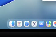
or not to see, that is the question. ![]()
Looking at that image, if you have less than perfect eyesight the whole thing is a disaster. Translucency works for the Apple Vision since you are superimposing a virtual reality on what you know to be the real one. On a computer screen it merely looks like bleed through from the reverse page of a book.
Complete disaster IMHO
That’s 100% a joke or a bug.
Maybe, but even if it is an exagerated example of the new UI my point stands. Unless translucency is much reduced - in which case what’s the point - it looks more like bleed through from the reverse page of a book. Not good for people with less than perfect eyesight.
Okay, for the uninitiated, the posts were from me, pigfender. The odds of them being serious are not good.
macOS Tahoe won’t be available for quite some time yet.
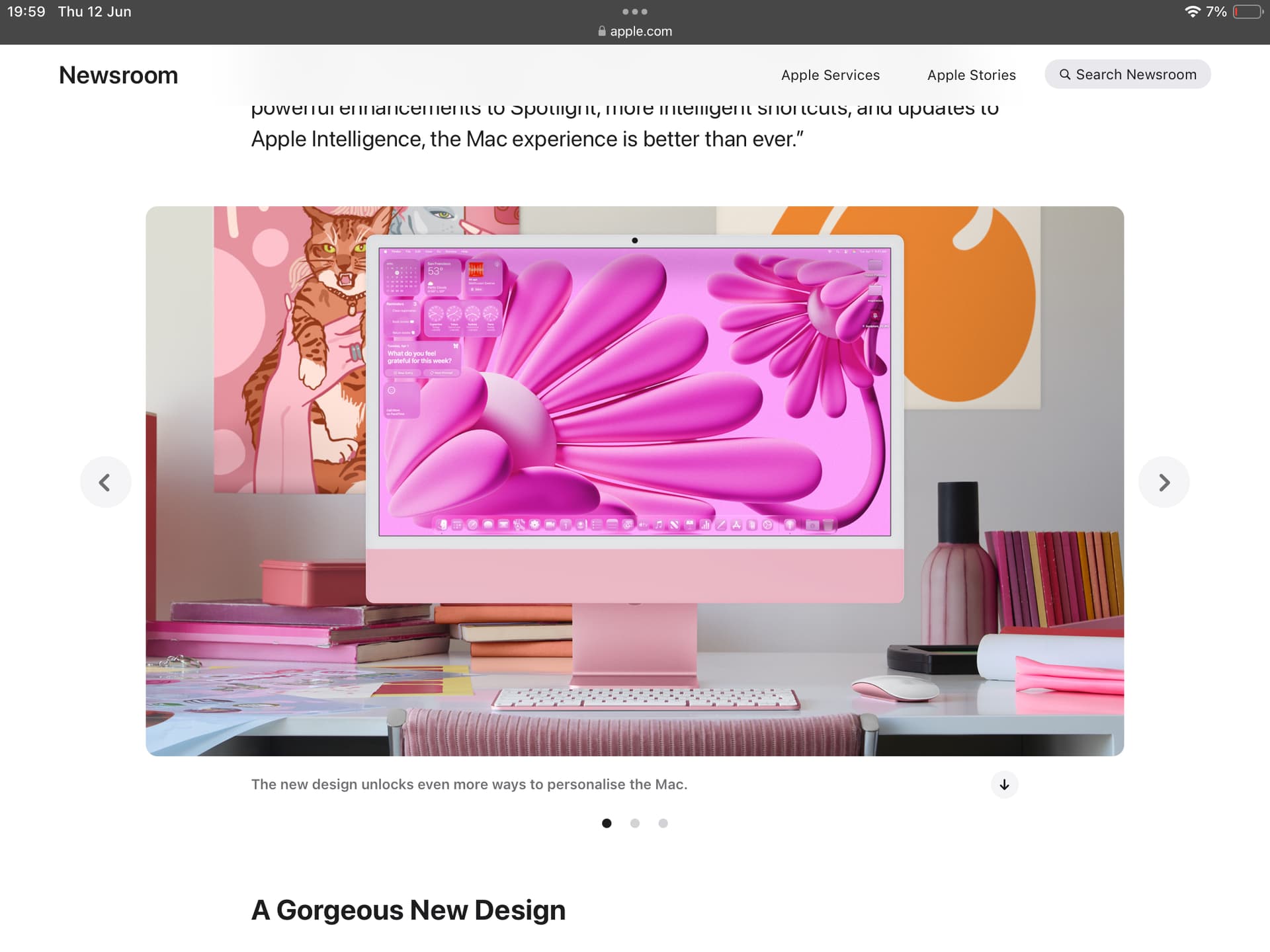
The actual screenshots, however are much, much worse:
“A Gorgeous New Design”, indeed. Who knew it was possible to get diabetes from using a computer.
That’s an optional layout, though (“You can personalize your Mac like never before” – but you don’t have to!). In fact, by default it looks pretty much like Sequoia:
Source: Apple
Some people can be so serious.
Sorry. I didn’t intend to ruin your joke, but I also don’t want less tech-savvy users dread the next major update for months. It’ll be fine. Hopefully Apple gets the menu bar right by then, too, that still needs work (too transparent for some wallpapers).
You don’t have to dread anything. Just don’t upgrade.
That’s what I said about Mac OS X 10.6 “Snow Leopard”. I hung on to the last Mac that could run that for many years, until it finally stopped booting and nobody could repair it.
Then the dread set in…
See, that’s exactly what I mean.
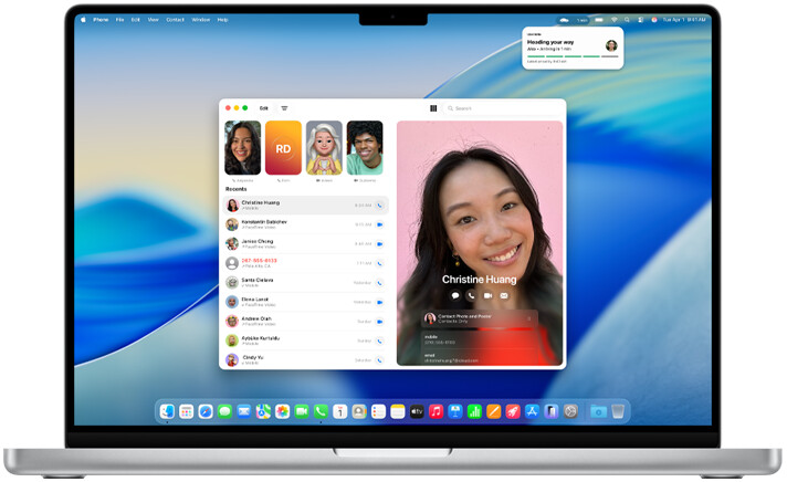
This subtle bit of Apple humour while showing off a setup coloured like Aunt Pettiput’s perfectly pink petticoat was even better than the more in your face laugh at Craig Federighi‘s hair when he removed his racing helmet.
Guess it was all a part of Apple Intelligence really.
In all seriousness, successfully running Scrivener under Tahoe (a virtual machine under Parallels to keep it nicely separated from my Sequoia OS). All good and have no issue with the new look.
I was even running (an app that can’t be talked about) installed on Sequoia by opening the Sequoia Applications folder in the Tahoe install (using sharing), but wouldn’t stick my neck out by opening any of my projects as there are a number of restrictions with iCloud when running a Mac OS on a virtual machine on an M series.
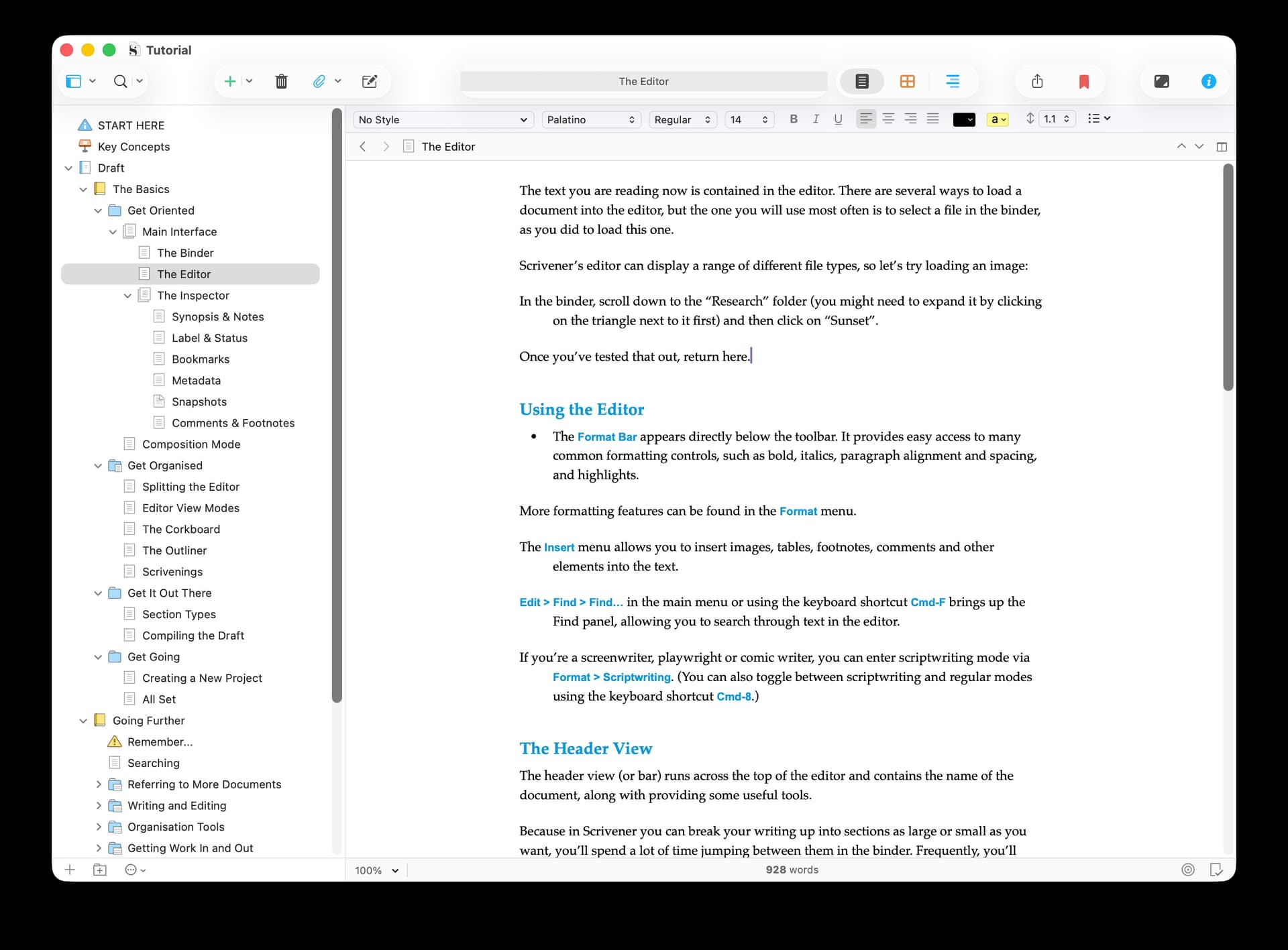
To be serious (sorry Pigfender), if you run the current version of Scrivener on Tahoe, it will just look like it did in Sequoia. Apps only get the new look once they’re rebuilt on Tahoe in Xcode 26. Here’s how it looks rebuilt with no other changes:
(I personally hope they tone down the shadows around toolbar buttons. They don’t look too bad here, but they are too much when directly over content.)
We’ll be making tweaks to the UI to fit better with Tahoe. From the screenshot, for instance, you can see that the formatting bar colour is off, and that header and footer bars need to be a bit bigger, with a bit more breathing room, to fit the new design. (You can also see drawing issues with the search bar in the toolbar.) We’ll be auditing every part of the UI, but Scrivener’s UI won’t be turning too glassy - just enough to fit in.
All our app icons need recreating, though.
(This week has been spent going through all the relevant WWDC videos for developers.)
I meant the new OS look. I didn’t pick any real differences in Scrivener, putting slight differences down to my customization of Scrivener, but it was pretty much just open and have a quick play to see what the whining about the Tahoe GUI was all about. My colors look a little different to yours and didn’t notice any issue with the shadows around buttons, even when hovering.
I can see some vague similarities with the dreaded Vista, but even at this early stage it looks more polished than Vista.
Damn, now I need a stiff drink with the Vista nightmares coming back. I was given the unenviable task of installing XP on all the new company machines that arrived with Vista pre-installed.
Don’t worry. Unless you go absolutely ape with personalized settings, the standard Tahoe interface is perfectly readable, even for this 4-eyed 73 and 9 month old broken down old fart.
I’ve tried a few combos without issue.