But … … this is 2.0, isn’t it?
No I don’t - but it’s very nice and clean. Is it possible to download it somewhere?
I love it! Very clean and much better to stay focused on the text.
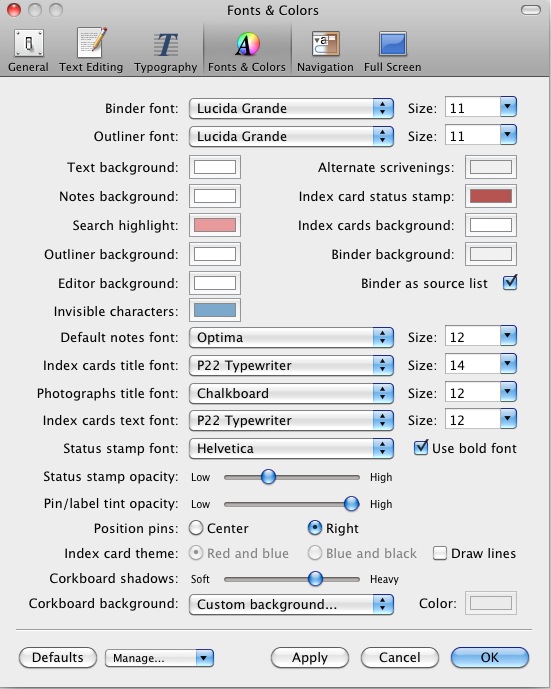
Here is the Things background. Right-click on the image and save it on your disk. Then open Scrivener preferences and change corkboard background (in fonts and colours) with the image on your disk.

Merci Rodix, j’apprécie.
I keep getting back to your screenshot, Keith. Imagining myself working in this environment, with these incredible notes seems too good to be true. You just made me want once again to use this 2.0! 
Jowibou, glad I could help!


i came on this forum to give you guys some general feedback about scrivener, but i really liked looking through this thread, so i decided to resurrect it, especially since there might be some new layout possibilities in 2.0.
i hadn’t heard of scrivener until late october, where i found it through the nanowrimo website (i’m on the nanowrimo trial version right now, though i plan to use my coupon to buy the license as soon as i can verify my winning novel!). i’ve really only been using it for the purpose of the novel so far, but the more i use it, the more i’m wishing i had had it when i was in grad school writing research papers, and i can’t imagine a writing life without it now, after only two weeks! it does everything i want it to do, and just when i think, “oh, i wish it did that,” i simply consult this forum or the manual and i learn that, oh yes, it does do that, i just need to do x-y-z. yay!
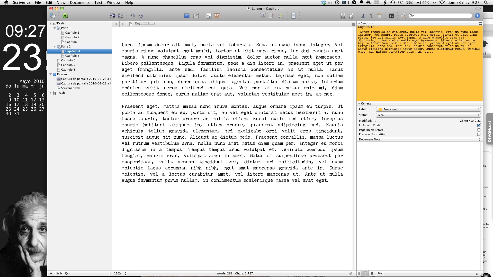
anyway, here’s my contribution to the screenshots:
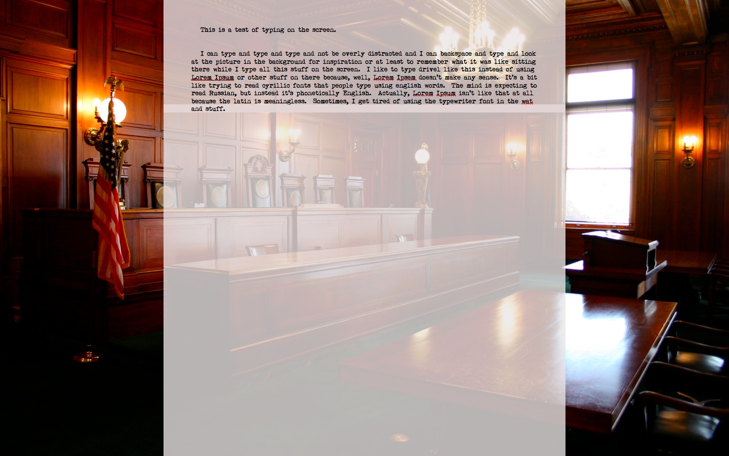
i’m finding full screen to be great for getting rid of distractions…i’ve got my nice soothing picture in the background (yes, it’s a mac standard wallpaper - what of it?  ), i’ve got typewriter mode on so that not only do i not have to look at the bottom of the screen while i’m typing, but i can keep my widgets open at the bottom and they won’t interfere with my text. the targets window is AWESOME for nanowrimo! i’ve been using the comments to keep notes to myself so i don’t have to go back or find references, i can just keep going…and the keywords are actually not so much keywords as a way for me to keep track of how i’m color-coding my comments - at least for now.
even though i like this setup a lot for straight up pounding words onto the page, i’ve been playing around trying to find what i like best for larger-scale organization, so i’m really curious to see more ways in which people are using their layouts creatively, especially since i’m on a macbook so screen space is at a premium.
once more, with emphasis - THIS PROGRAM ROCKS MY SOCKS.
ETA: i couldn’t seem to resize the screenshot so you can see the whole thing. not very techno-savvy, i’m afraid. anyway, i think you get the idea
If I had to name one thing I like best about Scrivener 2.0, I’d name the possibility to use one’s own icons in the binder. This way, I finally can realize something I have dreamed of since the beginning: To visualize the progress of my writing in the binder itself.
This looks like this:
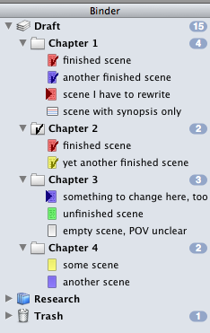
Just to remind, all this has to be done manually - not automatic function here. Keith didn’t like the idea whenever I suggested it, so this will be the best I’ll get. But on the other hand, an automatism is not really necessary - you use to think twice before declaring a scene as “done”, even if “done” means “first draft”, which is what we are talking about in Scrivener.
If anybody wants to mark his or her progress in the binder as I do, here are the checkmark icons I use:
AE_Icons.zip (7.86 KB)
Have fun! ![]()
Thank you so much ![]()
I’m glad someone likes my idea … ![]()
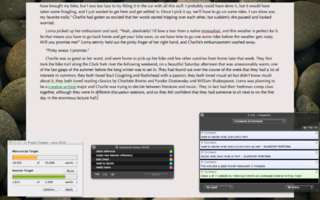
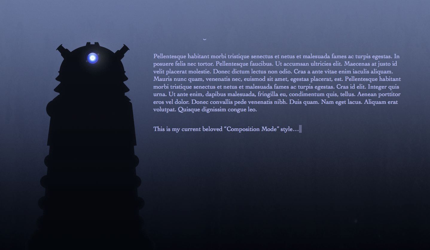
here’s full screen on my mac book.
I wish I could have it override all fonts and use a typewrite or goofy screen font in full screen, but when just typing to lay down some words, I like using the typewriter fonts with the typewriter.
Looking at this thread, for the ‘I’m not sure how manyeth time’ I see a lot of features that I’ve never touched in my writing… I have at least four projects that I’m actively working on, including the one that is eating my time as it’s for Camp NaNoWriMo. This is only the second work where I’ve created each chapter as a folder, and then put the scenes as separate text files. I’ve found that I actually write more this way than I do in one file per chapter, and I think I may be moving to this style for any new works that I start. I’ve noticed that I use the standard layout with very few modifications (and really have ever since the 1.x version of Scrivener.) I keep the inspector open (even though I don’t actually use it for much of anything) as a place to ‘Dock’ my targets window. I’ve also made a few tweaks to the tool bar, but that’s as far as my changes have deviated from the stock configurations.
Thanks for the great software, Keith and the team.
Josh

One from the Windows version.
Not as pretty as the Mac version but it gets the job done. I wish we could the default colour of index cards as mine are blue rather than white as my application window backgrounds are blue rather than white to help reduce screen glare. This also affects the reference and screenshot panes as well LOL!

2011-07-23_201609 by StaceyUK, on Flickr
I bought IA Writer for the Mac in a fit of procrastination, but then really couldn’t handle the non-adjustable text size. It is set so large that I found myself being overly-conscious of words, rather the flow of sentences and rhythm of the text overall–not what the designers intended, I’m sure. But I thought other aspects of the IA design were worth adopting. So I shamelessly adopted them.
For the attached layout, I pinched the page background of subtle lines from IA Writer, and tried desparately and unsuccessfully to steal the lovely (and proprietary) Nitti WM2 font. While thinking about whether I’d buy Nitti, I settled for using 17-point Inconsolata. I like it so much I’m not sure I’ll spring for Nitti after all.
It’s all subjective, but I love being in this writing environment, insofar as I enjoy being in any writing environment, which is not much, at least while doing first drafts.

Inconsolata is a beautiful font, perhaps my second favourite fixed width these days. I like OliveGreen Mono the best, my only gripe against it being that Apple’s typography engine turns on ligatures by default, which looks kind of weird on a fixed width font, but I think I am used to it now. The funny thing about Inconsolata is that it is inspired by Microsoft’s Consola, but I think it is superior to it in every way.
Thanks for the suggestion. I love Consolas so will give this a go…
Here is a quick comparison of the three fonts, by way of a current Scrivener screenshot to stay on topic

[size=80]Click here for large copy[/size]
![[size=80]Click here for large copy[/size]](http://www.semigreenpenny.com/img/forums/11215657-Scriv-three_font_compare-20110803-074659.png)