Thanks for that comparison Ioa.
Now you’ve gone and made a happy man discontented with his lot. And if I decide to pay for a font, what will it be - Nitti or OliveGreen Mono? Questions that will disturb my rest.
If you like these three fonts and Nitti Light you might like to cast an eye over the outstanding Courier substitute font called Cousine.
Free here: fontsquirrel.com/fonts/cousine
Look under STYLE on the right hand side of this site and then have a peek at MONOSPACED (28 fonts listed).
Also look at Flex, Momo, Menlo and PT Sans, PT Sans Caption, PT Sans Narrow, and BitStream Vera Sans Mono, Thonburi, and finally the DeJaVu family - Sans, Sans Mono and Serif.
Cousine, Liberation Mono and the DejaVu family are perfect alternatives to Nitti Light and frankly, I like them better. You could look at Liberation Mono all day and never tire of it.
fontsquirrel.com/fonts/Liberation-Mono
ONE MORE TIP
Try going to System Preferences > Universal Access > Use Grayscale
It gives a delicious grey scale writer’s screen with very enhanced text - particularly useful if you make either magnification or text size adjustments to suit your own monitor. For example, I use 125% on a 24 inch monitor with 13 point Cousine or 11 point Liberation Mono.
Yr Lordship,
Thanks for the tips. I have Cousine and Liberation Mono on my system. I picked them up on my monospace font search, but my eye prefers Inconsolata. There’s a thesis in why people are attuned to certain fonts. There’s another thesis in why some people don’t care about fonts at all. My wife, who breaks out in a rash at the wrong splash of colour on a sofa cushion, uses Cambria all day without flinching.
The Universal Access greyscale setting doesnt change much in Scrivener for me, because I’ve opted for a greyscale look anyway. It just turns off all OS’s the other visual colour cues, and I miss them. But you’ve just shown me another aspect of OS X I never knew existed.
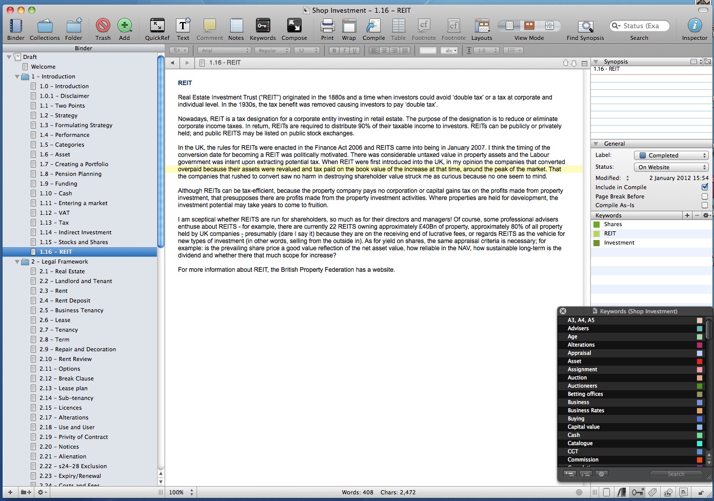
I am a commercial property surveyor, specialising in business tenancy advice for landlords and retailers in England and Wales. The nature of my work is largely in writing, a report for example would run to 10,000-20,000 words and in a typical week at a rough guess I expect I churn out at least 30,000 words in ‘routine’ correspondence: shortly before Christmas I wrote two reports one approximately 18,000 words, the other 15,000 in two days. Hardly any of my output can be standardised: mostly it’s all from scratch. To complement my services, I publish a few newsletters and free booklets, known as ML Guides. I’ve only been using Scrivener for a couple of weeks and I am experimenting (so far with considerable pleasure) using S for writing and preparing the content for one of my websites - shopinvestment.co.uk Much of the content I wrote during the 1980s when I published two booklets on the subject. I scanned the booklets to pdf and have imported the text via copy and paste and am now in the process of going through it all, editing and adding new content and then copy and paste the completed text direct to the website. I have designed the website to be read like a book, with topics and sections in numerical order. Each topic has a new page, and on each page are the sections for that topic using a tabbing feature so that the site visitor doesn’t have to wait for a page-reload to read each section. At present the site has 17 pages (I am likely to add more) and approximately 115 sections.
To save time, I have set up Scrivener to use the same font (Arial) and style as I use on the website. The topic header is in colour, the RGB of the Pantone spot colour on my headed notepaper. Apart from line and paragraph spacing I’m not as concerned with the aesthetics of the overall layout and sentence structure (no rivers) as I would be normally because my website is liquid layout (not fixed width). (Assume that if I wanted to a printed version of the content (which I may do in due course) I can simply change the font, etc in Preferences and either the whole lot will automatically change or I can go through each section and change it manually: for print I tend to use Adobe Garamond Pro regular 14, which reduces to a comfortable reading size when I shrink the text to create a booklet, using Quite Imposing 3. I then print the booklet, collate and bind and the finished product can then be distributed. (Interestingly the default font that Apple uses in Aperture for photo-books is Baskerville, and iPhoto uses Helvetica Neue, both I find easy on the eye.)
In the Collection, the ‘page numbers’ tally with the chapter/sections on the website. Because I tend to write from head straight to final (then edit the final) I rarely use comments or notes, but I do use keywords. Theoretically I should go through each section and add the keywords before writing and editing the content, but that would take too long (and could be a waste of time if I delete text) so I’m adding the keywords as I edit/write the content for each section. I find keywords very useful for searching similar points and consolidating text.
Under General tab, the labels include content awaited, edit and rewrite, awaiting final edit, completed. Status labels include to do, final draft, completed, on website. I find the Group Mode view of the groups subdocuments useful for picking up where I’ve left off: before I started using Scrivener I used to scribble the next section to do on a piece of paper then lose it, so I had to wade through the content of the website site to what to do next. (The website is live: I think much better to be out there saying something that wait until everything is finished before making the site ‘live’. Also, a website is a dynamic medium so there’s always room for improvement)
Since the finished content is effectively backed-up through being on the website I’m not fussed there, For portability, however, I compile to pdf at intervals and to date have 109 pages. (I perform a manual back-up of all files and folders as part of my end of day routine.)
When I had a PC I used WordPerfect and after switching over to Mac completely over the years I’ve used and trialled many ‘word-processors’ and writing software. (The one thing I miss about Word Perfect is line numbering: one can specify whether left or right hand side of a page. Why wp developers seem fixated on line numbers one-side only is beyond me: the advantage of numbering lines is obvious (for referencing) but the positioning more critical: there is no point in using line numbers when a publication (content one side of each page only) is bound in a folder and the width of the folder spine hides the numbering: much better to have the option of numbering on the right hand side.) Anyway, having settled on using Pages '09 (along with Indesign CS5 for newsletters/booklets) (Word is bloated and slow!) Pages is good enough for my purposes, I use other applications such as DevonNote for ideas, etc where I can quickly add the date/time and print to pdf. Another nice app is Thoughts - thoughtsapp.com/ - However, subject to the practicalities I’m thinking of using Scrivener instead of DevonNote. Anything to accelerate my output and have all information at my fingertips!
This is actually on my deviantART account from readers who wanted to know how I set up to write…
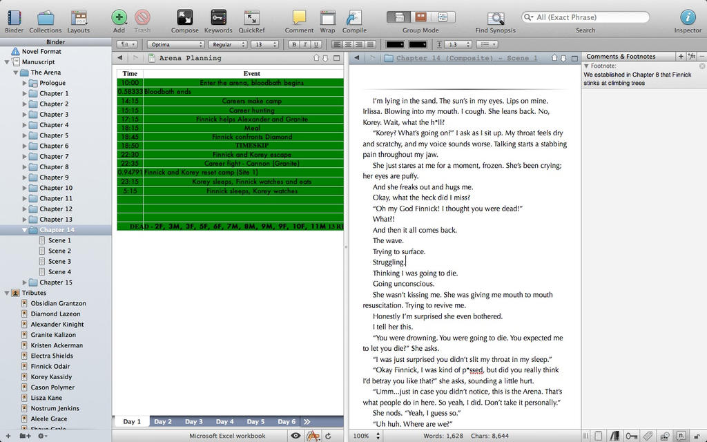
This is me working on my flagship Hunger Games fanfiction, When Life Became A Game.
The table on the left is imported into Research from Excel.
And I’m obsessive about footnotes. I list them at the bottom of the chapter when I upload to FF.N.
I love you Scrivener! :mrgreen: You make my heart feel super happy!
-cindella204
I hope it’s okay to post on an old thread like this, but I love seeing other people’s workflows, and have wanted to share this capture of mine. It’s a couple of years old now, but absolutely my favourite ever use of any piece of software, used on my favourite essay I’ve ever written. I looked back at it while doing a design course when using Scrivener as an illustration of a design I love, and it made me really want to share this!
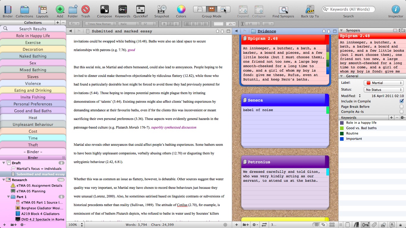
My setup is on an 11" MBA. At all times I keep the binder and inspector open, and the screen split horizontally. Depending on what stage my work is at, I adjust the width of the two ‘working’ panes to accommodate whatever I need to see - at the stage of composition, this was my essay in the left pane, and my sources in the right pane.
So, from the left:
Binder:
-
I made collections for each of the key areas I wanted to discuss in the essay (Martial’s presentation of the Roman baths, if anyone is interested). Each source was given keywords matching as many of these areas as the source discussed, and since many sources mention several of these areas, collections really helped me gather up what I needed to refer to in each paragraph.
-
When I began actually drafting, I split the binder so that all my collections were visible without scrolling, since these were what I needed to refer to most. In the research stage, I kept collections in a small area, and had all my research files and journal article PDFs - dozens of them - easily available, divided into folders where necessary.
-
I used different icons for different types and stages of file - for example the ‘thought bubble’ for basic notes, and a warning triangle for really important notes. Different coloured book icons helped me identify types and authors of sources and so forth. I used many different icons, but they really helped me find what I needed quickly. I also like colour, so I altered the binder background to be unobtrusive, but to me, attractive.
-
Left pane - the essay itself - in this case the marked version, but in use, whatever draft I was working on at the time. I almost always write from start to finish in a single document, so this is a long piece, as the word-count shows, though that also includes the Bibliography. If I were writing a draft I would set up the progress tracking bar to help me avoid going too far over the word-count and having to hack off more than a few hundred words. For the final stages of working, as opposed to early drafts where I might need to go back to my research, I would usually also lock both panes in place.
-
Right pane - Sources, displayed on index cards. In the case of short sources, these were copied both into the document itself and the synopsis card, while for long sources, just a key quote or note made it onto the card. I set the cards to show the keyword chips and be coloured according to label, in this case usually the author of the source (red = Martial, in this case).
-
Inspector - normally this would be focussed on the draft itself as I work, and might include project or document notes and the odd comment in the synopsis card, but here showing how I make use of multiple keywords per source. I rarely use the ‘status’ feature, except to mark final drafts in multi-section projects where I have a lot of drafts around.
So, my set-up is far from minimalist, but it works brilliantly for me, and helped make this really quite complex essay a joy to compose as well as to research. I personally enjoy the colour and the sense that everything is where it should be yet right at my fingertips - the whole environment of Scrivener feels very ‘natural’ and comfortable to me, both for fiction work and essays. Since this project was completed I have come up with a couple of extra ideas as to how I can make use of the keyword and collections features even better to help me use my sources, which I hope to test out sometime (the design course I’ve been doing hasn’t called for this type of working, though Scrivener has still played a key role).
Anyway, I hope no one minds me sharing this after all this time, and thank you Keith for making it possible! I dread to think how I would have handled this essay in any other piece of software!
Two observations:
(1) Thank goodness it’s about Roman baths. Reading some of the titles of your collections was making me nervous. ![]()
(2) So that’s how collections are used. I’ve seen them there, but never actually worked out how I could use them effectively. Now I know at least one way. Thanks. 8)
Yeah, sorry about that, I didn’t think! If it isn’t ok, can someone please delete it? I don’t want to offend anyone.
I like collections very much, and have ideas about a slightly more sophisticated way to use them in the future to almost mimic those programmes that allow text analysis. I have only tried it on samples, but it works quite well in theory - something like:
-
Read article in Skim, highlighting key points
-
Export annotations from Skim
-
Copy and paste each individual annotation into a separate document in Scrivener, named by author, title, page number
-
Assign one or more keywords to quote
-
Make a collection for each keyword through the smart feature
-
When I want to explore individual quotes for a topic, as represented by a keyword, call them all together into one document through the scrivenings feature
It’s an extra step or two, but since I already use Skim in this way and export annotations to a single file, it’s not much more, especially if I combine iClipboard and Typeit4me or something similar to save as much effort as possible, and I have a feeling it’ll pay dividends sometimes, especially in articles that have lots of key quotes on different topics so that a single summary for the whole article is unhelpful.
Don’t worry about it, we aren’t uptight about that kind of stuff on this forum. 
Regarding importing annotations from Skim, the [b]File/Import/Import and Split...[/b] menu command might save you a lot of manual labour. Using “• Anchored Note, ” to split by might work, if that is the type of annotation you use. That will result in line one stating the page number, with the note title on the following line and then the text of the note.
Ioa, thank you! That’s awesome! I love how amazing the support is for Scrivener; it’s nothing I’ve come across before. Not only can the software be flexible enough to do almost any text-based task, but there are amazing experts to help us know how! So yeah, thank you!
And honestly this has to be one reason Scrivener is such great software - when I first bought it I was up and running in a few minutes, using the basic features of documents, binder and synopsis cards. Project targets quickly got added to the workflow, then keywords, then collections and scrivenings… it’s so easy to use, but it just grows with you - brilliant! 
And thanks for not being cross about the photo content - I apologise for not thinking in advance 
Just to be clear: I love the image. I was joking when I said “thank goodness” and can assure you that no offence was taken. In truth I was intrigued to know what type of essay could include the various topics suggested by the collections. It was fascinating and well-worth posting. ![]()
Thanks nom - yeah, it was quite the topic to research and very interesting I have to say! I’m glad if the image and workflow was worth posting. I love reading other people’s uses and ideas, so it’s only fair to share mine
Yeah, we’re more likely to be titillated than offended here.
“Naked bathing” huh? I’m in favor of both.
“Sex”? Now yer talkin’!
“Mixed bathing”? What is that? Like mixing your bath with your sex? Ooh, la la!
“Slaves!?”  I got nothin to say 'bout that. nudges ‘toys’ back under the bed
“Violence?” Isn’t that a bit judgmental now? I prefer the term “forceful”. Rrrrower!
See what you’ve gotten yourself into by boarding with this motley crew?
Let’s hope Vic-k doesn’t see this…
My thoughts exactly!
Oh dear, I didn’t mean to cause such a stir 
It’s all right Scylax, this is called “fun” in these parts. It’s all in good spirits (preferably, at least from vic-k’s persecutive, Jameson’s) and posted with joy.
As a matter of fact, we often invoke the name of Mr. K in an effort to lure him into the open. Thereby unleashing all his pent up funniness on the rest of us.
Yes, it’s all in good fun; sorry if you thought we were upset or worried. And I’m also sorry if what I wrote embarrassed you in any way.