I’m a professional writer who bought Scrivener just for the index cards feature, which works. However, the program looks more interesting than that, so I thought I’d delve in.
Like every other writer, I use the white-text-on-blue-background feature that Jerry Pournelle got Microsoft to add to Word years ago. Since the Scrivener overview tutorial shows green text on black in Full Screen mode, and because I’ve stumbled on it once or twice on my own, I know it’s possible. It’s implementation is a nightmare, though. If you doubt me, check the boards: the question gets asked over and over and never gets answered coherently. Then try and find any mention of it in the manual.
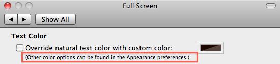
Why aren’t all the text colors on one menu, or even one section of Preferences? Is “Override natural text color” supposed to mean something? (WTF is “natural text color”? “Natural” doesn’t appear in the manual or on Help search. Neither does “override.”) Why does the only color chooser for main text seem to appear on the Full Page menu, but affect the Editor menu? Why does it work so poorly? Why does font color change when you hit return? Has anyone tested this software? Since background/text coloration is obviously a vital feature that you put in the overview video, and a lot of people are going to look to turn it on so they can just start writing, and figure out the details later, why not make it function smoothly and simply?
You’ve got (easy to use!) fading and texturing of the margins around the piece of paper in Full Page view, which right now is looking – to me, at least – like feature-creep over utility, and I’m not seeing how a program that can turn something so basic into such a time-suck is ever going to be useful for anything other than procrastination.
I didn’t know what “natural text color” meant either, but I changed it to white and changed background text to blue (under appearance) – white text on a blue background. I guess to make everything more consistent, “text” should be on option in customizable colours for “Full Screen”, but the terminology is a hold over previous versions of SCRIVENER. It took me less than a minute to get white text on a blue background, with just a bit of experimentation.
This is your FIRST post and you come on as Arrogance personified.
As my mom used to say, Watch your tone, Mister Man.
To me, the color of text on background is so trivial an issue that I’d never give it a thought.
I also never use full screen text, but do I complain about the presence of that feature?
Anyway, you are starting off so poorly I wonder if anyone will bother to answer you.
Some have more patience than I with really bad behavior.
I only see this question coming up a few times, and as the posters all seemed satisfied with the responses I wouldn’t say it never gets answered coherently. Nevertheless, I see how Scrivener’s many customization options could be initially confusing.
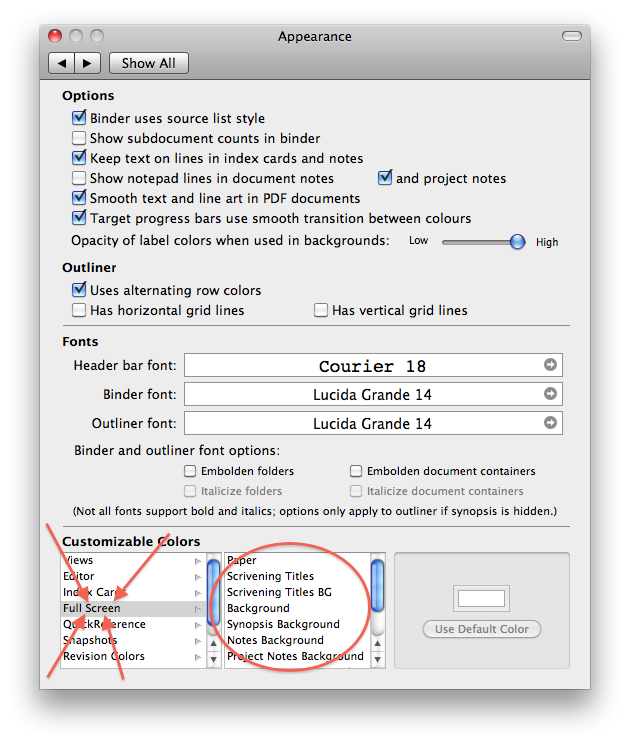
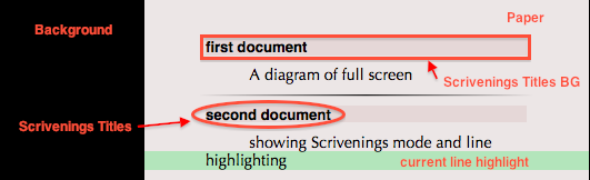
Ignoring the inspector, the color-customizable areas of full screen are these: as well as the text selection color. These options appear in Preferences:Appearance, Customizable Colors under Full Screen.
Preferences:Full Screen also gives you the option to “override natural text color with custom color,” which will override the color of all your text–including customized colors for Scrivenings Titles–with your selected custom color. The OS is basically setting a display color for full screen without destroying the actual (“natural”) color of the text, allowing you to use one color in FS but to maintain other text coloring throughout your project. For instance, you might use text colors to indicate revision status or use colored inline annotations, resulting in many different colors when you’re viewing text in the editor. When in full screen mode, the “override natural text color” gives you the option to work with all white on blue without losing the underlying “natural text color” that was set in the editor–when you leave FS, or choose not to override the text color, the original color is preserved.
Are you using the latest version of Scrivener? The manual that I’m looking at does in fact contain both these words, including this section as the top hit for “override”:
I’d like to answer this but I have literally no idea what you’re talking about. The only text color option in Preferences:Full Screen is to override the natural text color, as explained above. It has no effect whatsoever on the main editor. Default text color is set in Preferences:Formatting, along with all other main document text options, and in regular use the color can be changed via the format bar above the editor as in most word processors. (Also by the context menu in the editor, cmd-shift-C, or Format>Font>Show Colors.)
Fortunately, published authors in many fields have successfully used Scrivener, so you can content yourself that at least some people are able to stop procrastinating and get writing, even if it turns out not to be the program for you.
Guys, how can you expect from someone who is undoubtedly working to full capacity—or even more—as a professional writer who happens to know every other writer to be at least a hobbyist manual reader or to have a B. A. in Basic Human Interactions (in some countries known as “manners”) too? That would be too much, wouldn’t it?
What intrigues me about the O. P. is something else: English is not my first language but even I could easily come up with a variety of words to express dislike. So when a native speaker goes in a straight line for “hate” like the O. P. or that other guy in this forum a few weeks ago it always makes me wonder if they took the right profession. But maybe it’s just short temper shrouding vocabulary. Or a post-New Year’s Eve hangover.
Anyway, since I detected a “please” at the very end of his posting I’d like to contribute two screen shots from the preferences containing some hints (scrolling required for no. 2!).
I agree that this is one thing I’m not fully happy with, in that this setting is split between two panes in a way - in that all colour options are in the “Appearance” pane except for the text colour. However, there needs to be a checkbox for the user to decide whether the text colour should be overridden at all in full screen. The most obvious place for this checkbox to appear is in the “Full Screen” pane - placing that in the “Appearance” pane separate from all the other full screen options would be even more awkward. So essentially, it came down to a choice between having the full screen text colour separate from the other colour options, or having the checkbox to override text colour in a separate pane from the option for that colour - the latter seemed more awkward to me than the former, hence the way it is. (Another option would be to replicate the colour chooser in the “Full Screen” pane and have all full screen colour options in the “Full Screen” pane, but there’s not really room for that and I prefer keeping as many of the colour options together as possible.)
So, I’d agree the “Preferences” pane isn’t entirely perfect (though how that could make someone “hate” the entire program is utterly beyond me), but that mainly comes down to the wealth of options there. With so many options, it’s impossible to keep them all compact and tidied away - I spent a lot of time trying to organise them as best as possible. The alternative, of course, is to have barely any preferences at all, like most Apple programs - but my experience is that users like the range of options. Besides, preferences are the sort of thing you experiment with a little while and then barely touch once you are happy with the program’s set-up.
But if anyone can suggest a better placement for the full screen text colour in such a way as it doesn’t get separated from the “Override text colour” check button, I’m all ears.
I agree, because it represents print on paper, which often is my default destination, anyway. It certainly is still the standard in publishing, whether on screen or paper. Possibly that’s what “natural text color” means to KB, black on white.
Curious about the preference for white on blue, I Googled the phrase. A bunch of articles pop up; the first one says it stems from the WordPerfect era, when screens had a low refresh rate. I also remember green or amber on black, on some very early terminals.
But as screens and word processing evolved, both Mac OS and Windows have emulated the standard appearance of printed text, black “ink” on a white “paper” background.
You have probably already considered this, but is there any chance to make the checkbox fit in a Appearance > Customizable Colors > Full Screen > Text box? I see there are other options where the “Chose texture…” button appears or disappears. Maybe it can be replaced by the “Use natural text color” checkbox for this paritcular option?
Also, I wonder if something like Font Presets can be had for Full Screen colors (text, paper and background). I like to change colors a bit, for example to use amber over black by night, and green over black by day; or black over pearl grey when I need a feeling of real paper. Having the Preset separated by Preferences could be sometimes handy.
It just wouldn’t fit there very well. The checkbox would need to go before the colour palette because it determines whether or not the colour palette is enabled or not.
I’m not sure what you mean here, but if you mean different sets of colours, then no.
A lot of people say this, but for my eyes, I found, it’s actually more stressful to have light text on dark screen than the other way round. (From time to time, when I’m overwhelmed with nostalgic feelings, I recreate how computer screen appeared when I was young – light green on black! -, but I can’t stand it longer than ten minutes today. Then my eyes hurt.)
Unfortunately my friend Mr WS Gilbert presents his apologies, but he has problems with his internet connection. He asked me to pass along his comment on this thread.
The Writer Most Professional
I am the very model of a writer most professional
My style can run from Hemingway to Oprah show confessional
My articles are cliché free and quite devoid of platitude
The New York Times puts my by-line on its front page with gratitude
I’ve written songs for singalongs and haircare advertorials
I wrote the elegiac text that graces war memorials
My spelling is exemplary my grammar quite majestical
I’d no more split infinitives than I would split my testicle.
He’d no more split infinitives than he would split his testicle.
He’d no more split infinitives than he would split his testicle.
He’d no more split infinitives than he would split his bestest testicle.
My friends Flaubert and Baudelaire have praised my writing to the skies
The harshest critics say that they have nothing they can criticise
And deadlines hold no fear for me, I will deliver right on cue
But only if you let me write exclusively in white on blue.
It’s true that green on black won’t do and black on white is just not right
If it’s not white on blue then poo! Invariably it turns out shite.
I’ve solved that problem. Bought blue carbon paper, fed that into my printer, refilled black ink cartridge with White Out. Being a professional writer, I just felt, you know, more professional when the output matched the input.
 as well as the text selection color. These options appear in Preferences:Appearance, Customizable Colors under Full Screen.