I’m curious what fonts you guys use to work in. I’ve always worked in MS Word and imported it into Scrivener, so I’m still on Calibri, which is a font I like. It’s nice and modern-looking, especially when printed out. That said, most books I’ve read use a serif font. I tried working with that, too, and I like it as well. They both have their appeal and I’m not 100% sure yet which I like better.
Times New Roman is my BFF. It’s serifs make it easy to read, and it has very distinct bold and italicized types, unlike some other fonts. Classics never go out of style.
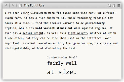
I write in the Editor using Courier New.
My Scrivener interface / Menus and Binder are in a bespoke font based on Interstate.
I use Merriweather for the Outliner. This also looks good for the Menus (since Interstate is a paid font).
I also use Merriweather for the Corkboard titles and text, and Sketch Rockwell for the Status stamps.
When compiling, I use Garamond for pretty much everything, with the exception of any title text on a Part separator, where I use good ol’ Arial in full caps.
If you don’t know it, I’d definitely encourage you to check out Merriweather. It’s free, and was specifically designed with being easy to read on a computer screen in mind.
For editing I use Adobe Garamond Pro for the text in most projects and Optima for inspector notes. If I’m going to be using IPA phonetics, I use Baskerville for the text as that works better with Charis SIL. For exporting, anything that will be distributed in PDF form or on paper remains in Garamond Pro or Baskerville/Charis SIL; anything that I’m sending to colleagues as an RTF, I compile in Times New Roman for compatibility.
Left to my own devices, I currently use Georgia for most things (Didot if I’m feeling sprightly and frivolous, and if I’m not sending the output to anyone else), with Helvetica Neue for sans-serif headings, and Menlo on the rare occasions on which I need something mono-spaced. If I’m sending stuff to other people, I tend to switch to Times New Roman, Arial and Courier, on the grounds that those fonts can’t be deemed unsuitable.
Love this topic! Always interested to know how others make it easier on their eyes. At the moment, after dalliances with Garamond, Lucida Grande, Helvetica Neue, and Courier, I’m back in Verdana, which seems to be fine… for now! I think my favorite font is the one used in Writer, Nitti Light. Wish I could have that in Scrivener and everywhere else.
While we’re on the subject, what colors/backgrounds are other scriveners using?
After dallying with the wonderful Fournier New font from Francois Rappo in Switzerland and finding (a) that it had a problem with faulty kerning tables and OS X Lion Refused to allow it to be loaded, and (b) it had recently disappeared from their site, I decided to try Linux Libertine, a free and open source font. Won’t be much good, I thought: wrong. It’s a lovely, fully-featured font, unobtrusive and good for any job. My publisher BlazeVox in Buffalo NY State has fallen in love with it too. Linux Biolinum (a near-clone of Optima) is the sans-serif.
URL at linuxlibertine.org/index.php?id=1&L=1
I use black type with off-white or dull green backgrounds at 150%.
As far as colors go, I’m using a light gray font on a blue background, sort of like the old WordPerfect setup. Specifically, the font color is Hue: 0, Sat: 0, Val: 222, Red: 222, Green: 222, Blue: 222, Alpha channel: 255. The editor background color is Hue: 240, Sat: 255, Val: 100, Red: 0, Green: 0, Blue: 100, Alpha channel: 255.
Well that’s probably for the whole font. I think you can get the basics for about half that. I’ve always said though, fonts are like office chairs, if you find one you really like it’s worth a little extra since you’ll be sitting in it all day.