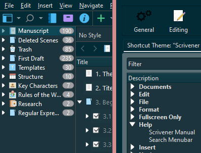
Hi. Is there a way to change the colour of the bullet/arrows in the Binder? Those angle things you click to expand or collapse sections/folders.
I would like to keep the binder dark but I can barely see the arrows as it is (first image). Even if I do change the binder to a lighter colour (in File Options Binder colours) the arrows aren’t shown. A wider block around them remains the old colour (second image).
Thanks
(I’m new so can’t upload screenshot yet. Trust me.)
- If you use Folders with underlying Files, Folders are bold be default. I know this because I unbolded mine. That said Files with underlying Files are not bold.
- Play around with the Binder’s Font settings under File>Options to either select a bolder font or a larger one. (Not at my computer to say where.)
Yes, there are Themes the show better contrast for the arrows in the Binder. Others are even worse than the Default or Dark Mode Themes.
On the Windows platform, when creating your own Theme, you can point the CSS-class for the TreeView control in the QSS Stylesheet to a local icon file of your own choosing. So, a white or black arrow is possible.
Even changing the arrows to plus and minus icons is an option.
The details are complicated, so may I suggest buying the e-book Mastering Scrivener Themes, which describes how to do this exactly, for it would be a rather lengthy explanation…
Thanks both. OK, Seems there are some options. Of course, makes sense now that the arrows are image icons. I guess I could find these and change them in a picture editor.
Must try not to spend too long ‘not writing’ though.
Should take a minute or three.
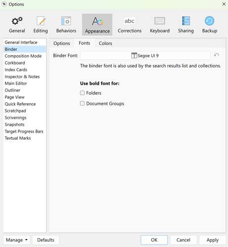
Files > Options > Appearance> Binder
You can use a bold font for Folders and Document Groups and resize or select another font here.
You’ll find a reference to them in the QSS Stylesheet, but you can’t change them, only replace them with other images.
Apologies. Didn’t see a notification of replies.
Thanks, I had played with that already. The issue is specifically the expand collapse arrows - I’m using the solarized dark theme and the arrows are practically invisible.
(still not trusted enough to post screenshot.)
Thanks again. I’ve spent a while looking but can’t locate the QSS files. Could anyone let me know the path on Windows 10 please.
Save the Theme you’re using to file and unzip it with 7-zip…
Thanks. I appreciate your help and see how that would work.
I’m leaving it now as it will still take time to figure out which controls I need, where to put the files, etc, etc. Time I can better spend writing.
It started as a trivial question that’s not worth this amount of effort.
It applies to all the included dark themes. If any of the theme writers are reading, please learn about colour contrast in terms of ACCESSIBILITY.
https://webaim.org/resources/contrastchecker/
Thanks again.
I can do this quickly for you. Which Theme do you want updated? Solarized dark?
It’s very kind of you to offer. Ah, I’m allowed to post images now. Slightly more visible on my other monitor.

Yes, solarized dark, for the arrows to be more like the text in brightness.
Many thanks.
Here you go… A new and updated version.
Here is an updated and corrected version of SolarizedDark (again):
This one has white arrows in TreeView controls like the Binder, Outliner and Keyboard Settings.

Do read the Readme.txt file for the place to store the custom icons that come with this Theme.
Use Window > Themes > Import Theme… to place the Theme in the Themes folder and on the Custom Themes menu. Alternatively, use Window > Themes > Load Theme from file… to place the Theme in the Themes menu until another Theme is selected.
SolarizedDarkWhiteBinderIconsTheme.zip (588.3 KB)
Njoy!
It’s really kind of you but I can’t seem to make it work. Spend another half hour trying it every which way.
The theme loads but without the icons. The icons are in the icon folder which I placed in the appdata local Scrivener Themes folder, as I understand from the ReadMe. I checked the permissions for folder and files. All but special for system, my account and admin. Tried both in this folder and within the unzipped theme folder. Am going to have to leave it for now.
Many thanks but as I said, it’s too minor to spend this amount of time.
So, did you read the Readme.txt? This should work. I’ll double check it…
The icons need to be in an icons subfolder… The complete path is:
C:/Users/%UserName%/AppData/Local/LiteratureAndLatte/Scrivener/Themes/icons/branch_closed_white.svg
and
C:/Users/%UserName%/AppData/Local/LiteratureAndLatte/Scrivener/Themes/icons/branch_open_white.svg
Hello Antoni, I must say first that I was absolutely overjoyed to find what you’ve done here, as the dulled-to-missing icons have been driving me wild for years now. When your eyesight isn’t entirely perfect, of course it’s worse,. Indeed, maybe Scrivener should hare a little work from you…??
Now, I trust that this will work, but I’m having the same issue that doesn’t seem to quite yet. I’ve got the icons in place. When I import your fresh theme, I can see it next to the icons folder.
But unfortunately, this theme now has a complete blank at pixel level (solarized color), where the normal SolarixedDark has its ghosts, if I go back to it. And this is true for either of the installed versions/placements of Scrivener alternatives as mentioned.
I guess there is something disturbed in the path, but the theme is binary, so couldn’t scope it out.
Thanks, Antoni, when you can get to it., and best,
Clive
This happens both on my latest released Scrivener, which is in Program Files, and with the Beta, which is (quite deliberately) installed in Appdata itself, as happens if installing without Admin permission.
Sorry to hear the Theme doesn’t work for you with the supplied icons.
I’ve updated the Zip-file with a Theme saved to file from the Predefined SolarizedDark Theme,
in case my own version had alterations already that might interfere with the theme.
In tests on my machine, the Theme works fine and the result looks like the screenshot provided.
If anyone wants to test, please let me know the results of your installation of this theme.
Hi Antoni, no joy, but I might be looking at the problem…
In your .qss file, starting about line 330 (end of file) you’ve got two ffull-pathed locations…for I think those icon files. They are pathed on your PC…!
With fortune, those could become relative paths – very possibly just ./icons/name.svg
Should be easy to test, and then fingers crossed ![]()
Clive
Shit, your right! You’d have to change the %UserName% IN THE QSS- FILE, zip the four files, and rename the zip to SolarizedDarkWhiteBinderIcons.scrtheme, before loading the Theme.
My bad. Worked on MY machine. ![]()
Update:
I’ve replaced the faulty hard-coded path with relative paths.
This works, but now you’ll have to IMPORT the Theme and not Load the theme from File.
The Readme.txt is updated to reflect this. The Zip-file is in the original post.
Sorry for all the confusion.
Antoni, that worked, I think, as I could modify it to work here…
Why? Well, I have the Beta, and it executes not from the expected directory for a ‘one-person’ Scrivener install. I worked out the proper place by checking the opening location in the shortcult, put in a relative path that would hit from there – and white icons!
You have no idea what a joy this was…
So, I tried to work out something which would accomodate the ‘everyone’ install of Scrivener, the one that happens if you install as an administrator. This ends up with the execution at in Program Files, a long way from AppData. Thus I tried every trick I may believe is in the book, not with further success:
- use %APPDATA%, with single ro doubled Win-backslash, as well as Unix forward slashes
- use ms-appdata://local…urls
- encode the svgs, and use this in a data url
- started to try encoded png, but this is worse than svg in size by far, even tiny, and I think that’s why the svg encode didn’t work, that it was well over the apparent 512 byte data limit.
So, I think there is no way. I wish there was someone at LL who understood eye issues some of us have, so that they would make available resources as you created, as that’s what Qt uses. And actually, just produce upgrades of their Dark themes, which would be the work of minutes with these resources. Which only take minutes to produce, no?
I guess I can re-install Scrivener again as a local install, to use your very appreciated work, Antoni.
The problem there has been a years-long battle with Paddle’s insane non-de-installing ‘protection’ of licenses, documented well elsewhere how to succeed against it I have, which caused a hour long use of that procedure any time I reinstall.
But I found the deeper secret to killing it, just a week ago, which finally puts an end to this – and need to put that up, possibly instead of hours spent here in honor of what you did ![]()
Antoni, again, thanks. I meant it, about the joy. It’s like having Scrivner back again, and I no longer have to be disappointed I can’t use any of those attractive ‘light’ schemes., as they are.
Clive
p.s. attached if I manage it here, the ForBeta version off the theme file. And to note it was pleasant enough to have the patient hours of a night listening to Mark Knopfler European countries concerts from 2019, very relaxed and relaxing, at his stage on the stage ![]()
SolarizedDarkWhiteBinderIcons ForBeta.scrtheme (233.9 KB)
to be used with your icons, as you explain above, and only for persons exploring the in-progress Windows Beta we have for now.
Thanks Antoni. And thanks Clive for reassuring me that I’m not completely crazy for wanting this change in the first place and stupid for not being able to make it work!
I have pretty good eyesight but still find myself clicking around the arrows because they’re so badly defined. I wonder if the underlying problem with these themes is that one set of icons have been designed to appear light in a dark background and dark in a light background?
Whatever. I still can’t make it work as it is.
I also tried renaming the icon files as the QSS refers to them in lowercase but the files were in title case. Just in, err, case.
I tried putting in the full path instead of relative path.
Tried putting the whole unzipped folder in the themes folder and trying to import from there.
In all cases the icons simply don’t appear.
BTW, I notice references to “url (:/Resources…”. Is this an actual URL or a path on my disk? In fact., never mind. I absolutely must leave this now.
I take on Clive’s input but I’m not using the Beta so am simply not going there. I do agree that L&L might reissue these themes to be accessible. In the meantime, if anyone else can install this theme on general release v3 and can post their mods, if any, I might give it another go. But for now I just have to squint and bear it.
Thanks again for all your efforts.
