As to the forum font, I’m not sure about any official changes. But in the meanwhile if you install the Stylish browser theme and check the online library for styles for this site, you’ll find a Bolder Sans theme I’ve created and use myself.
It has been possible to modify the index card look since version 1, though. No need to use the defaults if you don’t like them! I’d go through all of the Appearance pane settings in the “Fonts” tab if you haven’t done so. There are many areas of the UI that can be magnified through the use of custom fonts.
That’s an argument that should be made to Apple, but they’ll probably tell you that’s what the full-screen magnification option (the version that follows the mouse pointer) is for—or if not that, simply lowering your monitor’s scaling level in the System Preferences: Display panel. Handling this kind of thing at the application level isn’t realistic on macOS—it’s not a scalable UI.
Fortunately both can probably be addressed at once. We had to defer a larger forum system update in order to make a timely launch. Such an update will require tweaks to the skin, and so we’ve got all of the suggestions that have been made on a list to look over when that happens—and hopefully that will help with the spam too.
I’ve been changing fonts and background colors and have made everything but the Synopsis in the top window of the inspector nicely readable. Alas, The display font for the Synopsis in the top window of the Inspector does not change when I change the synopsis font in preferences. Changing it in preferences fixes the readability problems I had with out line view and I get along fine with the note cards. What I wish was easier to read is the Synopsis in the top window of the inspector. It’s really tiny on this 5K monitor, or any monitor for that matter. Scrivener 2 had the same problem.
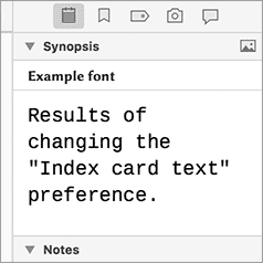
Hmm, that’s not an expected result in fact. You are definitely changing the “Index card text” setting in the Appearance: Index Cards preference pane? This is the result I get with an 18pt font set:
Okay, now I see my mistake. I mistakenly thought the “Synopses:” font under the “Outliner” preferences was supposed to change the font of the Synopsis in the Inspector (They are spelled differently and I still missed it). <slapping self on forehead - no wonder my cranial foliage is retreating in fear> I had no idea the Synopsis font was actually the index card (digital ones anyway - paper ones for sure) font because I never use index cards. I increased the index card font to 14 for both titles and text which makes it readable without having to lean forward and squint. Problem solved!
Ditto the forum font making it harder to read. Perhaps going from Effra-Light to Effra-Regular would address it. (Just looking at the Fontkit site the regular is much more legible.)
That said, having a care towards being WCAG 2.0-AA compliant on the web site would be nice given that a sixth of the Internet population has a disability affecting computer use. The font size (18), background and color don’t seem to be at issue…though when I highlight and the background goes black the readability increases (even with a white background and the text being #210. I’m viewing the site magnified 125% at that.
For giggles, I changed the font in the Chrome Inspect and are attaching them so you see the same display with Effra Regular (the first image) and Effra Light (the forum default). The Regular addresses the readability of the forum.
In spite of my 72-year old eyes, my only problem with the forum is the lack of a breadcrumb trail at the bottom of the ‘page’, to save having to scroll back up to the top in order to return to the current forum list … even more of a pain when viewing on my iPad. For the rest, I really like it, though I can understand why some members wish for a heavier font.
Count me in with the finding the forum very, very hard to read.
The highlighting of text seems odd too, misses the tops of characters and highlights space below the line.
Can we have some options? Just trying to read through a few threads gives me a splitting headache and eye strain. I have to really struggle to read the text since it’s so light and thin.
For instance, in the following screenshot of Oogiem’s post, at the Sans-serif dropdown I used Futura; it’s a medium weight font. The–Allow pages to choose their own fonts, instead of your selections above–box is unchecked.
[attachment=0]Screen Shot 2017-12-10 at 7.39.52 PM.png[/attachment]
Edit 12/18/17: I hadn’t used Fx for several months prior to the above post.(Started using it again specifically to address my inability to easily see L&L’s new forum design.) Since the post, I’ve learned of information regarding Mozilla that makes me not trust them (again). If you choose to seek it out, use the search terms trustworthy, censorship, tracking etc… I hope Mozilla can redeem itself; until then they’ve lost me.
I’m not liking the new look & I really wish I hadn’t upgraded. The thing I miss the most, though, is the use of label colours in the binder. I know it reflects a similar change in Mac OS from a few versions ago (dots of colour instead of wide swipes of colour) - but I don’t like it in the OS, either. If there were visual accessibility options in Scrivener, I’d be one of the people employing them.
And instructions for needed adjustments to the theme for Safari here:
I considered it but decided against it. Stylish is available at the Apple extension site (and elsewhere by the same developer) but the developer states–“This extension uses Google Analytics.”. I prefer to travel lighter than that. I don’t know if it’s available elsewhere developed in a different way.
[PS: If your issues with Fx are technical ones rather than general philosophical ones, feel free to PM me. Maybe I can help. This wouldn’t be the proper place to troubleshoot. If they’re more of a general just never gonna use that stinking browser dislike, pretend this PS doesn’t exist.]
Edit 12/18/17: I hadn’t used Fx for several months prior to the above PS post. (Started using it again specifically to address my inability to easily see L&L’s new forum design.) Since the post, I’ve learned of information regarding Mozilla that makes me not trust them (again). If you choose to seek it out, use the search terms trustworthy, censorship, tracking etc… I hope Mozilla can redeem itself; until then they’ve lost me.