I am glad to see that is not a completely dead concept, as it sounded from the original blog post.
-
Yes, I am aware of the WriteRoom project, and in fact have even submitted a few thoughts to that forum. I even submitted a multi-column editing feature before stumbling across your MyColumns prototype! Now that I have played with it, I agree with you, the overall experience is not as pleasant as reading; which is a real shame! I was racking my noodles, trying to think of a way around, and the only thing I could come up with was a time-delayed bulk insert, but how do you convey that visually without completely freaking out the user? While I like the concept of fading GUI elements, the main problem with this concept is that if you are unfamiliar, or are suddenly using the program on an unfamiliar screen resolutions, it can mean a lot of Hunt and Click. This is one problem with WriteRoom (and Ulysses) scroll bar. It is located directly beside the typing area, but it is invisible. Consequently, it is more difficult to quickly utilise it with the mouse, because when you start the actual movement, you do not know precisely where you are going with it. You have to travel, feedback to fade-in, stop, and then manipulate. Though, on the other hand, Having elements that are essentially invisible until needed is a good thing. What if the ‘X’ and the slider were barely visible and then faded up as the mouse comes within 50 pixels of them? Oh, as an aside, I always liked your Scrivener Gold’s scroll bar the best because even if it were to be invisible, you know precisely where it is – as far over on the right side as you can go. Finding it becomes irrelevant, it is simply a matter of tossing the mouse over to the right-hand side. Utilising screen edges is important in all things, Apple is very aware of this. It is my belief that these things become even more important when they represent functions which step outside of the primary “intent” of an environment. The mouse is wholly outside of the intent of BlockWriter, or any full screen situation, which is all about text and typing.
-
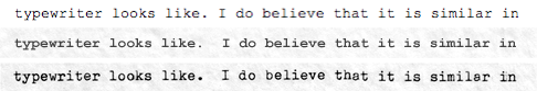
I definitely agree with you on the matter of dark text on a light background. I have never been very fond of the default settings in Ulysses, and consequently most other full screen implementations, since they all went after the console look too, with the exception of one or two. Here is a small thumbnail screen shot of my colour settings in WriteRoom:

As you can see, I am using an off-white slightly pinkish cast; there is a reason for this! The curtains where my typewriter sits cast this colour across the page when I am working in there. The brightness is very carefully chosen. I believe that, while the literal contrast is far weaker than actual ink on paper, this ratio much more closely emulates the “feel” of ink on paper. The darker page colour compensates for the difference between an emitting surface and a purely reflective surface. The text colour itself is about 86% dark, with a sepia cast. This seems to anti-alias especially well with the background colour.
Colour aside, you have accomplished something extremely important that amazingly, no other full screen implementation seems to have sufficiently addressed. That is, the presentation of the text follows simple typographic constraints that vastly increase readability. There is a good strong left and right margin, and enough top and bottom margin to keep text from “floating” outside of the “page.” There is that all important amount of line spacing, which looks about like the second stop of most typewriters, the 1.5x line height setting. This is my favourite setting when I know I do not need to double space. Double spacing on a computer screen is completely useless (More On That!), but keeping lines distinct is vital. All other full screens use a 1x line-height which for me is very difficult to interface with. One improvement you could make is to add an option to either indent or space paragraphs visually. This would not add a real tab or newline, but a visual one, to help paragraphs stand out.
-
As a default mode for Scrivener, you would probably run into a little friction. I say it would make a superb secondary mode though. It is novel; it is a tool which approaches the software philosophy in such a way that it stimulates through its simplicity. Where the Ulysses full screen philosophy simply removes distraction; BlockWriter removes distraction and introduces a physical element that is largely lacking in the software realm. We lose the sense that the forging of something is derived from anything else; and the necessity of loss/gain, et cetera. Philosophical notions, no doubt, rooted in my own subjective approach to life, but perhaps useful as a different perspective on things. One of the things that I very much like about writing on a manual typewriter is the tactile nature of it. It is to writing what sculpting is to the art of form.
-
Agreed, pinning the working line to the centre of the monitor would be quite nice, especially if you managed to implement a bit more intelligently than the Ulysses team did. Their implementation is just quirky enough that I find myself not using it a lot. But don’t feel as if you are copying Ulysses on it. The concept of pinning text in the centre of the monitor is actually quite old. I remember from my DOS PC days, there was a key called Scroll Lock which did precisely this in any application that support it. It locked the cursor and input to the vertical centre. Amusingly, the key still exists on every PC ever shipped, but I don’t think it has had an actual function in over a decade.
Now, in response to the original line items.
m1.
It is interesting that you brought up the introduction of sound into the application, for that would certainly be one of the main “typewriter-ly” things missing. Someone in the WriteRoom forum had the same notion, but I had my doubts on how effective it would be, based on two things: When typing on a manual, we type with a steady cadence. You queue up your letters and execute them in a careful staccato that, for a good typist, is around 60 WPM. On a computer we tend to type in bursts, because we are not constrained at all by mechanics. Since some word forms and letter combinations are naturally easier to type than others, they tend to “roll off” the hand. While this is a natural inclination on a manual, you avoid it because that sort of habit generally leads to a jam. And of course the second problem is speed itself. I can type over 125 WPM on a computer, with bursts of 150 WPM. As I put it in the WR forum, I can only imagine that with sound effects, such typing would probably sound like stepping into a 1940’s newsroom right before deadline. It sounds as if your experimentation has confirmed this.
I do not think that sound is something that should be completely discarded, however! There might be some other solution that would allow the senses to participate more, that might not be realistic from a typewriter perspective, but provide that little extra tactile feeling that the human brain so enjoys. Like the clicking noise on an iPod to make up for the complete lack of any tactile response from the physical controls themselves. Without the clicking, it is more difficult to navigate the menus. Nothing has changed by the noise, yet it is suddenly dramatically easier to “feel” your way through a menu if it clicks. How about: A similar, subtle click each time the spacebar is pressed? Maybe, every three or four keystrokes? It would be more abstract, but it would provide a bit of a metronome for the mind to “ride” as you physically convert your thoughts into words.
m2.
Bulk bold: Less intuitive, but useful, as making things bold is even more mechanical than underlining, right now, since you have to flawlessly retype what you wrote all over again. One has to start wondering though, with these “bulk” actions in place, what justification exists for omitting the standard keystrokes as well. I like the idea of using the old-fashioned method, as it is just part of that counter-normal stimulation process that BlockWriter presents, but for those who are less into that concept, can you justify not having Cmd-B around? I know that I, even if the standards existed, would still use the emulation techniques. It simply feels more tactile to underscore a section with the underscore key.
m3.
I am fully aware that my thoughts on this were off the deep end. Truth be told, the typographical conventions that you are using, already increase the readability of BlockWriter so much, that subliminal variation systems might just be overkill. It is just one of those completely off the wall things that “would be cool,” you know? What if BlockWriter looked like a scanned document as you typed it up? Would that increase or decrease the experience? If the implementation is impractical, but the concept is good, is there anything that can be done as a substitute?
m4.
Another nice thing about the “curtain” versus “wall” is that I can finally have reference material available in full screen if I want it! In fact, I am utilising that ability right now. I have my browser window with your post open to the right of the typing area, and I decreased the opacity so that I can read your response as I type. In WriteRoom, I would have needed to print out your comment, first, or simply use it in windowed mode.
On the restriction of grey-scale as colour options. I have another idea. If you want to be realistic, in a physical typing environment, unless you are typing in the middle of Wal*Mart under a battery of 9500º arc lamps, pure shades of grey simply do not exist. Even if you are sitting out in the sunlight, most of the time atmospheric effects or the reflectivity of the immediate environment will not result in a purely white colour base. I’d say most people typed indoors, though, and once you get indoors you have curtains, artificial lighting, firelight, et cetera. What you actually see is going to be a casted hue on the paper, most likely a yellowish or warm hue cast. The main reason that I just just a touch of colour in my setup is because stark black & white, and even more pleasing, yet still neutral, grey arrangements, feel “dead” or oddly surreal to me. Add just a little warmth to the screen, and all of that goes away. Something that I do quite frequently is adjust my System Display settings to use the D50 white point calibration. This is what a lot of graphic artists use to mimic gallery lighting settings, but I’ve found it makes looking at the standard black on white text entry fields a lot less “jarring.”
So, my idea is right along those lines, actually. Instead of having foreground/page colour wells (restricted to grey, even), have a Contrast slider that simultaneously decreases the brightness of the page and the darkness of the text. Then have a second slider for colour temperature (though perhaps calling it something less technical). Fiddling with that would add a colour cast to the text/page greys. Do play with Apple’s screen calibration white-point slider to see what I mean. I don’t know, I think having these two sliders would get most people precisely the preference they want, within the constraints of the typewriter look.
For the rest, there is always that alternate mode. WordPerfect 5.1 blue/white, or 1984 terminal screen. There are a lot of people that do like that. Scrivener should not lock them out. But for people that like the look of a typed/printed page, I like the two slider idea. Now the question is whether or not Apple provides access to a colour model that makes this kind of adjustment easy. I wonder if not actually changing the colours at all, but applying a real-time CoreImage filter effect to the display would be the solution?
Now for the negative bullets.
m-2.
I agree, visual over-typing would be fun from an emulation standpoint, but it does serve little practical use. The mechanical process of applying liquid paper and typing over a bad section did not even occur to me, as what the current over-typing metaphor relates to. You are right though, that is basically all you are doing, sans all of the fumes and sitting around for two minutes waiting for it to dry.  So the question is whether or not it is something that should be allowed. If the purpose of BlockWriter is to encourage “forward writing,” in the same manner that a typewriter does, then I think it should be disabled and made so that any key you hit will insert an overstrike. Why? Because even though this function is possible on a typewriter, because of all the things we are sans, it is much, much more difficult to execute it. Thus, when you are typing out your prose on a typewriter, you generally do not work with the liquid paper or the Tippex until it is time to revise or correct typos. Messing around with sticky fluids and waiting for them to dry completely halts the writing process, and thus marginalises its usefulness as a quick edit. Forward writing continues. On the computer, all of these steps are left out and the end result is displayed instantaneously. The temptation to edit while writing creeps in, and the forced forward writing concept withers. So that is my opinion.
It comes to mind that a lot of these restrictions are going to be personal in nature. I wonder if a preference section with a set of check boxes to disable/enable some of the more strict features would be a good idea? Perhaps this would alleviate the need for “modes.” Writers who do not want the forward writing ideology foisted upon them can simply turn off those features, set to use unrestricted colour pot selection and viola: WriteRoom/Ulysses/CopyWrite/MacJournal/et cetera.
You asked for ideas on intuitive typewriter-ly things that might be missing. I think the largest disconnected right now is this: Typewriters produce fixed width, line centric output. Text editors produce variable width, paragraph centric output. In this sense, a typewriter document is much more like a Mainframe text file, which has a limited length buffer for every line, whereas the UNIX/PC text file is a stream, and line endings are simply a display standard. A text editor could, if it was decidedly odd, decide to display newlines as bowls of fruit instead of vertical spacing.
Okay, on one side of things, I do not think the user should be forced to carriage return when the line gets to the end ding. That would be an example of taking the metaphor too far! But where I do see problems is when you do things which come from the typewriter world, such as adding format in a mechanical fashion, or over-typing. These things are so decidedly unusual for a text editor, that you forget that you are still working with a text stream. Ploughing over a newline causes paragraphs to jump around, for instance. Of course, just removing over-typing altogether would solve this problem.
Here is my big idea of the day, though. My little pet, of course, annotations I said I would get to double spacing, so here goes. Double spacing is generally pointless except for aesthetically speaking, on a screen, because we cannot go back and add text in between lines, but, what if we could? Like on a typewriter, ribbon select to red text, and then go back and add comments in between lines? This would mean that ribbon select is actually two things: text colour selection, and implicit insertion mode. However, it would have an important distinction from “black text” insertion mode that currently exists. Instead of inserting into the text stream, it would create Scrivener annotations. What we are essentially talking about here, is re-displaying the annotation system in a more typewriter-ly fashion, and when in typewriter mode, making the addition of annotations much more like using a typewriter (with magical powers).
This suggestion might be completely impossible to implement, and it is a little hard to describe, so I made another illustration, which should be self-explanatory:

Well, the main problem is that it is displaying text at odds to streaming, and since BlockWriter is paragraph centric instead of line centric, how does it know how to couple these two text areas together? Of coarse, if this idea is impossible, just showing annots. and footnotes as being right in the text stream with a different colour, that is fine too. We could still use the ribbon select idea in that case. Our magical typewriter could have a special ribbon colour for footnotes.
I know that I had another idea, but it is almost time for my mid-night nap, and I am nodding off whenever I close my eyes in an attempt to recall it. So, I’ll post if I think of anything further!