Scrivener 3.1 Accessibility

While Scrivener 1.9 was just fine for folks that cannot spot 8-point font on a 1080P screen, 3.1 is decidedly not. It literally feels like the Mac version was ported to Windows with the same GUI; one and done.

Let me just say first that 3.1 under the hood is a good improvement over 1.9. But the GUI sucks. One foresight that can save it, is being able to customize colors, but should a user have to spend hours and days to create a layout that makes the software usable?

I’m literally on the fence on just returning 3.1. And wonder if the requirements drilled into students of web development (accessibility) just don’t count in -21? Should new software make you angry while you use your magnifying glass on the screen?

I am in the process of making a high contrast layout; something the software frankly should ship with! All you really needed to do, is provide the interface from 1.9 as an option, and you’d be done–as if dark mode is desired, one can change the colors of it as well.

I’m hunting for the icon files inside 1.9, which by providence wasn’t uninstalled upon upgrade. Knowing which file they are embedded in would be of great help. If I know that, I can use Visual Studio to get at the contents. Yes I want to port 1.9’s icons to 3.1. Alternatively use Photoshop to alter some of 3.1’s icons.

I have screen prints, you will see what I mean.

I guess the moral of the story is, unless you got 20/20 vision, go find a different Software. Is that the message Literature and Latte wanted to convey?

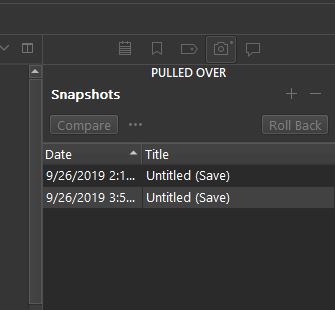
PS: What is high-contrast in the screenshots are such because I have already spent hours changing out the colors and fonts. Grey on grey, that’s the dark mode template.

And yes I have at this point tried ALL of them. The rest are worse, not better.

For those of you in the same boat, I’m also in the process of making a template duplicating the color and font scheme in 1.9. Won’t help you one iota for the monochrome icons though, unless I can get under the hood and Photoshop them.

BadAcc3
BadAcc2


dkmodeacc

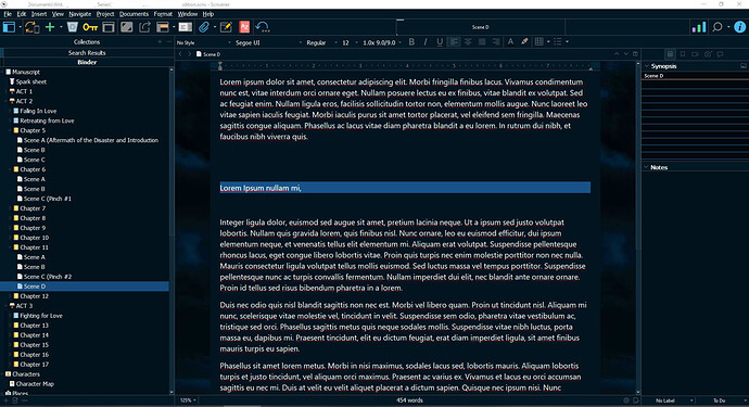
Highlighting the current line, by default dark-mode colors is also peachy.

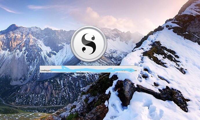
Someone also got skewered for stating 3.1 takes a long time to load. I’m on a high end gaming rig, and they are absolutely right, it does. Screenprint to prove it attached. That one though isn’t a no-go for me, as things can be tweaked to better load times. Just wanted to say for the record that they were not lying.

WIP High contrast dark mode theme included below:
PS: Please allow upload of Scrivener theme files outside of a zip file.
WIP-DarkMode.zip (17.1 KB)

Now if someone can point me to the file the icons reside in, in 1.9 and 3.1, things will be looking better.
1 Like

First, I’m not an L&L staffer, just a Mac Scrivener user. I’m providing comparisons with the Mac user interface for reference.

It doesn’t look like the Windows UI was imported directly from Mac. Here are the Mac dark mode inspector buttons:
image
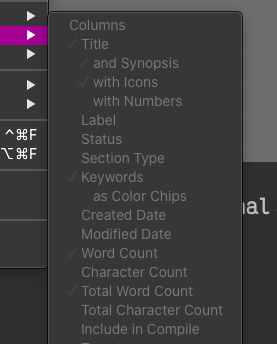
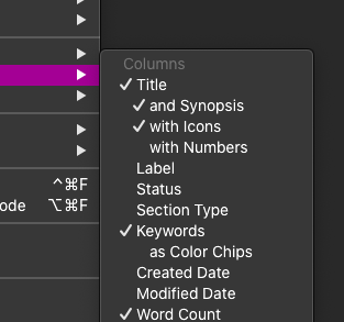
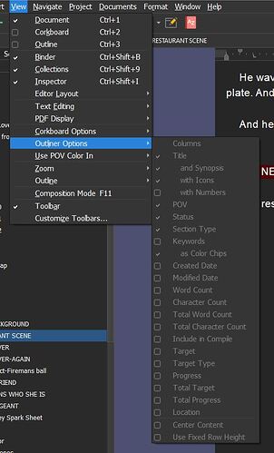
Black and white, to be sure, but much more visible than those you posted, @BadScribbler. As for your second image, I believe all those options are grey because they’re disabled (no outliner view active)—they should be as visible as the main menu if they’re active. Mac screenshot with an editor active:
image
And with an outliner active:
image
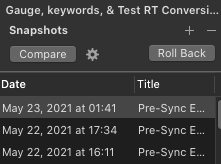
Here are the Mac “Compare” and “Roll Back” buttons:
image
Much more legible than the Windows buttons you’re displaying.

The “highlight current line” looks like it might be a bug—certainly Mac dark mode default line highlight is more reasonable:
image
Again, my purpose here is to provide a Mac reference point. It definitely looks like the Windows dark mode UI is less accessible in the cases of the Inspector button icons, the “Compare” and “Roll Back” buttons, and the default dark mode line highlight.

1 Like

As Silverdragon documents with screenshots, the UI is most certainly not ported over from the Mac. It would look very out of place there! Secondly, the only UI we commissioned a design for is the standard default. The development team implemented some additional themes as this was a popular request, and it’s good they have them, but they haven’t been extensively gone over by a graphic designer. I’ve noticed a number of flaws, particularly in contrast, but also in how confusing visual elements exist within them that do not in the default skin (like checkboxes beside elements that shouldn’t be there, hyphens not showing up for some reason, etc.). Hopefully now that the rush to get it out is done, they can spend some time polishing these to the same level of refinement as light mode default.

That said though, there is indeed a high-contrast theme that ships with the software. It is called, “Mellow Yellow”. Don’t be mislead, it is anything but mellow.

You can also boost the global UI font size (and change the font itself) in the Appearance: General settings pane, along with icon size. Where that won’t impact fonts is in places that take custom fonts, like the Outliner view. So it would be a good idea—once you apply the UI font setting and can see the settings area better—to go through Appearance and look for font tabs. Get things set up in a way that is comfortable for you. Overall I would say v3 should be a lot better than the old version for accessibility.

1 Like

Proves exactly what I’m saying. That the GUI was imported straight, without any needed changes done for the Windows version.

I’ve been on a Mac for over 10 years. Which means I know that on a Retina Screen, and with the graphics rendering on a Mac, it looks completely different.

EDIT: Now that I took the time to read your post again, you do say Windows is different here.

I’m going this direction now; but my comment stands.

Most writers do not have developer tools installed on their machines.
I’m working the layout in VS.code, and am about to put the QT tools into Visual Studio now.

This is because what’s under the hood of your program. Otherwise there is no way I’d do this. I intend to upload the theme once it is done.

EDIT: Again reading better; having used 1.9 since 2016 I disagree with you on the accessibility between the two versions. I have had zero problems with 1.9. I tried every layout that came with 3.1. And the one I started editing is the one that was best of them.

Bright yellow is out of the question. Not in a million years. Nor will it contrast unless put against very dark colors. Plus, why should people w-poor sight be stuck with something ugly? That feels mean to me.

Not talking about myself here; as I happen to have the rig full of dev tools.

Now, if you could tell me where the icons are, you’d save me a lot of time. I’m thinking from the truncated URL inside the QSS file, we’re talking about an archive file of some sort, as that is all that I can see in resources.

And once I’m done, you will have a good high-contrast theme for free.

1 Like

That’s a fine critique to be made, that there are many elements that one cannot easily customise without developer tools. I think the problem there is that replicating the amount of interface it would require to do that would be overwhelming—to the point of becoming a developer tool in and of itself.

It is perhaps worth noting that none of that is even possible on the Mac. There are two basic UI choices (Light and Dark), and then whatever you can change in the Appearance section. You can’t override the UI font, you can’t change icon sizes and so on. There are more colour options to work from on Windows, if you aren’t familiar with development tools, too. You’re stuck with working from grey no matter what.

And once I’m done, you will have a good high-contrast theme for free.

That would be great! We look forward to it. I also agree that the yellow is very extreme and not designed toward aesthetics but pure contrast boosting.

1 Like

Hey, you forgot to tell me, where are those icons? They are in resources something, please see paste from VS Code.

image: url(:/Resources/DarkMode/icon_checkbox_indeterminate_disabled.svg);

I will FIND them, but you can save me a lot of time by just telling me where.
If I do tinker w-icons at all, the only thing I will be doing is heightening contrast.

I have no idea, sorry, I’m not a Windows developer. I’ll try and summon someone who is. My guess would be that this is an install level thing though rather than something driven by the theme. I.e. you’d probably need to supply an unofficial patch that changes the core installation, but I could be wrong.

1 Like

It is a simple path I’m pretty sure. :slight_smile: Into an archive file.

If you can ask them that’d be cool. Meanwhile, I will go to BED, it is nearly 4AM!

Writers!!!
Devs!!!

What can I say. :woman_shrugging: :grin:

Oh indeed. :laughing:

Oh by the way…
Please give your devs props for excellent commenting. Makes it so much easier to know what’s what.

1 Like

Hi BadScribbler,

About the icons. They are compiled inside the Scrivener executable and there is no separate resource file that you can edit under VS-Code. There are resource files in the source code, but upon compiling they end up embedded inside the executable and not as separate files/folder to be installed on user’s machine. It would have been much simpler to modify the icon files, if they are all available in a separate directory for any user to edit, but this would also impact dramatically Scrivener startup times. At the moment I cannot point you to a place that will allow you to modify the icons easily. This is also not something we have prepared Scrivener for, and is definitely hacky with unexpected and questionable results, if you ever manage to do it. Have in mind that Scrivener uses lots of custom draw widgets, so the best way to modify Scrivener’s look and feel is use the existing Theme files and probably create your own Theme modifying the theme file which matches closer your preference. The icons unfortunately cannot be modified via the theme files.

All the best,
Tiho

2 Likes

About the slow Scrivener startup times, it depends a lot on your initial layout upon opening Scrivener. Some users tend to load the complete Draft folder in Scrivenings mode. If you close and reopen your project, this results into loading ALL Draft files all at once upon startup. This is a very heavy operation. The power of Scrivener is that you can work in chunks. Switch to any other view Mode (Corkboard, Outliner) or simply select a sub-folder, and Scrivener will load much faster for you. Loading and always working with your Draft folder in Scrivenings mode is an overkill, which still works, but will cost you few seconds of extra loading time.

Very Big embedded images (sometimes I have seen embedded images being ~10 Mb and more) are also another main reason for slow loading times. Imagine having multiple very big images in the same document and this document needs to be loaded upon startup. This is definitely asking for slow startup times.

Check your project for some of these common reasons for a startup delay and you might get your project loading much faster.

4 Likes

Hi,

This is something that I definitely did not know, and had never worked out. I am one of those who (almost) always closes and opens “the complete Draft folder in Scrivenings mode”. It had, to be frank, never occurred to me not to :slight_smile: I just experimented with the large project that I am currently working on. I switched to Outline vieww, closed it, then reopened it. It reopened immediately, just like @tito_d promised.

That’s several minutes of my working week reclaimed!

Cheers
Owen

5 Likes

Thank you Tiho. I JUST figured this out, not 15 minutes before going back on the forum. Found a book on QT, and took a visit to the QT platform maker’s website.

Reading the QT file in Visual studio now as I speak.

So I fully understand. And also understand why a company would choose to store the files in a QT resource file. Speed being one.

Thank you for taking the time to answer. I really appreciate it.

So to others, if you want to make your own theme; do a save-as of the theme which has the closest look of dividing lines and icon colors you want, make sure your new XML file points to the same location of the style in resources (do not change the style element’s name property), edit your PAL file and your QSS in your favorite code editor, and you got yourself a theme.

1 Like

Again thank you so much Tiho.
I didn’t know this about how the various parts load. Definitely something to keep in mind.

I was mostly angry at the users who skewered the other person who said it loaded slow when I wrote that. My solution, if it gets any slower over time w-a big project loaded will be to give Scrivener priority in using Windows resources, through inclusion in gaming mode for starters.

For the rest of you who have different PC’s, W10 comes natively w-the tools to do this. TenForums are your friend in the how to’s.

And Tiho, I bitched about load times and I bitched about themes. And cried about some other things in other threads. At one time I mentioned I liked what’s under the hood.

So, since I have a Dev’s ear here; and people rarely say anything if something is nice…

You and your team have done an absolute bang up job with this app. And on two platforms. Scrivener has pretty hefty complexity for a single-purpose app, and even w-that complexity is rock-solid stable.

It does its thing and it does it well. Also kudos for the tome that is the support manual, and for including it locally. And thanks for making the program infinitely customizable.

Now that I got my OCD satisfied w-a customized theme I’m a happy camper.

5 Likes

Thank You for the kind words, BadScribbler! It took us much more than expected to release Scrivener for Windows v3, but I am happy to read that many users find the software stable and feature rich. For a software developer to read that the software is stable and functional is probably the greatest satisfaction.
Thank You and Enjoy!

3 Likes

At long last… drumroll… Here’s the theme, for those who might want it.

The layout’s name is Midnight, and it uses the package resources from the darkmode default layout.

One thing; the dividing lines are a little weird, as I could not get into the package files & change that. Cannot be done, as it is QT. But, I have gotten used to the grey colliding with the blue by now, so hopefully you (that want this theme) will too. The button color still trips my OCD, just a smidge too green when 3 colors are involved–hopefully not too weird.

The Theme is based on a free picture from Unsplash, which makes up the desktop background. I have attached the picture in the zip file.

Below are a couple of screenshots to help you decide.

Desktop Screenshot:

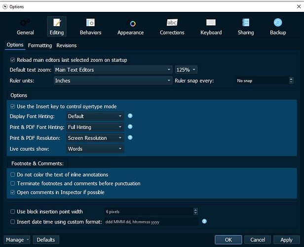
Options Window Screenshot

The Theme:

Midnight-ScrTheme.zip (1.6 MB)

Open the zip-file to find the theme & desktop background photo.

PS: I would have compressed the zip file a lot harder, but I don’t think you take 7z, do you?

7 Likes

Very nice! I’ll give this a workout over the next couple of weeks, but so far I really like what I see.

1 Like

Uh … then do what?

Thanks,

Thomas